Table of Contents
- What is a wordmark Logo?
- Some key benefits of using this type of logo:
- Tips for creating an outstanding wordmark logo:
- Some market-leading examples of outstanding pictorial mark logos:
A brand’s logo is often the first point of contact a customer has with a company, making it a crucial component of any successful branding strategy. Among the different types of logos, the wordmark logo stands out for its simplicity and focus on typography. In this article, we will explore all about it.
What is a wordmark Logo?
A wordmark logo, also known as a logotype, is a type of logo design that primarily consists of the stylized typography of a brand or company name. Unlike other logotypes that may include symbols, graphics, or illustrations, wordmark logos rely solely on typography to represent a brand. In a wordmark logo, the font, size, style, and color of the letters are carefully selected to reflect the brand’s personality and essence. Wordmark logos are often used by well-established brands or companies with distinctive and recognizable names.
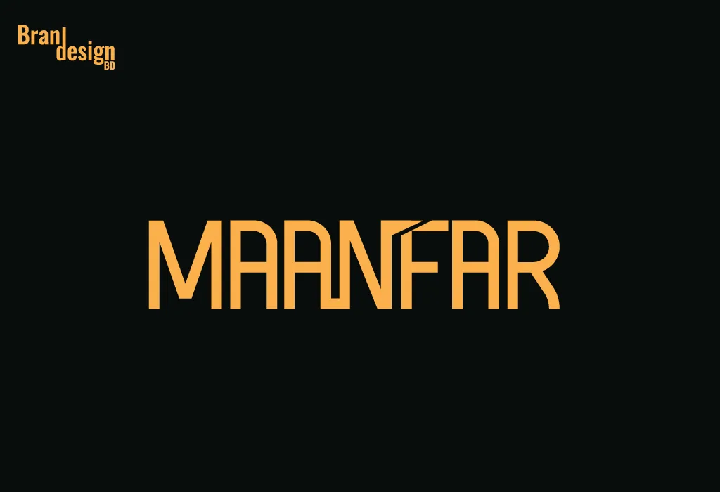
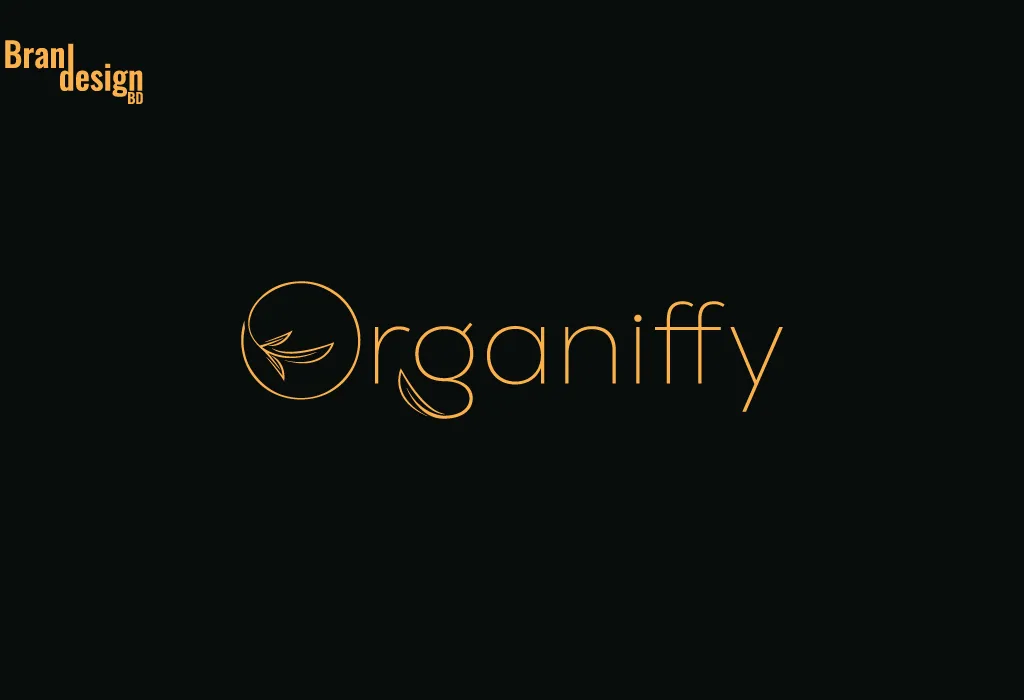
Here are some examples :




Some key benefits of using this type of logo:
1. Clarity: Wordmark logos acutely communicate the name of the brand or company, making it easier for customers to recognize and remember.
2. Simplicity: Wordmark logos are simple and uncluttered, making them easily recognizable and adaptable across various mediums.
3. Brand identity: Wordmark logos can effectively convey a brand’s personality and values through typography alone, helping to establish a strong brand identity.
4. Memorability: Wordmark logos with unique and distinctive typography can be highly memorable and stand out from competitors, helping to increase brand recognition and customer loyalty.
5. Legibility: Wordmark logos are typically designed to be highly legible, ensuring that customers can easily read and recognize the brand name across different mediums and at different sizes.
6. Scalability: Wordmark logos can be easily scaled up or down without losing their visual impact, making them ideal for use in a wide range of marketing and advertising materials.
7. Professionalism: Wordmark logos can give a brand a professional and polished image, helping to establish credibility and trust with customers.
Tips for creating an outstanding wordmark logo:
1. Choose the right font: Select a font that matches the personality of your brand and is easily legible in various sizes. Avoid overly decorative fonts that may be difficult to read.
2. Use typography creatively: Experiment with typography to create a unique and memorable design. Consider playing with letter spacing, capitalization, and color to create a visually interesting logo.
3. Reflect brand’s personality: Choose a font and design that reflects the personality of your brand. For example, a luxury brand may use a more elegant and refined font, while a tech company may use a sleek and modern font.
4. Make it versatile: Ensure that your wordmark logo is adaptable and can be easily used across various mediums, from digital to print.
5. Consider proper color: Choose a color scheme that complements your brand’s personality and is easily recognizable. Avoid using too many colors, which can make the logo look cluttered.
6. Research the competition: It’s important to research other companies in your industry to ensure that your wordmark logo is distinct and unique. Avoid creating a logo that is too similar to competitors’ logos.
7. Use negative space creatively: Experiment with using negative space to create a clever and visually interesting design. This can help your logo stand out and be more memorable.
8. Consider the logo’s placement: Think about where the logo will be placed, such as on a website header, business card, or packaging. Ensure that the logo looks good in these contexts and is easily recognizable.
Some market-leading examples of outstanding pictorial mark logos:
1. Coca-Cola: Coca-Cola has one of the most recognizable wordmark logos in the world. The logo uses a unique, flowing script font that is easily recognizable and reflects the brand’s classic, timeless image.
2. FedEx: The FedEx logo uses a bold, sans-serif font with a hidden arrow in the negative space between the letters ‘E’ and ‘X’, which represents the brand’s speed and reliability in delivering packages.
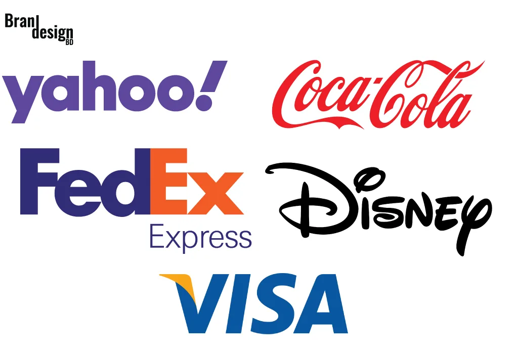
3. Yahoo: Yahoo’s wordmark logo features a bold, uppercase sans-serif font in purple that represents the brand’s renewed focus on simplicity and functionality. The logo is easily recognizable and reflects the brand’s commitment to providing relevant and useful content to its users.
4. Visa: Visa’s wordmark logo uses a clean, sans-serif font with a bold, blue color that represents trust, security, and stability. The use of a white checkmark in the negative space adds a subtle, clever element to the design that represents the brand’s focus on efficiency and convenience.
5. Disney: The Disney wordmark logo features a unique, playful font with exaggerated letter spacing that reflects the brand’s emphasis on imagination and creativity. The use of a whimsical, script-style ‘D’ adds a memorable and distinctive element to the design.
In conclusion, a wordmark logo is a simple yet effective way to represent a brand through typography. It requires careful consideration of font selection, size, color, and other design elements to create a memorable and effective logo that reflects the brand’s personality and values. When designed correctly, a wordmark logo can become a powerful tool for branding and help to establish a strong brand identity.
If you want to make this type of wordmark logo then contact us now.


