

Explore the Modern Abstract M Letterform and Infinity Loop Logo Design, featuring bold geometric shapes, flowing curves, and creative negative space for a distinctive brand identity.
Introduction
A memorable logo combines simplicity, meaning, and visual appeal to help a brand stand out. The Modern Abstract M Letterform & Infinity Loop Logo Design brings these qualities together through a bold letterform, a flowing infinity-inspired symbol, and carefully balanced negative space. The result is a contemporary logo concept that connects geometric structure with continuous movement.
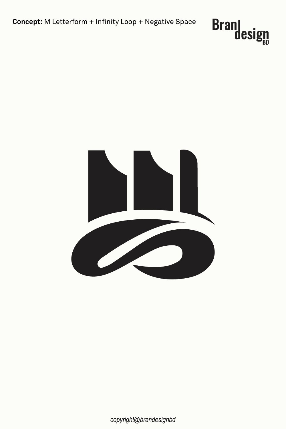
The design features an abstract M created from strong vertical shapes and curved cutouts. Beneath it, a flowing loop adds a sense of continuity, connection, and balance. The contrast between the structured upper symbol and the fluid lower element creates an interesting visual relationship that makes the logo distinctive and easy to recognize.
This minimalist concept can suit businesses seeking a professional identity with a modern appearance. From technology companies and creative agencies to consulting firms and lifestyle brands, the design offers a flexible foundation for a visual identity that can grow with the business.
Overview of the Modern Abstract M Letterform & Infinity Loop Logo
A Bold Abstract M Letterform
Geometric Structure + Distinctive Letterform
The upper portion of the logo uses bold, vertical forms to create an abstract interpretation of the letter M. Rather than relying on a conventional font, the letterform is constructed from simplified shapes and carefully considered curves.
This approach gives the symbol a strong visual presence while keeping the design minimal. The letter M can represent a business name, founder’s initial, product line, or another meaningful part of the brand identity.
An Infinity-Inspired Loop
Continuous Movement + Connection
The lower portion features a smooth, flowing loop inspired by the infinity symbol. Its continuous form introduces movement and contrasts with the more structured upper letterform.
An infinity-inspired shape can suggest continuity, long-term commitment, connection, and ongoing progress. These associations make it an appealing visual element for brands that value lasting relationships, innovation, or sustainable growth.
Flowing Negative Space
Hidden Balance + Visual Simplicity
Negative space is the area surrounding or separating visible shapes. In a thoughtfully designed logo, this space can help define the symbol, improve readability, and create a more engaging composition.
The flowing loop and the gaps within the abstract M work together to establish visual balance. This use of space helps the logo communicate its idea without relying on unnecessary decorative elements.
The Meaning Behind the Logo Elements
The Letter M
Identity + Ambition + Recognition
A custom lettermark can provide a direct connection to a company’s name or initials. By transforming the letter M into a distinctive geometric symbol, the logo creates a visual identity that can be recognized independently of a full wordmark.
Depending on the brand’s story, the letter can represent ambition, modern thinking, craftsmanship, or a commitment to quality. Its precise meaning will depend on the business using it.
The Infinity Loop
Continuity + Trust + Long-Term Vision
The infinity-inspired loop adds a symbolic dimension to the design. Its continuous path can represent enduring relationships, ongoing development, and a commitment to progress.
For service-based businesses, it may suggest long-term client partnerships. For technology companies, it can support ideas of continuous improvement. For lifestyle brands, it may represent lasting value and connection.
The Combination of Structure and Flow
Stability Meets Flexibility
The abstract M provides structure, while the loop introduces movement. This contrast creates a balanced composition that feels both stable and dynamic.
The relationship between these elements can communicate a brand that combines dependable service with fresh ideas. It offers a visual starting point for businesses that want to appear professional without feeling overly traditional.
For logo purchase or negotiation, please contact agency@brandesignbd.com
Logo Sale, Handover & NDA Information
All project handover agreements, ownership documentation, Non-Disclosure Agreement (NDA), and related communication will be handled through the email address provided above.
Once the logo is purchased, we will update the listing status to “Sold” and, upon request, add the buyer’s website or preferred address to the listing as confirmation of the sale. All necessary final files, ownership documentation, and agreed-upon project materials will be provided to the buyer after the purchase is completed.
Design Style and Visual Appeal
Minimalist Black-and-White Design
Bold Contrast + Timeless Simplicity
The logo’s black symbol against a light background creates a clear, high-contrast appearance. This treatment keeps attention on the letterform and loop rather than on color effects or decorative details.
A monochrome design also provides a practical foundation for branding. Additional colors can be introduced later to suit the company’s personality, industry, and audience while preserving the original symbol.
Geometric Shapes and Smooth Curves
A Balanced Visual Language
The upper M uses strong geometric shapes, while the lower infinity-inspired form relies on smooth curves. This combination creates visual contrast without making the design feel disconnected.
The geometric structure supports a sense of precision and order. The curved loop softens the composition and adds a feeling of movement, giving the logo a distinctive contemporary character.
Strong Silhouette and Recognition
A Compact, Memorable Symbol
A logo should remain recognizable across different sizes and applications. The compact composition of the M and infinity loop helps create a unified symbol that can work on websites, business cards, packaging, and promotional materials.
The smaller details should still be tested at reduced sizes. Proper spacing between the letterform and loop helps prevent the design from becoming crowded when reproduced on small surfaces.
Suitable Industries and Brand Applications
The abstract M and infinity concept is flexible enough to support several types of businesses. The most suitable industry will depend on the brand’s name, positioning, and target audience.
Technology and Software Companies
Innovation + Continuous Development
Technology companies, software developers, IT service providers, and digital platforms often need a clean identity that works across websites, applications, and digital products.
The abstract M can provide a recognizable brand mark, while the infinity loop can support ideas of ongoing development and connected systems. The design may work on application icons, dashboards, websites, presentations, and digital advertisements.
Consulting and Professional Services
Trust + Long-Term Partnerships
Consulting firms, business advisors, financial service providers, and professional agencies often build their reputations through trust and lasting client relationships.
The infinity-inspired loop may help communicate continuity, while the bold lettermark provides a clear brand signature. Combined with professional typography, the logo can support a consistent identity across proposals, business documents, and corporate websites.
Creative Agencies and Design Studios
Original Thinking + Creative Connection
Creative studios, marketing agencies, branding specialists, and production companies can benefit from a logo that feels distinctive without becoming complicated.
The abstract geometry offers an opportunity to build a modern visual system around the symbol. It can be used across portfolio websites, presentations, social media profiles, and promotional materials.
Education and Learning Platforms
Continuous Learning + Growth
Educational institutions, online learning platforms, coaching services, and professional training businesses may find the infinity concept relevant to their message.
The loop can represent ongoing learning and development, while the letter M can connect the logo to the organization’s name. A clear typeface and accessible color palette would help complete the identity.
Wellness and Lifestyle Brands
Balance + Connection + Continuity
Selected wellness, lifestyle, and personal development brands may appreciate the smooth curves and balanced composition.
The infinity-inspired form can support a message of ongoing growth or connection, while the abstract M provides a distinctive visual anchor. The final identity should use appropriate typography and colors to match the brand’s audience and values.
Retail and Consumer Product Brands
A Distinctive Mark Across Products
Retail businesses and consumer brands often need a logo that can be reproduced consistently on packaging, labels, tags, and online stores.
The compact design can work as a primary brand mark or a supporting symbol. Before production, the artwork should be tested at the intended size to ensure the loop and negative-space details remain clear.
Originality and Copyright Verification
Originality is an important part of professional logo development. A logo should not simply imitate an existing identity or use another company’s protected artwork.
Yandex Image Search
Reviewing visual similarities
Yandex can be used as one part of a broader visual similarity review. Image search can help identify visually similar marks, concepts, or existing artwork that may appear online.
This type of search is useful during the design review process because it provides another opportunity to identify potential visual similarities before final delivery.
TinEye Reverse Image Search
Checking for matching or reused imagery
TinEye is another reverse-image search resource that can help investigate whether a similar image or graphic appears elsewhere online.
For logo development, reverse-image searches can support an originality review, particularly when the designer wants to check whether a visual element resembles existing online artwork.
Non-Disclosure and Logo Handover Agreement
Professional logo projects may involve confidential business information. A client may share a company name, product concept, launch plan, marketing strategy, packaging information, or other materials that are not yet publicly available.
Clear communication about confidentiality, ownership, and final deliverables can help establish expectations between the designer and buyer.
Non-Disclosure Agreement
Protecting confidential client information
A non-disclosure agreement, commonly called an NDA, can establish clear expectations regarding confidential information.
Depending on the agreement, the designer may be required to keep private materials confidential and avoid sharing unreleased brand information, business documents, product concepts, or other protected project details without permission.
An NDA should clearly define what information is confidential, how that information may be used, and what responsibilities apply after the project ends.
Logo Handover Agreement
Defining final ownership and deliverables
A logo handover agreement can clarify what the buyer receives after the purchase and completion of the project.
A professional handover may include the final logo files, editable vector artwork, approved variations, color versions, and other agreed project materials.
The agreement should also state when ownership or usage rights transfer to the buyer. Depending on the project terms, this may occur after final payment has been received.
Final File Delivery
Providing practical brand assets
A complete logo package may include formats such as AI, EPS, SVG, PDF, and high-resolution PNG files when these are included within the agreed scope.
Vector formats are particularly useful because they allow the logo to be resized for both small and large application.
The Modern Abstract M Letterform & Infinity Loop Logo Design combines bold geometric structure with smooth, continuous movement. The abstract M creates a recognizable brand anchor, while the infinity-inspired loop introduces ideas of connection, continuity, and long-term progress.
Its minimalist silhouette can support a range of potential applications, including technology, consulting, creative services, education, lifestyle, and consumer products. The most effective use will depend on how well the symbol fits the business’s identity and audience.
With complementary typography, a thoughtful color palette, and professionally prepared vector files, this logo concept can become the foundation of a consistent visual identity across digital platforms, packaging, print materials, and merchandise.
For inquiries about purchasing this logo concept or discussing its availability, please contact support@brandesignbd.com.
Also, check the recent article about the Creative Doorway and Ocean Wave Loop Logo Concept here