Untitled-1-01Untitled-1-01

brandesignbd

Graphic Design Service Provider

  • Home
  • About Us
  • Our Services
  • portfolio
  • Contact Us
  • Blog
Get Started

Home » Custom Lettermark Logo

Posts tagged: Custom Lettermark Logo

AS Lettermark Custom Brand Logo Design Concept

Modern AS Lettermark Custom Brand Logo Design Concept

October 24, 2026
by badhan666@@ Graphic design
 AS Lettermark Custom Brand Logo Design Concept
AS Lettermark Custom Brand Logo Design Concept

Table of Contents

  • The Concept Behind the AS Lettermark Logo
  • Why Choose a Modern AS Lettermark Logo?
  • For logo purchase or negotiation, please contact agency@brandesignbd.com
  • Logo Sale, Handover & NDA Information
  • Potential Applications for the Logo
  • Originality and Copyright Verification
  • Non-Disclosure and Logo Handover Agreement
  • Final Thoughts on the Modern AS Lettermark Logo

Discover the Modern AS Lettermark Custom Brand Logo Design Concept, combining the letters A and S in a flowing monogram for a clean, elegant, and memorable brand identity.

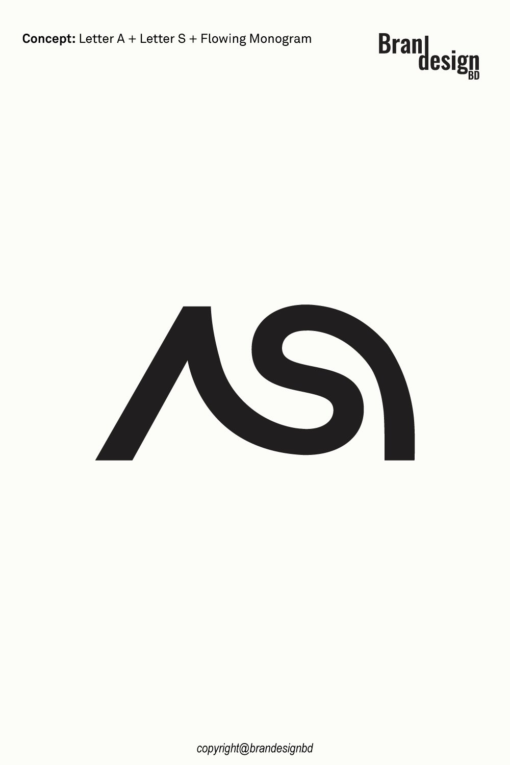
A memorable logo can transform two simple letters into a distinctive brand identity. The Modern AS Lettermark Custom Brand Logo Design Concept combines the letters A and S in a smooth, connected composition. Its clean lines and flowing curves create a modern visual mark that feels elegant, balanced, and professional.

The concept brings together the strong, angled structure of the letter A and the curved form of the letter S. The A provides a sense of stability and direction, while the S introduces movement and fluidity. By connecting these different letterforms, the design creates a unified monogram that is simple enough to recognize and distinctive enough to stand on its own.

This custom logo concept can work well for fashion labels, creative agencies, architecture studios, technology companies, consulting firms, luxury products, and personal brands. Its minimalist black-and-white appearance makes it adaptable for websites, business cards, packaging, product labels, social media, signage, and other branding applications.

The Concept Behind the AS Lettermark Logo

A successful lettermark begins with a clear typographic idea. Instead of displaying initials as ordinary text, this concept turns the letters A and S into one connected visual symbol.

The Letter A

A foundation of strength and structure

The letter A introduces a strong, angular element to the design. Its slanted form creates direction and provides a clear foundation for the overall composition.

In branding, this type of structure can suggest confidence, ambition, stability, and forward thinking. It can also represent the initial of a company name, founder’s name, product, or personal brand.

The simplified shape helps the letter remain recognizable without adding unnecessary details. This is especially useful for brands that want a clean and professional monogram.

The Letter S

A symbol of movement and continuity

The letter S adds a smooth, flowing quality to the logo. Its curved form contrasts with the sharper structure of the A, creating a visually interesting relationship between the two letters.

The S can represent a business name or another meaningful brand connection. Its curves also help soften the overall composition, giving the mark a more fluid and contemporary appearance.

This balance between straight lines and curved forms is a key feature of the design.

The Connected Monogram

Turning two initials into one visual identity

The main strength of the concept is the way the A and S work together as one symbol. The letters are not simply placed side by side; their forms create a connected visual composition.

This approach gives the monogram a distinctive silhouette that can be used independently of the full company name. It also creates flexibility for different branding situations, from compact digital icons to larger printed applications.

The Minimalist Design

Keeping the logo clean and memorable

The black-and-white presentation places the focus on the letterforms, proportions, and negative space. By avoiding unnecessary decoration, the design keeps its main idea clear.

A minimalist logo can also be easier to adapt to different backgrounds, production methods, and color systems. The final artwork should be tested at different sizes to make sure the connection between the letters remains clear.

Why Choose a Modern AS Lettermark Logo?

A professional logo should reflect a brand’s character while remaining practical and recognizable. The connected A and S monogram offers a balance of structure, movement, and simplicity.

A Modern and Elegant Appearance

Combining geometric lines with flowing curves

The angled A and curved S create contrast without making the composition feel disconnected. This combination gives the logo a contemporary appearance that can suit both creative and professional businesses.

The restrained design also allows the monogram to work alongside different typefaces, colors, and supporting brand graphics.

Strong Brand Recognition

Creating a distinctive visual signature

Initial-based logos can provide a direct connection between a symbol and a company’s name. When used consistently, an AS monogram can become a recognizable visual identifier for the brand.

The standalone mark can appear on product labels, social media profiles, websites, stationery, and packaging, while a complete logo can include the business name for additional clarity.

A Versatile Black-and-White Style

Supporting different branding applications

The monochrome design focuses attention on shape and contrast. It can work on light or dark backgrounds when suitable positive and reversed versions are prepared.

The artwork should be checked at reduced sizes to ensure that the narrow spaces and connected letterforms remain distinct.
Asking Price $500

For logo purchase or negotiation, please contact agency@brandesignbd.com

Logo Sale, Handover & NDA Information

All project handover agreements, ownership documentation, Non-Disclosure Agreement (NDA), and related communication will be handled through the email address provided above.
Once the logo is purchased, we will update the listing status to “Sold” and, upon request, add the buyer’s website or preferred address to the listing as confirmation of the sale. All necessary final files, ownership documentation, and agreed-upon project materials will be provided to the buyer after the purchase is completed.

Potential Applications for the Logo

The Modern AS Lettermark Custom Brand Logo Design Concept can be adapted for businesses across several industries. The most suitable application depends on the company’s name, audience, and brand positioning.

Fashion and Luxury Brands

Creating a refined brand signature

An AS monogram can suit clothing labels, accessories businesses, jewelry brands, premium lifestyle products, and selected luxury businesses.

The connected initials can provide a compact emblem for garment labels, hangtags, packaging boxes, shopping bags, product cards, and promotional materials.

The logo can also be paired with elegant typography to create a complete brand identity. For small product applications, the design should be tested to ensure that the connected letters remain recognizable.

Creative Agencies and Design Studios

Representing creativity and individuality

Creative businesses often need a distinctive mark that communicates their identity without relying on a detailed illustration.

The flowing S and angled A create an interesting balance that can suit design studios, branding agencies, photography businesses, and independent creative professionals.

The logo can be used on portfolio websites, project presentations, business cards, social media profiles, and branded documents.

Architecture and Interior Design

Connecting structure with visual harmony

The geometric form of the A can suggest structure, while the flowing S adds a more expressive element. This combination may suit architecture firms, interior designers, property businesses, and design consultancies.

The monogram can appear on project documents, presentation covers, signage, client materials, and websites. A clean wordmark can be added to create a complete professional identity.

Technology and Consulting Businesses

Communicating modern thinking

Technology companies and consulting firms often need a logo that looks professional across digital platforms and business materials.

The compact AS mark can provide a consistent identifier for software companies, digital service providers, consultants, and other businesses whose names connect with these initials.

The symbol can be used on websites, app interfaces, reports, presentations, proposals, and email signatures.

Personal and Corporate Brands

Building an identity around initials

The concept can also work for individuals and businesses whose names begin with A and S. A connected monogram can help create a recognizable personal brand or corporate symbol.

It may be suitable for professional portfolios, executive services, creative entrepreneurs, and companies looking for a simple initials-based identity.

Originality and Copyright Verification

Originality is an important part of professional logo development. A logo should not simply imitate an existing identity or use another company’s protected artwork.

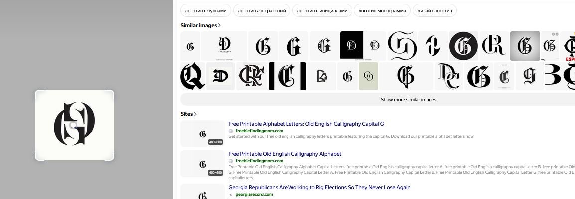
Yandex Image Search

Reviewing visual similarities

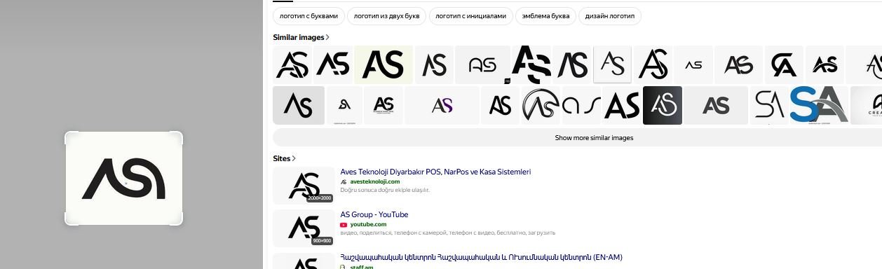
Yandex can be used as one part of a broader visual similarity review. Image search can help identify visually similar marks, concepts, or existing artwork that may appear online.

This type of search is useful during the design review process because it provides another opportunity to identify potential visual similarities before final delivery.
 AS Lettermark Custom Brand Logo Design Concept

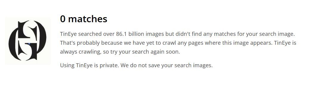
TinEye Reverse Image Search

Checking for matching or reused imagery

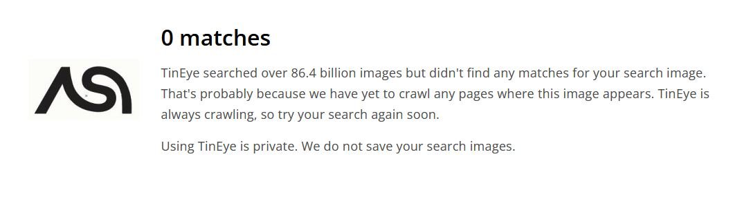
TinEye is another reverse-image search resource that can help investigate whether a similar image or graphic appears elsewhere online.

For logo development, reverse-image searches can support an originality review, particularly when the designer wants to check whether a visual element resembles existing online artwork.
AS Lettermark Custom Brand Logo Design Concept

Non-Disclosure and Logo Handover Agreement

Professional logo projects may involve confidential business information. A client may share a company name, product concept, launch plan, marketing strategy, packaging information, or other materials that are not yet publicly available.

Clear communication about confidentiality, ownership, and final deliverables can help establish expectations between the designer and buyer.

Non-Disclosure Agreement

Protecting confidential client information

A non-disclosure agreement, commonly called an NDA, can establish clear expectations regarding confidential information.

Depending on the agreement, the designer may be required to keep private materials confidential and avoid sharing unreleased brand information, business documents, product concepts, or other protected project details without permission.

An NDA should clearly define what information is confidential, how that information may be used, and what responsibilities apply after the project ends.

Logo Handover Agreement

Defining final ownership and deliverables

A logo handover agreement can clarify what the buyer receives after the purchase and completion of the project.

A professional handover may include the final logo files, editable vector artwork, approved variations, color versions, and other agreed project materials.

The agreement should also state when ownership or usage rights transfer to the buyer. Depending on the project terms, this may occur after final payment has been received.

Final File Delivery

Providing practical brand assets

A complete logo package may include formats such as AI, EPS, SVG, PDF, and high-resolution PNG files when these are included within the agreed scope.

Vector formats are particularly useful because they allow the logo to be resized for both small and large application.

Final Thoughts on the Modern AS Lettermark Logo

The Modern AS Lettermark Custom Brand Logo Design Concept combines the letters A and S into one flowing, minimalist symbol. The angled A provides structure, while the curved S introduces movement and balance.

This combination creates a distinctive monogram that can suit fashion labels, creative agencies, architecture firms, technology companies, consulting services, and personal brands. Its simple black-and-white style also makes it adaptable for websites, social media, business cards, packaging, signage, and other branding applications.

With properly prepared vector files and clear handover terms, the logo can provide a practical foundation for consistent brand communication across different platforms.

Before commercial use or trademark registration, buyers should complete appropriate visual and legal checks for their market. Image-search resources can support the design review, while formal legal questions may require professional guidance.

A successful lettermark should do more than combine two initials. It should create a recognizable visual signature that reflects the brand and remains useful as the business grows.

Also, check the recent article about the Creative Doorway and Ocean Wave Loop Logo Concept here

Read More
Interlocking-Double-G-Lettermark-Custom-Logo-Design

Interlocking Double G Lettermark Custom Logo Design

October 12, 2026
by badhan666@@ Graphic design

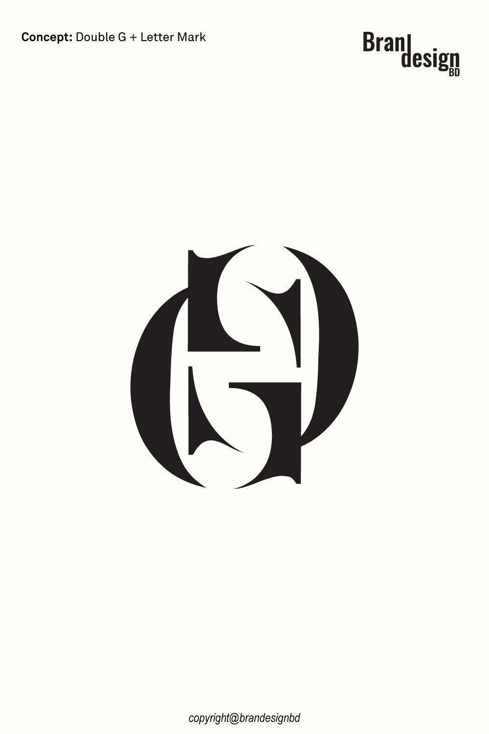
A memorable logo can turn two simple letters into a distinctive brand identity. The Interlocking Double G Lettermark Custom Logo Design explores the creative potential of combining two G letters into one unified symbol. Its interlocking structure creates a sense of connection, balance, and continuity while giving the logo a clean and professional appearance.

The concept uses two letter G forms that connect or overlap to create a single visual mark. Rather than displaying the initials as ordinary text, the interlocking arrangement allows the letters to work together as a custom monogram. This gives the design a distinctive character while keeping the focus on simple shapes, strong lines, and clear letterforms.

An interlocking Double G logo can suit fashion labels, luxury products, jewelry brands, corporate businesses, creative agencies, architecture studios, and personal brands. Its compact structure makes it suitable for websites, packaging, business cards, product labels, social media, and other branding applications. For businesses connected with the letter G, this concept offers a flexible foundation for a recognizable visual identity.

The Concept Behind the Interlocking Double G Logo

A successful lettermark begins with a clear typographic idea. This concept uses two matching letters to create a unified symbol instead of treating each letter as a separate element.

The Double G Monogram

Two letters forming one identity

The two G letters form the foundation of the logo. Their repetition creates visual harmony and gives the symbol a clear connection to the brand’s initials.

A custom monogram can use shared strokes, overlapping curves, mirrored forms, or carefully arranged letter shapes. The aim is to make the two letters feel connected while keeping the letter G recognizable.

This approach can work especially well for companies whose names, founders’ initials, or product lines are associated with the letter G.

The Interlocking Structure

Creating connection through letterforms

The key feature of this design is the way the two G letters interlock. Instead of appearing side by side, the letters connect to create a single, compact composition.

This structure can represent unity, partnership, continuity, and collaboration. It also gives the logo a stronger visual identity because the relationship between the letters becomes part of the design.

The precise arrangement of the letters can influence the personality of the finished mark, allowing it to feel elegant, geometric, bold, or contemporary.

The Combined Lettermark

Turning initials into a recognizable symbol

The main goal of the Double G concept is to transform two letters into one cohesive brand mark. A well-designed lettermark should feel complete when used alone, without always needing the full business name beside it.

The symbol can serve as a standalone brand emblem or be paired with a wordmark for a complete logo system. This flexibility helps businesses use the identity across different platforms while maintaining a consistent appearance.

Why Choose an Interlocking Double G Logo?

A custom monogram offers a practical way to build a brand identity around initials. The interlocking arrangement adds another layer of meaning while keeping the design focused and versatile.

A Modern and Elegant Appearance

Keeping the design clean and balanced

An interlocking Double G logo can combine simple geometry with smooth curves to create a refined appearance. Its visual strength comes from the relationship between the letters rather than from unnecessary decoration.

This style can suit businesses that want a professional identity that looks polished across different applications and remains flexible as the brand develops.

Strong Brand Recognition

Creating a distinctive visual signature

Two connected G letters can form a recognizable symbol that customers associate with a business over time. Consistent use across packaging, websites, documents, and promotional materials can help reinforce that visual connection.

The monogram can also be easier to place in small spaces than a longer company name, making it useful for labels, profile images, and product details.

Versatile Design Applications

Adapting the logo to different formats

The compact structure of an interlocking lettermark can work across both small and large applications. It can be used as a digital icon, printed emblem, packaging mark, or signage element.

The final artwork should be tested at different sizes to ensure that the overlapping letters and interior gaps remain clear.

Asking Price $500

For logo purchase or negotiation, please contact support@brandesignbd.com.

Logo Sale, Handover & NDA Information

All project handover agreements, ownership documentation, Non-Disclosure Agreement (NDA), and related communication will be handled through the email address provided above.
Once the logo is purchased, we will update the listing status to “Sold” and, upon request, add the buyer’s website or preferred address to the listing as confirmation of the sale. All necessary final files, ownership documentation, and agreed-upon project materials will be provided to the buyer after the purchase is completed.

Potential Applications for the Logo

The Interlocking Double G Lettermark Custom Logo Design can suit businesses that value a clean, recognizable, and professional visual identity. Its best application will depend on the brand’s name, industry, target audience, and positioning.

Fashion and Luxury Brands

Creating a refined brand emblem

Interlocking monograms are commonly suited to visual identities that emphasize elegance and presentation. A Double G logo can work for clothing labels, jewelry businesses, accessories, premium lifestyle products, and selected luxury brands.

The symbol can be applied to garment labels, product tags, packaging boxes, shopping bags, and promotional materials. A carefully developed monogram can provide a consistent visual element across different product lines.

Corporate and Consulting Businesses

Representing a professional identity

The Double G lettermark can work for companies whose names or founders’ initials connect with G. Its structured form can support an identity for consulting firms, corporate services, property businesses, and professional organizations.

The monogram can be paired with a company name to create a complete logo for business cards, presentations, reports, letterheads, and websites.

Jewelry and Accessories

Supporting a distinctive product identity

Jewelry and accessory brands often need compact symbols that look clear on small surfaces. An interlocking Double G mark can be adapted for jewelry packaging, product cards, tags, pouches, boxes, and other branded materials.

For engraving or small-scale production, the logo may need simplified details to preserve the clarity of the letterforms.

Architecture and Interior Design

Connecting geometry with creative thinking

The structured nature of an interlocking monogram can also suit architecture studios, interior designers, property developers, and design consultancies.

The logo can appear on project documents, presentation covers, signage, websites, and client materials. Its simple structure allows it to work alongside different brand colors and typography styles.

Creative Agencies and Personal Brands

Building a recognizable monogram

Creative professionals and personal brands can use a Double G logo to establish a distinctive identity based on their initials or business name.

The standalone mark can be used on portfolio websites, social media, watermarks, stationery, and promotional materials. It can also be paired with a full name when greater clarity is needed.

Originality and Copyright Verification

Originality is an important part of professional logo development. A logo should not simply imitate an existing identity or use another company’s protected artwork.

Yandex Image Search

Reviewing visual similarities

Yandex can be used as one part of a broader visual similarity review. Image search can help identify visually similar marks, concepts, or existing artwork that may appear online.

This type of search is useful during the design review process because it provides another opportunity to identify potential visual similarities before final delivery.

TinEye Reverse Image Search

Checking for matching or reused imagery

TinEye is another reverse-image search resource that can help investigate whether a similar image or graphic appears elsewhere online.

For logo development, reverse-image searches can support an originality review, particularly when the designer wants to check whether a visual element resembles existing online artwork.

Non-Disclosure and Logo Handover Agreement

Professional logo projects may involve confidential business information. A client may share a company name, product concept, launch plan, marketing strategy, packaging information, or other materials that are not yet publicly available.

Clear communication about confidentiality, ownership, and final deliverables can help establish expectations between the designer and buyer.

Non-Disclosure Agreement

Protecting confidential client information

A non-disclosure agreement, commonly called an NDA, can establish clear expectations regarding confidential information.

Depending on the agreement, the designer may be required to keep private materials confidential and avoid sharing unreleased brand information, business documents, product concepts, or other protected project details without permission.

An NDA should clearly define what information is confidential, how that information may be used, and what responsibilities apply after the project ends.

Logo Handover Agreement

Defining final ownership and deliverables

A logo handover agreement can clarify what the buyer receives after the purchase and completion of the project.

A professional handover may include the final logo files, editable vector artwork, approved variations, color versions, and other agreed project materials.

The agreement should also state when ownership or usage rights transfer to the buyer. Depending on the project terms, this may occur after final payment has been received.

Final File Delivery

Providing practical brand assets

A complete logo package may include formats such as AI, EPS, SVG, PDF, and high-resolution PNG files when these are included within the agreed scope.

Vector formats are particularly useful because they allow the logo to be resized for both small and large application.

Final Thoughts on the Interlocking Double G Lettermark Logo

The Interlocking Double G Lettermark Custom Logo Design transforms two matching letters into a unified visual identity. Its connected structure creates a sense of balance and continuity while giving the brand a clear and recognizable symbol.

From fashion and jewelry labels to corporate businesses, creative agencies, architecture studios, and personal brands, the Double G monogram can provide a flexible foundation for a professional identity.

Its compact form makes it suitable for websites, social media, business cards, packaging, stationery, signage, and merchandise. With properly prepared vector files and clear handover terms, the artwork can be adapted for a broad range of practical applications.

Before commercial use or trademark registration, buyers should complete the appropriate originality and trademark checks. Image searches can help identify possible similarities, while legal questions may require professional guidance.

A successful lettermark should do more than combine two initials. It should create a consistent visual signature that reflects the brand and remains useful as the business grows.

Also, check the recent article about the Creative Doorway and Ocean Wave Loop Logo Concept here

Read More

Search

Untitled-1-01Untitled-1-01

brandesignbd

Graphic Design Service Provider

Visit Link

  • Privacy Policy
  • Terms and condition

Company

  • Home
  • Our Services
  • portfolio
  • Contact Us

Contact

  • support@brandesignbd.com
  • brandesignbd27@gmail.com

Address

Narayanganj,

Dhaka, Bangladesh

1400

Linkedin-in Pinterest Facebook-f Instagram Behance
Copyright ©brandesignbd. All Rights Reserved.
Shopping Basket