A flat lay image of a keyboard, mouse, and other design tools with the text BEST KEYBOARD AND MOUSE COMBINATION FOR GRAPHIC DESIGNER overlayed.

Best Keyboard and Mouse Combination for Graphic Designer

A flat lay image of a keyboard, mouse, and other design tools with the text BEST KEYBOARD AND MOUSE COMBINATION FOR GRAPHIC DESIGNER overlayed.
Discover the ideal keyboard and mouse for your design work.

Table of Contents

Introduction

As a graphic designer, having the right tools is essential for efficiency, comfort, and precision. While high-end software and monitors often get the spotlight, the keyboard and mouse combo you use daily plays an equally critical role. A poorly designed keyboard can strain your wrists, while an unresponsive mouse can slow down your workflow and affect accuracy in detailed design work. Choosing a reliable keyboard and mouse combination ensures seamless navigation, enhanced productivity, and long hours of comfortable work. In this guide, we explore some of the best wireless options that combine ergonomics, performance, and style—perfect for designers at every level.

Why the Right Keyboard and Mouse Matter for Graphic Designers

Before exploring specific recommendations, it’s important to understand why choosing the right Keyboard and Mouse can transform a graphic designer’s workflow.

Enhances comfort during long design sessions
Spending hours working on intricate design projects means your hands, wrists, and shoulders are constantly in use. The right ergonomic tools can minimize strain and prevent repetitive stress injuries.

Boosts precision and control
Graphic design often involves pixel-perfect adjustments. A responsive mouse and a stable, well-designed keyboard can improve accuracy when editing images or manipulating shapes.

Improves workflow efficiency
Shortcut keys, customizable buttons, and adjustable sensitivity settings help you work faster, allowing you to focus more on creativity than navigation.

Key Features to Look for in a Keyboard for Graphic Design

A keyboard is more than just a typing tool—it’s a creative instrument for designers who rely on shortcuts and smooth key response.

Ergonomic layout
A split or curved keyboard can reduce strain, especially during extended work periods.

Mechanical or scissor switches
Mechanical keyboards offer tactile feedback, while scissor switches provide quiet and smooth keystrokes—both beneficial depending on preference.

Programmable keys
Dedicated keys for custom shortcuts can save significant time in applications like Photoshop, Illustrator, or Figma.

Backlighting
Backlit keys improve visibility in low-light work environments and add a professional aesthetic to your workspace.

Build quality
Durable materials, such as aluminum frames and high-quality keycaps, ensure longevity for heavy daily use.

Key Features to Look for in a Mouse for Graphic Design

Transitional: If a keyboard is your main input tool, a mouse is your precision instrument—especially in graphic editing.

Adjustable DPI
Being able to switch sensitivity helps when moving between detailed editing and broader navigation.

Ergonomic shape
A well-contoured mouse supports your hand’s natural position, reducing fatigue.

Programmable buttons
Extra buttons allow quick access to commands like zoom, undo, or switching tools.

High polling rate
A high polling rate ensures faster response times and smoother cursor movement.

Wireless or wired options
Wireless mice reduce desk clutter, while wired models avoid latency and battery concerns.

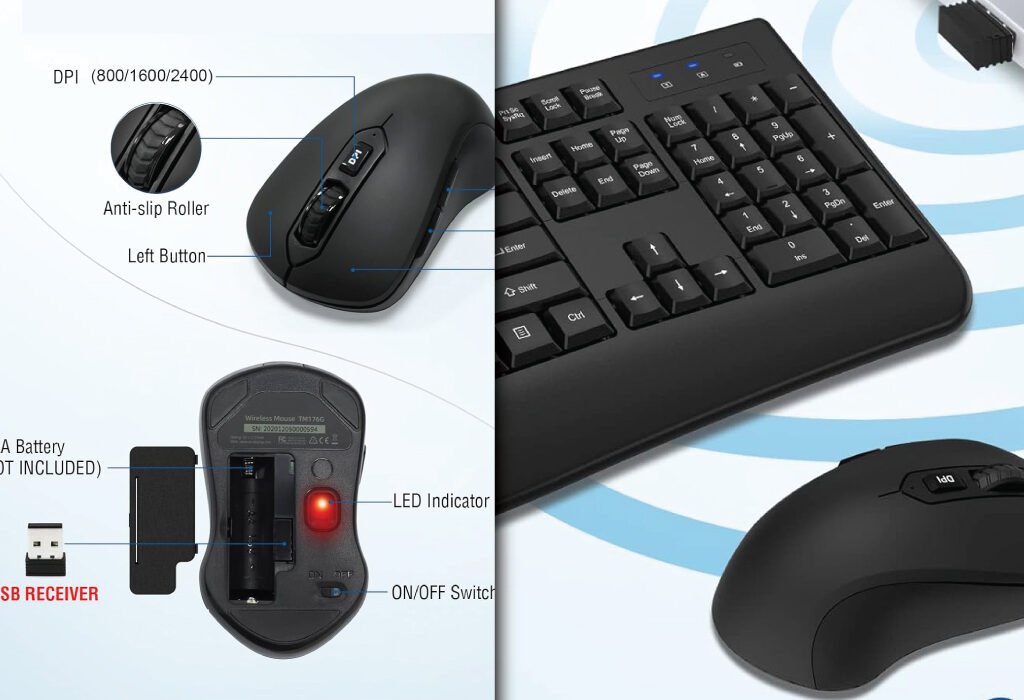
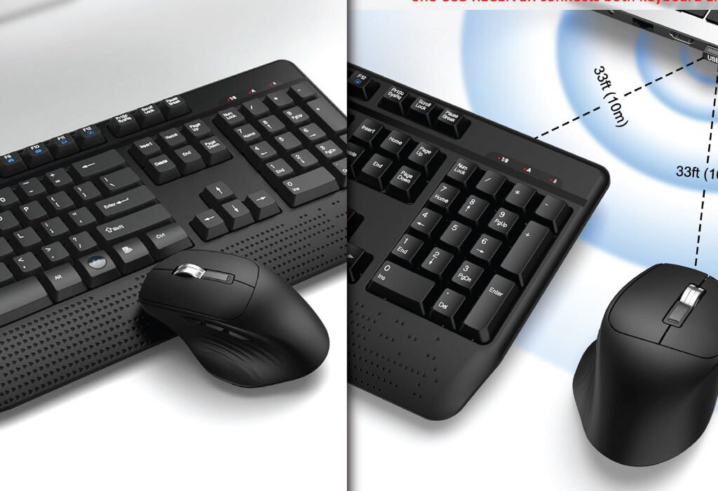
BEST OPTION :Wireless Keyboard and Mouse Combo – Full-Sized 2.4GHz Wireless Keyboard with Comfortable Palm Rest and Optical Wireless Mouse – Compatible with Windows, Mac OS, PC, Desktops, Computers, and Laptops

1. Black

Upgrade your workspace with this Black Wireless Keyboard and Mouse Combo. Designed for comfort and productivity, the full-sized keyboard features an ergonomic palm rest and folding holder to reduce wrist strain. The optical mouse provides smooth, accurate tracking with a symmetrical design for both right- and left-handed users. With a 2.4GHz stable wireless connection and plug-and-play USB receiver, you can work seamlessly up to 33 feet away. Perfect for home or office use

A detailed image of a black wireless keyboard and mouse combination, highlighting features like adjustable DPI, anti-slip roller, USB receiver, and battery compartment.
A sleek and functional wireless keyboard and mouse set.
FeatureDetails
ColorBlack
Price$17.50
Keyboard FeaturesFull-sized, ergonomic with palm rest and folding holder
Mouse FeaturesOptical wireless, symmetrical design, smooth movement
Connectivity2.4GHz wireless, shared USB receiver, plug & play
CompatibilityWindows XP/Vista/7/8/10/X, Mac, desktops, laptops, Chromebooks
Special FeaturesAuto power-saving, ergonomic, wrist protection
Battery RequirementsKeyboard: 2 × AAA, Mouse: 1 × AA (not included)
DPI Levels800 / 1600 / 2400
Warranty12 months
ProsAffordable, lightweight, ergonomic wrist support, stable wireless connection
RecommendationIdeal for entry-level designers or home use who need a reliable, budget-friendly combo.

2. Carbon Black

The Carbon Black Wireless Keyboard and Mouse Combo is built for productivity. Full-size keyboard with ergonomic wrist rest and 12 shortcut keys enhances efficiency, while the low-profile mouse offers quiet, precise clicks. A single 2.4GHz USB receiver supports both devices, providing a reliable wireless connection up to 33 feet. Ideal for designers needing shortcut keys and long typing comfort.

A detailed infographic of a black ergonomic keyboard and a six-button silent mouse, highlighting features, dimensions, and ergonomic design.
A quiet and comfortable keyboard and mouse combination for enhanced productivity.
FeatureDetails
ColorCarbon Black
Price$21.59
Keyboard FeaturesFull-size, ergonomic wrist rest, adjustable tilt feet, 12 shortcut keys, 7 multimedia keys
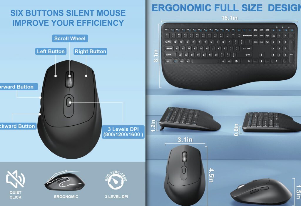
Mouse FeaturesContoured design, clicky but 95% quieter, forward/backward buttons
Connectivity2.4GHz wireless, single USB receiver
CompatibilityWindows XP/Vista/7/8/10/X, Mac, desktops, laptops, Chromebooks
Special FeaturesAuto power-saving (15 min keyboard, 10 min mouse), low-profile scissor keys
Battery RequirementsKeyboard: 2 × AAA, Mouse: 1 × AA (not included)
DPI Levels800 / 1600 / 2400
Warranty24 months
ProsMultimedia keys for productivity, ergonomic wrist rest, quiet typing, adjustable tilt
RecommendationPerfect for designers who need extra shortcuts and quiet typing for long work sessions.

3. Dark Gray

Experience precision and comfort with the Dark Gray Wireless Keyboard and Mouse Combo. This full-size keyboard comes with 12 multimedia hotkeys and an ergonomic wrist rest, while the optical mouse offers adjustable DPI (1000/1200/1600) for smooth and accurate cursor control. The 2.4GHz wireless connection ensures reliable performance up to 33 feet. Ideal for professional designers seeking both efficiency and comfort.

A split-screen image showing a dark grey wireless keyboard and mouse combination from two different angles, highlighting its ergonomic design and long-range connectivity with a single USB receiver.
A sleek and efficient dark grey wireless setup for your workspace.
FeatureDetails
ColorDark Gray
Price$33.99
Keyboard FeaturesFull-size, wrist rest, adjustable tilt legs, 12 multimedia hotkeys
Mouse FeaturesOptical mouse with adjustable DPI (1000/1200/1600), forward/backward buttons
Connectivity2.4GHz wireless, single USB receiver
CompatibilityWindows XP/Vista/7/8/10/11, Mac, desktops, laptops, Chromebooks
Special FeaturesAuto power-saving (30 min keyboard, 10 min mouse)
Battery RequirementsKeyboard: 2 × AAA, Mouse: 1 × AA (not included)
DPI Levels1000 / 1200 / 1600
Warranty12 months
ProsAdjustable DPI for precise control, multimedia hotkeys, ergonomic design
RecommendationRecommended for professional designers who need precise mouse control and shortcut keys.

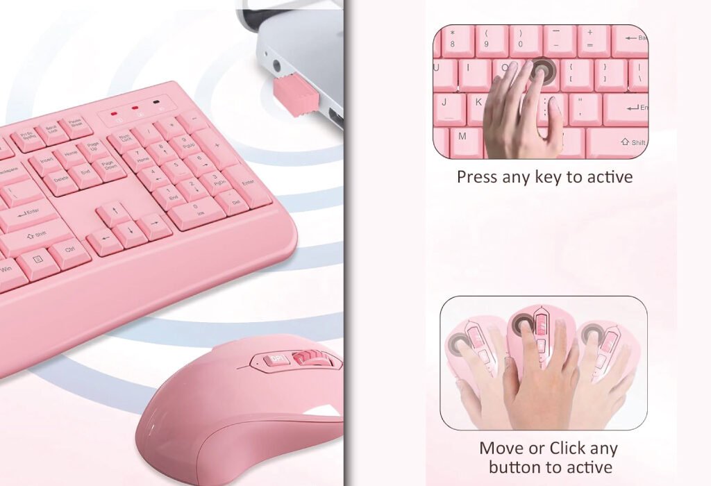
4.Full Pink (Women’s Best Choice)

Add style and comfort to your workspace with the Full Pink Wireless Keyboard and Mouse Combo. Ergonomic keyboard with palm rest protects wrists, while the optical mouse provides smooth movement for both hands. The shared 2.4GHz USB receiver offers stable wireless performance up to 33 feet. Perfect for designers who want both functionality and a visually appealing setup

A pink wireless keyboard and mouse combination with a small USB receiver plugged into a laptop, with two additional panels showing how to activate the devices by pressing a key or clicking a button.
A stylish and functional pink wireless keyboard and mouse set.
FeatureDetails
ColorFull Pink
Price$24.00
Keyboard FeaturesFull-size, palm rest, folding holder
Mouse FeaturesOptical wireless, symmetrical design, smooth movement
Connectivity2.4GHz wireless, shared USB receiver
CompatibilityWindows XP/Vista/7/8/10/X, Mac, desktops, laptops, Chromebooks
Special FeaturesAuto power-saving, ergonomic, wrist protection
Battery RequirementsKeyboard: 2 × AAA, Mouse: 1 × AA (not included)
DPI Levels800 / 1600 / 2400
Warranty12 months
ProsStylish color, ergonomic wrist support, reliable wireless connection
RecommendationGreat for designers who want a visually appealing setup without sacrificing comfort.
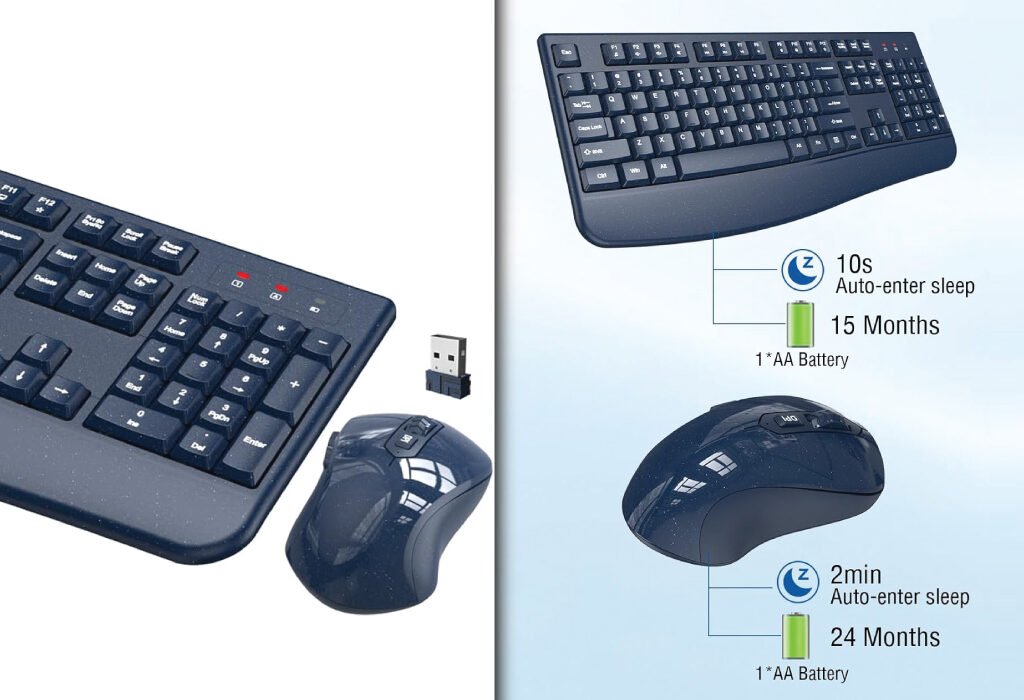
5.Starry Blue

The Starry Blue Wireless Keyboard and Mouse Combo combines comfort, style, and reliability. The full-size keyboard with palm rest reduces wrist fatigue, while the optical mouse ensures smooth, accurate tracking. The 2.4GHz wireless connection with shared USB receiver delivers seamless performance up to 33 feet. Ideal for designers who want a standout color along with ergonomic support.

A dark grey wireless keyboard and mouse set shown in a split-screen image, with an infographic highlighting a long battery life, a USB receiver, and auto-sleep features.
A reliable and long-lasting wireless keyboard and mouse combo.
FeatureDetails
ColorStarry Blue
Price$35.99
Keyboard FeaturesFull-size, palm rest, folding holder
Mouse FeaturesOptical wireless, symmetrical design, smooth movement
Connectivity2.4GHz wireless, shared USB receiver
CompatibilityWindows XP/Vista/7/8/10/X, Mac, desktops, laptops, Chromebooks
Special FeaturesAuto power-saving, ergonomic, wrist protection
Battery RequirementsKeyboard: 2 × AAA, Mouse: 1 × AA (not included)
DPI Levels800 / 1600 / 2400
Warranty12 months
ProsUnique color, ergonomic wrist support, reliable 2.4GHz connection
RecommendationIdeal for designers who want a premium, eye-catching setup with comfortable use.

Conclusion

Selecting the right keyboard and mouse combo can make a noticeable difference in your design workflow. From ergonomic palm rests and low-profile keys to adjustable DPI settings and stable wireless connections, the options outlined here cater to both comfort and performance. Whether you prefer a budget-friendly solution like the Black combo or a stylish, feature-rich choice like Starry Blue, investing in a quality keyboard and mouse setup ensures smoother, more productive design sessions. Prioritizing ergonomics, precision, and reliable connectivity will help you work efficiently while protecting your wrists during long creative hours.

Also, check the recent article about the best laptop for graphic design here.


Why do I need a special keyboard and mouse for graphic design?

Graphic design involves long hours of work and precise movements. A good keyboard and mouse combo reduces wrist strain, improves accuracy, and helps you work faster. Ergonomic features and adjustable mouse DPI make your workflow smoother.

What is DPI, and why does it matter for designers?

DPI stands for dots per inch. It measures mouse sensitivity. A higher DPI means the cursor moves faster. Designers often use adjustable DPI to control precision when editing images or drawing fine details.

Can a wireless keyboard and mouse be as reliable as a wired one?

Yes. Modern wireless devices use 2.4GHz connections that are fast and stable. You get freedom of movement without lag, which is perfect for both laptops and desktops.

How does an ergonomic keyboard help?

Ergonomic keyboards are designed to reduce wrist strain. Features like palm rests, low-profile keys, and adjustable tilt help you type comfortably for long sessions without pain.

Are these keyboards and mice compatible with all computers?

Most combos work with Windows, Mac, Chromebooks, and PCs. Check the product description for any specific system requirements. The included USB receiver makes setup easy—just plug and play.

How long do the batteries last?

Many models include an auto power-saving feature. The keyboard and mouse go to sleep after inactivity to save battery. Depending on usage, batteries can last several months.

Is setup difficult for beginners?

Not at all. These combos are plug-and-play. Insert the USB receiver into your computer, and you’re ready to go—no extra software is needed.

A visual guide showing 10 Logo Presentation Mockup PSDs Every Graphic Designer Needs with examples of different logo mockups.

10 Logo Presentation Mockup PSDs Every Graphic Designer Needs

A visual guide showing 10 Logo Presentation Mockup PSDs Every Graphic Designer Needs with examples of different logo mockups.
Elevate your logo designs with these essential mockup PSDs.

Table of Contents

Why Use Logo Presentation Mockup PSDs?

Transitional: Before we dive into specific mockups, let’s explore why designers love Logo presentation Mockup PSDs and what makes them indispensable.

Logo presentation mockups let designers:

  • Visualize branding in context — from metallic foil on paper to industrial wall displays.
  • Save time — edit smart object layers instead of building scenes from scratch.
  • Impress clients with clean, professional visuals that feel real.

These mockups give logos depth, style, and room to breathe—essential for portfolio pieces, social media, pitch decks, and more. Now, here are the 10 must-have mockup types.

Modern 3D Logo Wall Display Mockup

Starting strong with a crowd-pleaser—the Modern 3D Logo Wall Display.

Features of this mockup

  • Hyper-realistic 3D depth and shadow
  • Wall texture that adds authenticity
  • Smart objects for easy logo placement

Why it matters
Perfect for showcasing tech brands, startups, or interior design logos. The depth engages viewers and highlights how your design interacts with space.

Technology Logo Mockup PSD

From 3D walls to sleek and metallic designs.

Key highlights

  • Metallic finish ideal for tech brand identities
  • Clean background to keep the focus on your logo
  • Professional-grade lighting effects

Ideal use cases
Use this template for electronic brands, IT services, or app startups. It adds a high-tech polish, positioning logos as cutting-edge.

Engineering and Infrastructure Logo Mockup PSD

Up next: designs built for heavy-duty industries.

Mockup details

  • Industrial aesthetic with concrete or steel textures
  • Rugged shadows and realistic material depth
  • Adjustable layers to personalize hardness

When to use it
Ideal for architects, construction firms, and engineering consultants. It reinforces strength, precision, and technical skill.

A blank, four-panel collage featuring different textures and tones, often used as a background for a Logo Presentation Mockup PSD.
Discover diverse textures and lighting for your mockup needs.

Construction Logo Mockup PSD

Related to engineering but tailored for construction aesthetics.

Core qualities

  • Hard hat, machinery, or blueprint-inspired settings
  • Texture-rich backgrounds like steel or brick
  • Large-scale logo display—great visibility

Perfect contexts
Use this mockup when pitching to contractors or real estate developers. Its gritty realism reflects workmanship and stability.

Metallic Foil Logo Mockup on White Textured Paper

Shifting focus from industrial grit to high-end paper branding.

Highlights

  • Elegant metallic foil effect
  • Subtle paper grain texture
  • Natural light for a luxe finish

Best use scenarios
Ideal for boutique brands—think wedding planners, luxury goods, and craft businesses. Adds tactile sophistication and upscale feel.

Metallic Logo Mockup (Various Styles)

From paper foils to versatile metallic options.

Mockup features

  • Versatile finishes: gold, silver, bronze
  • Clean backgrounds, glossy or matte options
  • Editable smart object layers

Design scenarios
Great for packaging labels, corporate identity, and premium product launches. Metallic sheen adds perceived value.

A four-panel abstract collage with various textures, including a dark gray surface, a white textured paper corner, a light gray line drawing of scaffolding, and a dark blue blurred background, used for a Logo Presentation Mockup PSD.
Find the perfect backdrop for your logo designs.

Office Interior Logo Mockup PSD

Let’s bring logos into real-world office settings.

What to expect

  • Boardroom walls or reception areas
  • Natural and artificial ambient lighting
  • Portable signboards or mounted logo plaques

Why it’s great
This mockup shows how a logo lives in a workspace—excellent for corporate clients, co-working spaces, or professional service brands.

Additional Logo Presentation Mockup PSDs You Can’t Miss

Transitional: Here are a few more versatile mockups that belong in every designer’s toolkit.

3D Floating Logo Mockup

  • Soft shadows and floating effect
  • Neutral studio lighting
  • Flexible color and background controls

Minimal Embossed Logo Mockup

  • Embossed effect on paper or cardstock
  • Elegant and understated design
  • Works well for letterhead or business cards

App Icon-style Logo Mockup

  • Rounded square or circular presentation
  • Screen glare and device reflection
  • Perfect for app or digital brands

How to Choose the Right Logo Presentation Mockup PSDs

With these types in your toolkit, selecting the right one matters most.

Match mockup to brand personality

  • Industrial → engineering, construction
  • Luxe metallic → premium goods
  • Office interior → corporate services
  • Minimal emboss → stationery, subtle elegance

Consider the presentation medium

  • Web portfolio/social posts → brighter, glossy mockups
  • Print → textured paper and embossing
  • Proposals → professional interior or wall-mounted scenes

Check file quality

  • Full smart-object functionality
  • High resolution (3000 × 2000+ px)
  • Organized layers and documentation

Tips for Working with Logo Presentation Mockup PSDs

To make your mockups shine, keep these tips in mind:

1. Name and organize your assets
Clear layer names avoid confusion when working with multiple mockups.

2. Match your logo’s perspective and lighting
Adjust shadows and highlights to blend seamlessly.

3. Tweak colors and textures
Subtle changes in foil, wall color, or background can dramatically shift mood.

4. Add ambient shadows
Let logos ‘sit’ in scenes—drop shadows or ground reflections lend realism.

5. Export correctly
For web: export at 72 dpi RGB JPEG/PNG. For print: use 300 dpi CMYK TIFF or high-quality PDF.

Conclusion

By integrating these top 10 Logo presentation Mockup PSDs—ranging from 3D walls to metallic foils—you’ll elevate every logo presentation. They add realism, polish, and context to help both you and your clients visualize the final brand and make an emotional connection. Matching mockup style to brand personality and medium ensures each presentation feels intentional and professional.

Adopting smart templates also speeds up your workflow, freeing time to focus on creativity and client needs. So regularly expand your collection, label layers smartly, and don’t be afraid to customize each mockup for maximum impact.

Also, check the recent article about the best laptop for graphic design here.


What is a Logo presentation Mockup PSD?

A Logo presentation Mockup PSD is a Photoshop file that allows you to insert your logo design into a realistic or stylized scene. It uses smart object layers so you can replace placeholder graphics with your own artwork in seconds. This helps designers present their work in professional, context-rich settings without having to build scenes from scratch.A four-panel abstract collage with various textures, including a dark gray surface, a white textured paper corner, a light gray line drawing of scaffolding, and a dark blue blurred background, used for a Logo Presentation Mockup PSD.

Why should I use Logo presentation Mockup PSDs instead of plain logo images?

Mockups add depth, texture, and realism to a logo presentation. They show how your design might look on paper, walls, packaging, or even in a corporate office space. This makes your portfolio more appealing and gives clients a better understanding of how their branding will appear in the real world.

Do Logo presentation Mockup PSDs require advanced Photoshop skills?

Not at all. Most mockups are designed for easy use, even for beginners. You simply open the PSD file in Photoshop, locate the smart object layer, insert your logo, save, and watch it update automatically within the mockup scene.

Can I customize the backgrounds and textures in a mockup?

Yes, most high-quality Logo presentation Mockup PSDs offer editable background layers. You can change colors, textures, and lighting effects to better match the brand identity you’re showcasing.

What resolution should I look for in a Logo presentation Mockup PSD?

For professional results, choose PSDs with a resolution of at least 3000 × 2000 pixels. This ensures your presentation looks sharp both online and in print.

Can I use the same mockup for different clients?

Yes, but it’s best to customize colors, lighting, and backgrounds each time. This keeps presentations unique and prevents your work from looking repetitive.

Where can I find high-quality Logo presentation Mockup PSDs?

Websites like PSD Free Mockup offer a variety of professional-grade mockups, free for use. These are curated for quality, ease of use, and creative versatility.

An office desk with a pile of documents, a pen, and text overlay that reads WHICH IS MORE COST-EFFECTIVE FOR TEAMS: A FIGMA SUBSCRIPTION OR ADOBE CREATIVE CLOUD? There are also colorful shapes and a partial Adobe Creative Cloud logo in the background.

Which Is More Cost-Effective for Teams: A Figma Subscription or Adobe Creative Cloud?

An office desk with a pile of documents, a pen, and text overlay that reads WHICH IS MORE COST-EFFECTIVE FOR TEAMS: A FIGMA SUBSCRIPTION OR ADOBE CREATIVE CLOUD? There are also colorful shapes and a partial Adobe Creative Cloud logo in the background.
Compare the cost-effectiveness of a Figma subscription versus an Adobe Creative Cloud subscription for design teams.

Explore a detailed comparison of Figma subscriptions and Adobe Creative Cloud for teams. Understand features, pricing, collaboration tools, and overall value

Introduction

Choosing the right design software for a team can significantly affect productivity, creativity, and budget management. Two popular options in the design industry are Figma and Adobe Creative Cloud. Both platforms offer powerful tools but differ in pricing models, features, and collaboration capabilities.

This blog post compares Figma subscription or Adobe Creative Cloud to help teams decide which service is more cost-effective based on their unique needs. By examining pricing plans, collaboration features, integrations, and scalability, you’ll gain clarity on which platform provides the best value for your team’s investment.

Understanding Figma Subscription for Teams

Verified site: Figma

Pricing Structure of Figma

Figma offers tiered pricing plans, including a free version with basic tools and paid subscriptions for professional and organizational use. Team plans are priced per editor per month, with discounts for annual billing. The pricing is straightforward, focusing on design collaboration with unlimited cloud storage.

Collaboration Features in Figma

One of Figma’s standout features is real-time collaboration. Multiple team members can design, prototype, and comment simultaneously within the browser or desktop app. This eliminates version control issues and speeds up feedback loops.

Platform Accessibility

Figma operates primarily through the web, allowing users on different operating systems (Windows, macOS, Linux) to access the same design files seamlessly. This cross-platform flexibility is a major advantage for distributed teams.

Feature/AspectDetails
Pricing (Annual)$660/year (Full Seat: $55.00/month billed annually)
Free PlanYes — limited projects, features, and version history
Primary FocusUI/UX design, prototyping, collaborative web/app design
Platform AccessWeb-based (Windows, macOS, Linux)
Offline CapabilityLimited — primarily online use
CollaborationReal-time multi-user collaboration and commenting
Cloud StorageUnlimited cloud storage
Ease of LearningBeginner-friendly, intuitive
IntegrationSlack, Jira, GitHub, and project management tools
Best ForIndividual UI/UX designers and freelancers needing collaboration tools

Exclusive Business Features

  • Centralized Admin Controls – Manage users, assign seats, and control access across multiple teams from a single, intuitive admin dashboard.
  • Role-Based Seats – Choose from Collab Seats, Dev Seats, and Full Seats to allocate the right tools and permissions for each team member.
  • Advanced Security & Compliance – Includes features like SSO (Single Sign-On), audit logs, and granular permissions to meet enterprise security standards.
  • Organization-Wide Design Systems – Maintain brand consistency with shared libraries and component governance across the company.
  • Version Control & Audit Trails – Access detailed edit history to track design changes and roll back if needed.

Included Collaboration & Integration Tools

  • Real-Time Coediting – Multiple team members can work on the same file simultaneously with instant updates.
  • Cross-Platform Access – Work seamlessly on Windows, macOS, Linux, and directly in the browser.
  • Developer Handoff Tools – Allow developers to inspect designs, export assets, and access specs without disrupting the design flow.
  • Integrated Plugins & Widgets – Extend functionality with a growing marketplace of third-party tools.
  • Unlimited Cloud Storage – Keep all design files, prototypes, and assets accessible from anywhere.
A graphic comparing Figma and Adobe Creative Cloud with a cost-effectiveness icon in the center. The image features the Figma logo on the left, an orange square with an icon representing cost or subscription in the middle, and the Adobe Creative Cloud logo on the right. The text reads Figma Subscription and Adobe Creative Cloud.
A visual comparison of a Figma subscription and Adobe Creative Cloud subscription for design teams.

Adobe Creative Cloud Subscription for Teams

Verified site: Adobe Creative Cloud

Pricing and Plans for Teams

Adobe Creative Cloud offers several plans, including individual app subscriptions and a full suite plan that includes Photoshop, Illustrator, Premiere Pro, and more. Team plans typically include volume licensing with centralized administration, priced per user per month.

Features and Tools Included

Adobe Creative Cloud provides a comprehensive set of creative tools for design, video editing, web development, and more. The suite offers desktop applications with powerful capabilities, offline access, and integration across apps.

Collaboration Capabilities

While Adobe has enhanced collaboration through cloud documents and Adobe Creative Cloud Libraries, real-time multi-user editing is limited compared to Figma. Adobe relies more on version control and file sharing workflows.

Feature/AspectDetails
Pricing (Annual)All Apps: $1199/year ($99.99/month)
Free PlanNo free plan; 7-day trial available
Primary FocusComprehensive creative suite for photo, video, illustration, and design
Platform AccessDesktop apps (Windows, macOS)
Offline CapabilityFull offline use
CollaborationCloud syncing; limited real-time collaboration
Cloud Storage1TB with All Apps
Ease of LearningSteeper learning curve, professional-grade tools
IntegrationAdobe Fonts, Adobe Stock, Behance, and full Adobe ecosystem
Best ForProfessionals requiring a broad range of design, editing, and media tools

Exclusive Business Features

  • Admin Console for License Management – Centralized control for adding, reassigning, and managing team licenses, making scaling simple and efficient.
  • Advanced 24/7 Technical Support – Around-the-clock assistance to resolve issues quickly, ensuring minimal downtime.
  • Two 1:1 Expert Sessions per User per Year – Personalized guidance from Adobe-certified experts to help users master tools or workflows.
  • 180-Day Version History – Access to an extended archive of file versions, providing peace of mind for projects that evolve over time.
  • Unlimited Job Posts via Adobe Talent – Connect with global creative talent by posting unlimited job opportunities through Adobe’s hiring platform.

Included Cloud Services

  • Unlimited Standard Creative AI Image Features – Harness AI-driven creativity for faster design generation without usage caps.
  • 4,000 Monthly Generative Credits – Access premium AI-powered video and audio creation tools.
  • Adobe Fonts – A vast library of high-quality, licensed fonts to elevate designs.
  • Step-by-Step Tutorials – Built-in learning resources to enhance skills at any level.
  • Behance – Showcase work and discover global creative inspiration.
  • Creative Cloud Libraries – Store, share, and access assets seamlessly across teams.
  • 1TB Cloud Storage – Secure, high-capacity cloud storage for easy access to projects anywhere.

By combining powerful creative applications with enterprise-level support and cloud capabilities, Adobe Creative Cloud Pro positions itself as a comprehensive solution for teams that require both flexibility and performance.

Figma Organization Plan vs. Adobe Creative Cloud Pro – Team Comparison

Feature / CriteriaFigma Organization PlanAdobe Creative Cloud Pro
Pricing ModelBilled annually, per seat typeAnnual commitment, billed monthly per license
Seat/Licensing TypesCollab Seat – $5/mo ($60/yr) Dev Seat – $25/mo ($300/yr) Full Seat – $55/mo ($660/yr)Standard Pro – $1199/year ($99.99/month) per license
Primary Use CaseUI/UX design, prototyping, collaborative design workflowsGraphic design, video editing, photography, digital art
CollaborationReal-time coediting, cross-platform browser accessCloud file sharing, version control, library syncing
Admin & SecurityCentralized admin console, role-based permissions, SSOAdmin Console, license management, enterprise security
Version HistoryUnlimited version history with detailed audit logs180-day version history
StorageUnlimited cloud storage1TB cloud storage per user
AI & AutomationPlugin marketplace, widgets, automation via APIGenerative AI for images, video, and audio (4000 credits/mo)
Extra PerksIntegrated developer handoff tools, shared design librariesUnlimited Adobe Talent job posts, Adobe Fonts, Behance
Learning SupportCommunity-driven resources, plugin documentationStep-by-step tutorials, 1:1 expert sessions
Best ForTeams focused on product design, development collaborationTeams needing diverse creative tools for multiple media formats

Comparing Cost-Effectiveness for Teams

Upfront and Recurring Costs

Figma’s subscription model is simpler and often less expensive for teams focused mainly on UI/UX and web design. Adobe’s full suite subscription is costlier but provides more diverse creative tools, which may be necessary depending on team requirements.

Impact on Productivity

Figma’s browser-based, real-time collaboration reduces delays and miscommunication, potentially increasing productivity. Adobe’s rich feature set suits teams requiring advanced image and video editing but may introduce complexity and steeper learning curves.

Scalability and Flexibility

Figma easily scales with team size due to its per-editor pricing and flexible access. Adobe Creative Cloud’s volume licensing supports large enterprises but might be more rigid for small or medium-sized teams.

Factors Beyond Pricing to Consider

Integration with Existing Workflows

Consider how each platform fits with your team’s existing software. Adobe integrates well with other Adobe apps and services, while Figma offers robust plugins and APIs for popular project management and development tools.

User Experience and Learning Curve

Figma’s interface is generally intuitive and designed for quick onboarding, especially for teams focused on design and prototyping. Adobe’s tools, while powerful, may require more training for less experienced users.

Customer Support and Community

Both platforms provide customer support and active communities. Adobe’s longer presence means extensive resources and tutorials, but Figma’s growing user base offers strong community support tailored to modern design workflows.

Making the Decision: Which Is Right for Your Team?

Deciding between a Figma subscription or Adobe Creative Cloud for your team can significantly impact your workflow efficiency and budget. Both platforms offer excellent tools but cater to different creative needs and team dynamics. Understanding these differences alongside updated pricing can help you make an informed choice that best fits your team’s requirements.

At $1,199 per year per license, Adobe Creative Cloud Pro Standard provides a comprehensive creative suite. This suite includes flagship apps like Photoshop, Illustrator, Premiere Pro, and After Effects, offering a robust toolkit for graphic design, video editing, photography, motion graphics, and more. For teams working across diverse media, Adobe’s all-encompassing approach supports nearly every creative project type. Along with powerful offline desktop applications, Adobe offers enterprise-grade features such as centralized license management, advanced 24/7 technical support, and access to Adobe Talent for unlimited job postings. The platform also includes cloud services with 1TB of storage per user and AI-powered creative tools, enabling innovation at scale.

Conversely, the Figma Organization Plan Full Seat costs $660 annually per user, nearly half the price of Adobe’s subscription. Figma shines in collaborative UI/UX design and prototyping, built around real-time coediting and browser-based accessibility. Its flexibility allows teams to assign different seat types—Collab, Dev, or Full—tailored to each member’s role, which can optimize costs further. Figma’s cloud-native design enables seamless remote collaboration, instant feedback loops, and easy developer handoffs, making it a top choice for product design teams focused on agility and streamlined workflows. Additionally, Figma includes unlimited cloud storage, robust version control, and enterprise-grade security features.

Cost-wise, Figma is more budget-friendly, especially for teams prioritizing design collaboration rather than a broad spectrum of creative tools. The difference in pricing becomes substantial when scaled across large teams. For example, a team of 10 full-seat users would spend $6,600 annually on Figma but $11,990 on Adobe Creative Cloud Pro.

However, price alone shouldn’t drive your decision. Consider the nature of your projects. If your team requires heavy-duty video editing, 3D animation, or print-ready graphic design, Adobe’s extensive app ecosystem is unmatched. On the other hand, if your workflow centers on interface design, prototyping, and cross-functional collaboration, Figma’s specialized tools and real-time collaboration capabilities offer distinct advantages.

Another factor is platform accessibility. Figma’s web-based platform works across Windows, macOS, and Linux without the need for software installation, supporting hybrid and remote teams effortlessly. Adobe relies on powerful desktop applications with offline functionality, suitable for users needing high-performance tools but potentially limiting flexibility for remote collaboration.

Conclusion

Ultimately, the choice between a Figma subscription or Adobe Creative Cloud depends on your team’s workflow, creative needs, and budget priorities. Many teams find value in using both, leveraging Figma for rapid design and prototyping while employing Adobe tools for final production and multimedia work.

Carefully analyze your team’s current and future project requirements, the percentage of users needing full design access, and collaboration style. This clarity will help you select the solution that maximizes productivity, creativity, and cost-effectiveness for your team’s success.

Also, check the recent article about the best laptop for graphic design here.


An office desk with a small fan, a laptop, and some books, with text overlay that reads COOLING & VENTILATION TIPS FOR LONG DESIGN WORK. The image is a thumbnail for an article.

Cooling & Ventilation Tips for Long Design Work Sessions

An office desk with a small fan, a laptop, and some books, with text overlay that reads COOLING & VENTILATION TIPS FOR LONG DESIGN WORK. The image is a thumbnail for an article.
Stay comfortable and productive during long design work sessions with these essential cooling and ventilation tips.

Table of Contents

Discover practical cooling & ventilation tips to keep your workspace comfortable and productive during long design work sessions. Learn how airflow, temperature control, and ergonomic adjustments can enhance your creativity and focus.

Introduction

Long design work sessions can be incredibly rewarding, but they often come with a hidden challenge—maintaining a comfortable and well-ventilated environment. Whether you’re crafting detailed illustrations, building intricate UI layouts, or editing high-resolution images, heat and poor air circulation can quickly sap your energy and hinder productivity.

The good news is that with the right approach to cooling and ventilation, you can keep your workspace fresh, your body comfortable, and your mind focused. This guide explores a range of cooling & ventilation tips tailored for designers, ensuring you work efficiently without feeling overheated or sluggish.

Understanding the Importance of Cooling & Ventilation for Designers

Why Comfort Matters in Creative Work

Design work requires sustained focus, precision, and creativity. When your environment is too warm or stuffy, your cognitive abilities decline, and even simple tasks start to feel difficult.

Studies show that working in excessively warm spaces can lead to slower reaction times and more mistakes. For designers working on client projects, this can affect output quality and deadlines.

Health Benefits of Proper Airflow

Good airflow not only prevents heat buildup but also reduces indoor pollutants, helping you avoid headaches, fatigue, and eye strain during long design sessions.

Assessing Your Workspace for Cooling Improvements

Identifying Heat Sources

Before improving cooling, pinpoint the sources of heat in your workspace. Computers, monitors, and desk lamps can contribute significantly to rising room temperature.

Evaluating Air Circulation

Check whether your room has natural airflow through windows or if it relies solely on mechanical ventilation. Poor circulation often leads to stale air and discomfort.

Measuring Room Temperature and Humidity

A small digital thermometer with a humidity reader can give you real-time insight into your workspace climate, helping you make targeted adjustments.

Effective Cooling & Ventilation Tips for Designers

Optimizing Airflow with Fans

Fans are among the most accessible and cost-effective ways to improve airflow in your workspace. A desk fan can create a steady stream of air to keep you comfortable during long hours without dramatically altering the room’s temperature. For best results, position your fan to circulate air across your workspace instead of aiming it directly at your face. This prevents issues like dry eyes or irritation. If your workspace is larger, consider a tower fan that can oscillate and move air more evenly across the room.

Using an Air Conditioner Wisely

An air conditioner can be a game changer for temperature control, but it’s important to set it wisely. Keeping the temperature between 22°C and 24°C creates a comfortable environment without making it too cold. Overcooling may lead to stiff fingers and hands, which is especially problematic for designers working with fine tools, styluses, or keyboards. Using the AC’s energy-saving mode can help maintain a steady temperature without sudden temperature swings.

Harnessing Natural Ventilation

Whenever possible, take advantage of natural ventilation. Opening windows for even short periods during cooler hours of the day can help refresh the air and reduce stuffiness. The most effective technique is cross-ventilation—opening two windows on opposite sides of the space so air can flow through naturally. This helps push stale air out and draw fresh air in, giving you a healthier work environment.

Layering Ventilation Methods

Relying on a single cooling method isn’t always enough. Combining tools—such as running a fan while keeping a window slightly open—can make a significant difference. This layered approach ensures both air movement and temperature control, which is essential during long work sessions when electronic devices are generating extra heat.

Considering Portable Cooling Solutions

If you work in a shared space or can’t make permanent changes, portable cooling units can be an excellent investment. Mini evaporative coolers or portable air conditioners allow you to target cooling right where you need it. Look for models with adjustable fan speeds and timers so you can adapt them to your work patterns.

Monitoring and Adjusting Regularly

Cooling and ventilation needs can change throughout the day as outside temperatures shift and your equipment generates heat. Make it a habit to check the room’s temperature and airflow periodically. Small, consistent adjustments will keep your workspace comfortable and your focus sharp throughout your design sessions.

Desk Setup Adjustments for Better Cooling

Minimizing Heat-Generating Equipment

Many design workspaces have multiple devices running at once—monitors, laptops, external drives, printers, and even decorative lighting. Each of these produces heat that can raise the overall room temperature. Whenever possible, turn off or unplug devices you’re not actively using. Switching to energy-efficient LED desk lamps and low-heat electronics can also make a noticeable difference in keeping the temperature comfortable.

Common Sources of Heat in a PC

  • High-performance CPUs and GPUs: These generate the most heat under heavy use.
  • Power supplies: Older or low-efficiency PSUs can produce a lot of heat.
  • Mechanical hard drives: They generate some heat but less than CPUs and GPUs.
  • Poor airflow and cable clutter: Blocked fans and cramped spaces trap heat inside the case.
A tidy and well-ventilated desk setup for a designer, featuring a mesh office chair, a monitor displaying an illuminated PC case, a keyboard, a mouse on a pad, a speaker, a desk lamp, and a small potted plant.
Maximize comfort and focus during long design sessions with these cooling and ventilation tips for your desk setup.

Organizing Cables for Better Airflow

Cables might not seem like a factor in cooling, but when they’re tangled and bunched together, they can restrict airflow around your equipment. Poor airflow leads to more trapped heat near your desk. Using cable ties, clips, or under-desk organizers keeps them tidy and ensures heat from devices dissipates more effectively. This small adjustment can have a surprising impact on keeping both your gear and your workspace cooler.

Choosing Breathable Chair Materials

Your seating choice affects more than just ergonomics—it can also influence body temperature during long design sessions. Chairs with mesh backs allow for better ventilation, preventing the buildup of heat against your back. This is especially useful in warm climates or during summer months when prolonged sitting can lead to discomfort. If replacing your chair isn’t an option, consider a breathable seat cover to improve airflow.

Adjusting Desk Placement for Cooler Airflow

The location of your desk in the room plays a big role in cooling efficiency. Placing it closer to windows, air vents, or fans allows you to benefit directly from air movement. Avoid positioning your desk in enclosed corners where air tends to stagnate. Even a slight shift in desk placement can improve cooling and make your workspace feel fresher during long design work sessions.

Personal Cooling Strategies for Long Work Sessions

Staying Hydrated

Drinking cool water throughout the day helps regulate body temperature and prevents dehydration, which can worsen fatigue.

Wearing Breathable Clothing

Lightweight, moisture-wicking fabrics keep you comfortable even if the room gets warmer during the day.

Taking Cooling Breaks

Every hour, step away from your desk for a few minutes to stretch in a cooler area or near a fan.

Advanced Cooling Solutions for Design Studios

Installing Ceiling Fans

Ceiling fans are an excellent way to improve air circulation throughout a design studio without relying solely on air conditioning. Unlike desk fans, ceiling fans create a more even airflow that can help reduce the perceived temperature in the entire room. When set to rotate counterclockwise during warmer months, ceiling fans push air downward, creating a cooling breeze that evaporates sweat and keeps you comfortable during long work sessions. This option is energy-efficient and works well in studios with higher ceilings.

Using Air Purifiers with Cooling Features

Air purifiers designed with built-in fans or ventilation capabilities serve dual purposes in a design studio. Not only do they improve air quality by filtering dust, allergens, and VOCs often found around electronics and art supplies, but they also help circulate air, enhancing cooling effects. Some models come with adjustable fan speeds, allowing you to customize airflow according to your needs. Cleaner air can reduce eye strain and headaches, common issues for designers working extended hours.

Recommended model: Dirt Devil Air Purifier

An image showing a black and red Dirt Devil air purifier on the left, and on the right, an exploded view of the same air purifier revealing its internal components and multi-stage filtration system, including a pre-filter, HEPA filter, and active carbon filter, with blue air being released from the top.
Discover the Dirt Devil Air Purifier, engineered to improve your indoor air quality with its multi-stage filtration system.

Incorporating Smart Climate Control

Smart thermostats and climate control systems bring convenience and precision to studio cooling. These devices learn your schedule and preferences to adjust temperatures automatically, ensuring your workspace is cool and comfortable when you need it most. They can be controlled remotely via smartphone apps, allowing you to pre-cool the studio before your work session begins. Many smart systems also integrate with other smart home devices, such as window sensors and fans, creating a fully automated ventilation setup that optimizes both comfort and energy efficiency.

Investing in Zoned Cooling Systems

For larger design studios or shared workspaces, zoned cooling systems offer the ability to cool specific areas independently. This prevents energy waste and ensures that only occupied zones receive cooling. Zoned systems often pair with smart controls, allowing multiple designers to adjust settings according to their preferences without affecting others. This flexibility supports productivity and comfort, particularly in collaborative environments with varied temperature needs.

Maintaining Ventilation Equipment

Cleaning Fan Blades and Filters

Dust buildup can reduce the efficiency of fans and AC units. Clean them regularly to maintain optimal airflow.

Checking for Air Leaks

If using an AC, ensure windows and doors seal properly to prevent cool air from escaping.

Scheduling Professional Maintenance

Annual servicing of air conditioners and ventilation systems ensures they operate efficiently and avoid sudden breakdowns.

Ergonomics and Cooling: Working Together

Positioning Your Desk Near Ventilation Sources

The placement of your desk can significantly influence both your comfort and productivity. Positioning your workspace close to windows, air vents, or fans allows you to take full advantage of natural and mechanical airflow. This proximity helps keep you cooler without having to rely on running air conditioners or fans at full power. It also ensures you receive fresh air throughout your work session, reducing the buildup of stale air and preventing discomfort caused by overheating.

Avoiding Direct Cold Air

While cooling is essential, exposure to direct cold air can cause discomfort and health issues, especially during long design sessions. Direct airflow on your hands, neck, or back may lead to stiffness, muscle cramps, or chills, which can negatively affect your ability to work precisely. Using adjustable vents or fans that can be redirected helps maintain a comfortable environment. Position fans or vents so the air circulates around you gently rather than blasting directly at your body.

Balancing Lighting and Temperature

Lighting choices play a crucial role in managing your workspace temperature. Traditional incandescent bulbs generate a lot of heat, contributing to a warmer environment. Switching to LED lights reduces heat output significantly, helping keep your workspace cooler. Additionally, LED lights often offer adjustable color temperatures, which can help reduce eye strain during long design hours.

Supporting Posture to Aid Temperature Regulation

Good ergonomic posture not only prevents strain and injury but also helps your body regulate temperature more effectively. Sitting upright with proper back support allows better blood circulation, which can reduce feelings of sluggishness or overheating. Ergonomic chairs with breathable materials further enhance comfort by allowing airflow around your body, preventing heat buildup during extended sitting periods.

A man sitting at a wooden desk with a computer and a desk lamp, demonstrating a well-ventilated and ergonomically sound workspace. Text overlays point to elements like adjusting desk placement for cooler airflow, balancing lighting and temperature, positioning the desk near ventilation sources, and supporting posture.
Optimize your workspace for comfort and productivity with these cooling and ventilation tips for long design sessions.

Seasonal Cooling & Ventilation Tips and Adjustments for Designers

Summer Strategies

Use blackout curtains to block sunlight during the hottest parts of the day. This prevents heat buildup in your workspace.

Winter Considerations

Even in colder months, proper ventilation is essential to prevent stuffiness. Slightly crack a window to maintain fresh air circulation without losing too much heat.

Adapting to Transitional Seasons

During spring and autumn, take advantage of mild weather by relying more on natural ventilation and less on mechanical cooling.

Combining Cooling & Productivity Practices

Structuring Work Around Cooler Times of Day

Schedule your most demanding tasks in the morning or evening when temperatures are naturally lower.

Integrating Breaks into Your Workflow

Short breaks every hour give your cooling systems a chance to keep up and help your body recover from prolonged sitting.

Monitoring Your Environment with Smart Devices

Smart sensors can track temperature, humidity, and air quality, sending alerts when adjustments are needed.

Common Mistakes to Avoid in Cooling & Ventilation

Overcooling the Workspace

Excessively low temperatures can cause muscle stiffness and discomfort, especially for tasks requiring fine motor control.

Ignoring Humidity Levels

Too much humidity can make a room feel hotter, while too little can cause dry skin and eye irritation. Aim for a balanced 40–60% humidity level.

Blocking Air Vents

Furniture or storage boxes placed in front of vents can significantly reduce airflow efficiency.

Conclusion

Maintaining comfort during long design work sessions isn’t just about personal preference—it directly impacts your creativity, efficiency, and well-being. By applying these cooling & ventilation tips, you can create a workspace that supports your best work without the distraction of heat and stale air.

From simple solutions like using desk fans and wearing breathable fabrics to advanced upgrades like smart climate control, each adjustment contributes to a more pleasant and productive environment. With a thoughtful approach to cooling and ventilation, you’ll not only protect your health but also elevate the quality of your design work for years to come.

Also, check the recent article about the best laptop for graphic design here.


What are the best ways to keep a design workspace cool during long work sessions?

The best ways include using desk fans or ceiling fans to improve airflow, setting air conditioners to moderate temperatures, opening windows for natural ventilation, and minimizing heat-producing equipment. Proper desk placement near vents and wearing breathable clothing also help maintain comfort.

How does ventilation affect productivity during design work?

Good ventilation improves air quality and temperature control, reducing fatigue, headaches, and eye strain. This helps designers stay focused and creative for longer periods, boosting overall productivity.

Can natural ventilation alone keep a design studio cool?

Natural ventilation can be very effective, especially with cross-ventilation where windows on opposite sides are open. However, in hot or humid climates, it’s often best combined with fans or air conditioning for consistent comfort.

What temperature is ideal for a design workspace?

A temperature between 22°C and 24°C (72°F to 75°F) is generally comfortable for most people. This range keeps the body cool without causing stiffness or discomfort, especially important for tasks requiring fine motor skills.

How often should I clean my cooling and ventilation equipment?

Regular maintenance is key. Clean fan blades and air filters every few weeks to prevent dust buildup that can reduce efficiency. Annual professional servicing for air conditioners is recommended to maintain optimal performance.

Does the choice of office chair affect cooling during work?

Yes, chairs with breathable mesh backs improve airflow and help prevent heat buildup on your body, making long sitting periods more comfortable in warm conditions.

A monitor displaying a color calibration chart, with the text Why Every Graphic Designer Needs a Calibrated Display overlaid on the image.

Why Every Graphic Designer Needs a Calibrated Display

A monitor displaying a color calibration chart, with the text Why Every Graphic Designer Needs a Calibrated Display overlaid on the image.
Learn why a Calibrated Display is critical for accurate color representation in design work.

Table of Contents

Discover why a calibrated display is essential for every graphic designer. Learn how color accuracy improves design quality, client satisfaction, and workflow efficiency.

Understanding What a Calibrated Display Is

What Does Calibration Mean?

Calibration is the process of adjusting your monitor’s settings to display colors as accurately and consistently as possible. It aligns the output of your screen with established color standards. Without calibration, colors can look different on various devices, causing confusion and errors in design.

Why Is Calibration Necessary for Graphic Designers?

Graphic designers rely heavily on color to communicate messages, evoke emotions, and create visually compelling work. If the colors on your screen are off, your designs may look different when printed or viewed on other devices. This can cause rework, client dissatisfaction, and even loss of credibility.

Benefits of Using a Calibrated Display in Graphic Design

Improved Color Accuracy

A calibrated display ensures the colors you see are true to life. This means what you design on your screen will closely match the final product, whether it’s a printed brochure, website, or app interface. Accurate colors reduce the guesswork and revisions during project delivery.

Consistency Across Devices

With calibration, your monitor matches industry color profiles like sRGB or Adobe RGB. This consistency means your designs will look similar across different screens, from client monitors to smartphones. It creates a professional workflow that minimizes surprises.

Enhanced Detail and Clarity

Calibration helps bring out subtle differences in shades and gradients. This makes it easier to spot errors, fix color banding, and refine your work to a higher standard. Better detail means your designs will have depth and polish.

Saves Time and Reduces Costs

When colors are accurate, you avoid multiple rounds of corrections. This speeds up your workflow, reduces frustration, and lowers the costs related to printing errors or digital mishaps. In the long run, a calibrated display is a smart investment.

How to Calibrate Your Display Effectively

Using Hardware Calibration Tools

Hardware calibrators, like the X-Rite i1Display or Datacolor Spyder, measure your screen’s output and automatically adjust settings. These devices provide the most precise calibration, tailored to your specific monitor.

Software Calibration Methods

Some monitors and operating systems include built-in calibration tools. While less precise than hardware calibrators, software options can still improve color accuracy. Tools like DisplayCAL or the calibration wizards in Windows and macOS are good starting points.

Setting the Right Brightness and Contrast

Calibration isn’t only about color but also brightness and contrast. Correctly setting these parameters ensures your screen isn’t too dark or washed out, providing an accurate viewing environment. This step is vital for precise color work.

Calibrate Regularly for Best Results

Monitors change over time, affecting color accuracy. Regular calibration, ideally every month or two, helps maintain consistent output. Keeping a calibration schedule ensures your display remains reliable throughout your design projects.

2024 Datacolor Spyder Photo/Video Kit: The Best Hardware Calibrator for True Color Accuracy

If you’re a photographer, videographer, or graphic designer, precise color accuracy is crucial for your work. The 2024 Datacolor Spyder Photo/Video Kit is a leading hardware calibrator designed to deliver professional-grade monitor calibration and color management from capture to editing. This all-in-one solution ensures your colors are vibrant, consistent, and true-to-life across devices and media.

Why Choose the Spyder Photo/Video Kit?

Color accuracy is non-negotiable for creative professionals. The Spyder Kit combines multiple tools — including the SpyderPro colorimeter, SpyderCUBE, and Spyder Checkr color charts — to provide comprehensive calibration for your monitors and cameras. This means fewer revisions, confident client approvals, and a streamlined workflow.

Key Features of the 2024 Spyder Photo/Video Kit

  • Precise Monitor Calibration: The SpyderPro device measures your display’s color output up to 2000 nits brightness, supporting OLED, LED, and mini-LED screens.
  • White Balance and Exposure Reference: The SpyderCUBE helps you set perfect white balance and exposure in RAW images, saving editing time.
  • Accurate Color Correction Tools: Spyder Checkr Photo and Video charts aid in consistent color matching across cameras and lighting setups.
  • User-Friendly Software: Guided calibration with ambient light measurement ensures your screen adapts to your workspace conditions.
  • Portable and Durable: All tools come in a protective metal case for studio or on-location use.
A dual-panel image showing a Datacolor SpyderCube for white balance and a Datacolor Spyder Photo/Video Kit, emphasizing tools for a calibrated display.
Essential tools for a professional calibrated display and accurate color management.

Who Should Use This Hardware Calibrator?

This monitor calibration tool is ideal for photographers, video editors, graphic designers, and digital artists who want to maintain color fidelity throughout their creative process. Whether you work in a professional studio or on the go, the Spyder Photo/Video Kit guarantees that your colors stay accurate from capture to final output.

How Does Calibration Improve Your Work?

By calibrating your monitor with this hardware calibrator, you ensure that the colors you see on screen match the printed or published version. This eliminates guesswork, reduces costly mistakes, and improves your client’s trust in your work. Accurate colors also enhance your portfolio by showing your true creative vision.

System Compatibility and Setup

Compatible with Windows 10, 11 and macOS Mojave through Sonoma, the Spyder Photo/Video Kit integrates seamlessly into your existing workflow. The intuitive Datacolor software walks you through calibration in minutes, making it accessible even for beginners.

Get the Best Hardware Calibrator for Color Accuracy

For the best color calibration results in 2024, the Datacolor Spyder Photo/Video Kit stands out as a complete and reliable solution. Elevate your creative work with precise color control and consistency, ensuring every project looks exactly as you envision it.

Technical Details: 2024 Datacolor Spyder Photo/Video Kit

FeatureSpecification / Description
Included DevicesSpyderPro Colorimeter, SpyderCUBE, Spyder Checkr Video, Spyder Checkr Photo
Calibration TargetSupports monitor calibration and color correction for photography and video workflows
Colorimeter BrightnessMeasures brightness up to 2000 nits
Supported DisplaysLCD, LED, OLED, Mini-LED monitors
Color Gamut SupportCalibrates to standard color spaces such as sRGB, Adobe RGB, DCI-P3
Color DepthSupports 8-bit and 10-bit color displays
Calibration SoftwareDatacolor Spyder software with ambient light monitoring, custom profiles, and calibration reminders
White Balance ToolSpyderCUBE for setting white balance and exposure reference in RAW image editing
Color Reference ChartsSpyder Checkr Video (for video color correction), Spyder Checkr Photo (62 color patches for photography)
PortabilityAll tools stored in a durable metal case, easy for field and studio use
ConnectivityUSB interface for all devices
Supported Operating SystemsWindows 10 and 11 (32/64-bit), macOS 10.14 (Mojave) through macOS 14 (Sonoma)
Calibration FrequencyRecommended monthly or as needed
Software FeaturesAmbient light sensing, multiple calibration targets, intuitive step-by-step process
Physical DimensionsColorimeter approx. 2.5 x 2.5 x 1.5 inches (varies slightly)
WeightApprox. 150 grams per device
A dual-panel image showing a Datacolor SpyderCube on a pool table and a Datacolor SpyderX calibration tool on a laptop, demonstrating the use of a Datacolor Spyder Photo/Video Kit for a calibrated display.
Ensure color accuracy across all your screens with the powerful Datacolor Spyder Photo/Video Kit.

Choosing the Right Monitor for Calibration

Look for Professional-Grade Monitors

Not all monitors are made equal. For graphic design, invest in displays that support wide color gamuts like Adobe RGB and have 10-bit color depth. Brands like Eizo, BenQ, and Dell offer models designed for color-critical work.

Consider Panel Technology

IPS panels provide better color accuracy and viewing angles compared to TN or VA panels. This is crucial for design, where even small color shifts can impact your work.

Resolution and Screen Size Matter

Higher resolution screens (like 4K) allow for finer detail and more workspace. Screen size should match your work habits and desk space but aim for at least 24 inches for comfort and clarity.

The Impact of a Calibrated Display on Client Relationships

Builds Trust Through Accurate Presentation

When your designs match client expectations, it builds confidence in your professionalism. Accurate color representation reassures clients that you deliver high-quality work.

Reduces Miscommunication and Disputes

Color inconsistencies often cause disagreements between designers and clients. A calibrated display minimizes these issues by showing the correct colors from the start.

Enhances Portfolio and Brand Image

Consistent and vibrant designs improve your portfolio’s appeal. It reflects your attention to detail and dedication to quality, making you stand out in a competitive market.

Common Challenges and How to Overcome Them

Dealing with Multiple Devices and Color Profiles

Working with clients using different devices can be tricky. Understanding color profiles and managing them during the design process helps maintain accuracy across platforms.

Environmental Factors Affecting Calibration

Ambient light, screen reflections, and room color temperature affect how colors appear. Creating a controlled workspace with neutral lighting supports your calibrated display’s performance.

Budget Constraints for Calibration Tools

Hardware calibrators can be costly. For beginners or freelancers, starting with software calibration and upgrading later is a practical approach.

Tips for Maintaining Your Calibrated Display

Avoid Changing Monitor Settings Frequently

Once calibrated, avoid altering brightness, contrast, or color settings unless necessary. Frequent changes can throw off calibration accuracy.

Keep Your Workspace Consistent

Maintain consistent lighting and avoid glare to preserve color perception. Using curtains or blinds and positioning your monitor away from direct light sources helps.

Use Color Management in Your Design Software

Programs like Adobe Photoshop and Illustrator allow you to embed color profiles and preview colors accurately. Pairing a calibrated display with proper software settings maximizes results.

Final Thoughts on the Importance of a Calibrated Display for Graphic Designers

A calibrated display is not just a nice-to-have; it is an essential tool for every graphic designer committed to excellence. It elevates your design quality, streamlines your workflow, and strengthens client relationships. Investing time and resources into calibration pays off through more accurate colors, fewer revisions, and a more professional output.

By understanding how to calibrate your display, choosing the right monitor, and maintaining your setup, you ensure that your creative vision translates perfectly from screen to final product. In today’s competitive design world, a calibrated display sets you apart and supports your success.

lso, check the recent article about the best laptop for graphic design here.


What is a calibrated display?

A calibrated display is a monitor adjusted to show colors as accurately and consistently as possible, matching industry color standards. This ensures the colors you see while designing are true to life.

Why do graphic designers need a calibrated display?

Graphic designers need calibrated displays to ensure their designs have accurate colors that will look consistent across devices and in print. It reduces errors, revisions, and client dissatisfaction.

How often should I calibrate my monitor?

It’s recommended to calibrate your monitor every month or two to maintain accurate color display, as monitors tend to drift in color accuracy over time.

Can I calibrate my display without special tools?

While some basic software calibration tools exist, hardware calibrators like the Datacolor Spyder offer far superior accuracy and reliability for professional design work.

Does ambient light affect monitor calibration?

Yes, ambient lighting impacts how colors appear on your screen. Proper calibration tools measure room light and adjust your display accordingly for the most accurate color representation.

A graphic overlaying an image of a designer working at a large monitor, with the text The Designer's Guide to Choosing the Right Monitor Size.

The Designer’s Guide to Choosing the Right Monitor Size

A graphic overlaying an image of a designer working at a large monitor, with the text The Designer's Guide to Choosing the Right Monitor Size.
An essential guide for designers on how to select the optimal monitor size for their creative work.

Table of Contents

Struggling to pick the right monitor size for design? Learn what pros use, why screen size matters, and how to upgrade your creative setup in 2025.

Understanding the Importance of Monitor Size for Designers

A monitor is more than just a screen for a designer—it’s a canvas that directly impacts creativity, efficiency, and eye comfort. Choosing the right monitor size isn’t just about picking the biggest display you can afford. It’s about balancing resolution, workspace needs, ergonomics, and your design workflow.

Selecting the wrong size could mean constant eye strain, difficulty fitting your work on the screen, or wasted desk space. On the other hand, the right choice can significantly improve productivity and precision in your design projects.

Factors to Consider When Choosing a Monitor Size

Before you invest in a monitor, you need to understand the key factors that influence size choice. Each consideration plays a role in determining whether the monitor will suit your design workflow.

Screen Resolution and Clarity

Resolution refers to the number of pixels displayed on the screen. Higher resolutions like 4K or 5K deliver sharper visuals, making it easier to work on high-detail projects. For large monitors, higher resolution is essential to avoid pixelation.

Workspace Dimensions

Your available desk space will determine the maximum monitor size you can comfortably use. Oversized screens can overwhelm smaller desks and lead to poor posture. Always measure your workspace before purchasing.

Viewing Distance and Ergonomics

The ideal viewing distance changes with monitor size. A 27-inch monitor is best viewed from about two feet away, while ultrawide monitors may require a slightly greater distance. Poor ergonomics can cause neck and eye strain.

Type of Design Work

Different design fields have different requirements. A video editor might prefer a 34-inch ultrawide for timeline visibility, while a graphic designer might opt for a 27-inch 4K display for precision work.

Aspect Ratio Preferences

Aspect ratio impacts the layout of your workspace. While the standard 16:9 ratio works well for most designers, 21:9 ultrawide monitors offer extra horizontal space for multitasking.

The right monitor size can transform your workflow, especially in the design world where detail, color, and workspace management matter as much as creativity. While there’s no universal answer that works for every designer, understanding how different monitor sizes suit different types of design work will help you make an informed choice. Below is a detailed guide on the most common creative fields and the ideal monitor sizes for each, along with specific use cases, pros, and potential drawbacks.

For Graphic Design and Illustration

Illustrators and logo designers often work on highly detailed graphics that require pixel-level precision. While large monitors are popular for multitasking, a 24-inch 4K right monitor size offers several advantages for these creatives.

The compact size keeps all elements within your natural field of vision, reducing the need to move your head or shift focus constantly. This can lead to less eye strain during long illustration sessions. With a 4K resolution, even on a smaller screen, the pixel density is extremely high, ensuring crisp lines and accurate curves when zoomed in.

For example, if you’re refining a logo in Adobe Illustrator, a 24-inch screen allows you to keep your artboard in view while having your essential toolbars at the edges without crowding the design. It’s also more space-efficient for smaller studios or home workstations.

Recommended model: ViewSonic VP2456A

A dual-panel image showing the back of a monitor with its flexible connectivity ports and a front view with dimensions of a 24-inch screen, illustrating its specifications.
Discover the perfect balance of size and resolution with this 24-inch 4K monitor.

For Video Editing

Video editors have unique needs compared to other designers. They work with complex timelines, multiple video tracks, and a range of visual effects panels. A 32-inch 4K monitor offers the space needed to view your entire editing timeline without excessive scrolling.

If you prefer an even broader view, a 34-inch ultrawide monitor with a 21:9 aspect ratio can be a game-changer. The extended horizontal space allows you to see longer portions of your timeline at once, which is especially helpful when editing documentaries or multi-scene commercial videos. The extra width also means you can keep your preview window, effects panel, and file browser all visible at the same time, reducing the need for constant window switching.

An example would be working in Adobe Premiere Pro—on a standard monitor, your timeline might require constant left-right scrolling. On an ultrawide, you can see the entire sequence in one glance, which makes cutting and syncing clips much faster.

Recommended model: ViewSonic VP3456A 34 Inch Ultrawide

Two curved ultrawide monitors, one displaying a vibrant burst of colorful powder and the other showing data analytics, highlighting the immersive experience of a 34-inch ultrawide monitor with a 21:9 aspect ratio.
Experience a panoramic view with the 34-inch ultrawide monitor, perfect for both work and play.

For 3D Modeling and Animation

3D artists and animators benefit from large monitors because their workflows often involve multiple viewports—front, side, and perspective—displayed simultaneously. A 32-inch 4K monitor is ideal for this kind of work.

With a large display, you can dedicate separate areas to modeling, texture painting, and animation timelines without overlapping windows. This reduces the need to zoom in and out constantly. For instance, if you’re sculpting a character in Blender, you can have your sculpting viewport take up half the screen while your material editor and reference images remain visible.

Some animators even prefer dual-monitor setups—one large main display for the 3D workspace and a secondary vertical monitor for scripts, notes, or real-time previews.

Recommended model: LG 32UN650-W Monitor 

An LG UltraFine Display monitor showing a vibrant, colorful image of paint splashes, with a large, abstract colorful pattern to its left.
Experience true-to-life colors and stunning detail with the LG 32UN650-W monitor.

For Web and UI Design

Web and UI designers need to see their projects as end users would experience them. This means testing designs across multiple resolutions, from small mobile screens to large desktop displays. A 27-inch QHD or 4K right monitor size works well for this purpose.

The benefit of this size is that it offers enough room to view full-page designs while still keeping your developer console, style guides, and design tools visible. For responsive design testing, having an ultrawide monitor lets you open multiple browser windows side by side—simulating how the design will look on different devices.

Imagine you’re designing a landing page in Figma—you could keep the desktop layout on one side of the screen while previewing the mobile layout on the other, all without switching tabs. This setup speeds up testing and reduces context switching.

Recommended model: BenQ MA270U 27

A BenQ MA270U 27-inch monitor is shown from the back with its ports, and its adjustable features are highlighted including a 90-degree pivot, swivel, tilt, and height adjustment.
Experience a flexible and comfortable viewing experience with the ergonomic BenQ MA270U monitor.

For Photography and Photo Editing

Photographers require high-resolution monitors with excellent color accuracy to ensure their edits match the intended look across print and digital platforms. A 27-inch or 32-inch 4K monitor with a wide color gamut (such as AdobeRGB or DCI-P3 coverage) is the go-to choice for most professionals.

A 27-inch display allows you to view high-resolution photos in full detail without excessive zooming. The larger 32-inch variant offers even more room for editing panels, side-by-side image comparisons, and reference shots. For example, in Adobe Lightroom, you can have the histogram, tone curve, and adjustment sliders all open without covering your image.

If you regularly work on print projects, a 5K display can be an even better option, as it offers extremely sharp detail and extra workspace for large-format editing.

Recommended model: LG 32UN650-W Monitor 

For Motion Graphics and VFX

Motion graphics artists and VFX professionals deal with layered compositions, particle effects, and real-time rendering. A 32-inch 4K monitor or 34-inch ultrawide provides the necessary space for multiple panels and high-resolution previews.

Programs like After Effects can be very panel-heavy, and a large display means you can keep the timeline, effects controls, and preview window open without compromising on visibility. An ultrawide setup also helps when scrubbing through long animation sequences, reducing the need for constant zooming and scrolling.

Recommended model: LG 34WP65C-B UltraWide Computer Monitor 

For Print and Layout Design

Layout designers working with newspapers, magazines, or catalogs need to see entire spreads at once. A 27-inch QHD or 4K monitor is often sufficient, but for very large projects, a 32-inch display offers the extra space to view multiple pages side by side.

This makes it easier to ensure visual consistency across spreads and reduces the need for zooming in and out. For example, in Adobe InDesign, you could view a two-page magazine spread at full size while keeping your layers, styles, and swatches panels visible.

Recommended model: LG 32UN650-W Monitor 

For Multi-Discipline Design Work

Some designers work across multiple fields—switching between photo editing, web design, and occasional video projects. In this case, versatility is more important than size alone. A 24-inch 4K monitor is often a smart choice for multi-discipline designers who value balanced desk space, portability, and affordability.

At 24 inches, the display offers enough room for most creative applications while remaining compact enough for tight workspaces or multi-monitor setups. For example, you could pair a 24-inch main display with a second monitor or a drawing tablet without feeling crowded.

This size also encourages better posture since you don’t have to move your head as much when switching between panels or applications, which is useful for long work sessions that jump between design tasks.

Recommended model: ViewSonic VP2456A

How Resolution Impacts Your Monitor Size Choice

When choosing the right monitor size, resolution is one of the most important factors to consider. Resolution defines how many pixels make up the display, directly affecting image sharpness, clarity, and the amount of workspace you have on the screen. Understanding the relationship between resolution and monitor size will help you pick a screen that fits your design needs perfectly.

What Is Resolution?

Resolution is expressed as width × height in pixels, such as 1920×1080 or 3840×2160. More pixels mean more detail, resulting in clearer images and sharper text. The most common resolutions for design monitors include Full HD (1080p), Quad HD (1440p), and Ultra HD (4K). Higher-end displays can even have 5K or 6K resolutions, providing exceptional clarity.

Why Resolution Matters for Different Monitor Sizes

Choosing a large monitor without adequate resolution often leads to a poor experience. For example, a 32-inch monitor with 1080p resolution can look pixelated because the pixels are stretched over a larger area. This reduces sharpness and makes detailed design work difficult. Conversely, a small monitor with very high resolution may render text and icons too small, straining your eyes.

Common Resolutions and Their Best Uses

1080p (Full HD)
Full HD displays have 1920 pixels horizontally and 1080 vertically. They are ideal for smaller monitors, generally under 24 inches. At this size, pixel density remains high enough for clear visuals. However, at sizes above 24 inches, 1080p starts to look less sharp because the same number of pixels spreads out over a larger area. This can make precise design work challenging.

1440p (Quad HD)
Also called QHD, 2560×1440 pixels is a popular middle ground. It offers higher pixel density than Full HD, making it a great choice for 27-inch monitors. QHD provides more workspace, letting you fit more windows and design elements on screen without losing clarity. Many designers find this resolution balances cost, performance, and image quality well.

4K (Ultra HD)
4K resolution is 3840×2160 pixels, offering four times the pixels of Full HD. This is perfect for monitors 27 inches and larger. The pixel density on a 27-inch 4K display results in extremely sharp images, ideal for detailed graphic design, photo editing, and video production. However, 4K requires more powerful computers to run smoothly and may need scaling settings to keep interface elements readable.

5K and Higher
Some monitors go beyond 4K to 5K (5120×2880) or 6K resolutions, mostly used by professionals requiring the highest clarity. These are found on larger screens—27 inches or more—and provide unmatched detail, essential for print designers and photographers working with large-format files.

Pixel Density: The Key Metric

Pixel density, measured in pixels per inch (PPI), combines screen size and resolution to describe how sharp the display appears. Higher PPI means more pixels packed in a smaller area, producing crisper images. For example, a 24-inch 4K monitor has a higher PPI than a 32-inch 4K monitor, making it look sharper even though they share the same resolution.

Balancing Resolution and Workspace

Higher resolution increases workspace, allowing you to fit more design windows, toolbars, and reference materials on the screen. But too high a resolution on a small monitor can make UI elements tiny and hard to read without scaling. Proper scaling settings in your operating system can help make interface elements comfortable, but not all software scales well.

Practical Tips

  • Match your monitor size with the right resolution to maintain a sharp, clear image.
  • For 24 inches and smaller, 1080p or 1440p is usually sufficient.
  • For 27 inches and above, opt for 4K resolution for the best clarity.
  • Always consider your computer’s graphics capability to handle higher resolutions smoothly.
  • Check if your design software supports scaling well to avoid tiny or blurry UI elements.

Understanding how resolution impacts your monitor size choice ensures you pick a display that makes your design work easier, more accurate, and more enjoyable. Balancing size, resolution, and pixel density will help you create a workstation tailored to your creative needs.

Also, check the recent article about the best laptop for graphic design here.