Untitled-1-01Untitled-1-01

brandesignbd

Graphic Design Service Provider

  • Home
  • About Us
  • Our Services
  • portfolio
  • Contact Us
  • Blog
Get Started

Home » business logo design

Posts tagged: business logo design

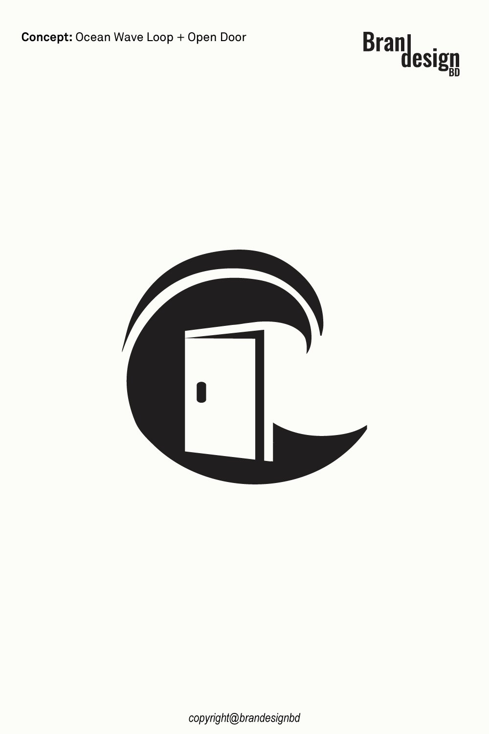
Doorway and Ocean Wave Loop Logo

Creative Doorway and Ocean Wave Loop Logo Concept

September 30, 2026
by badhan666@@ Graphic design
Doorway and Ocean Wave Loop Logo

A strong logo can tell a story without using a single sentence. The right shape, space, and visual symbol can help people understand a brand within seconds. The Doorway and Ocean Wave Loop Logo is designed around this idea, combining two simple concepts into one memorable visual mark.

The logo brings together an open doorway and a flowing ocean wave loop. The doorway can represent welcome, access, opportunity, and new beginnings. The ocean wave can suggest freedom, movement, travel, nature, and continuous growth. Together, these elements create a modern symbol with a calm yet dynamic character.

This type of logo can work well for businesses connected with real estate, architecture, interior design, hospitality, travel, coastal properties, home services, construction, lifestyle brands, and other industries that want a clean and meaningful identity.

The Concept Behind the Logo

A successful logo should have a clear visual idea. Instead of adding many elements, this concept uses a small number of shapes to communicate several related ideas.

The Open Doorway

A symbol of welcome and opportunity

The open doorway is one of the most recognizable symbols of entry and possibility. In this design, the doorway creates a sense of invitation. It can suggest entering a new space, starting a new journey, or discovering a new opportunity.

For a business, this message can be useful because customers often want to feel that a brand is approachable and trustworthy.

The Ocean Wave Loop

A symbol of movement and continuous flow

The curved wave structure adds energy to the logo. Its loop creates a feeling of movement while also giving the overall mark a rounded and balanced appearance.

The ocean-inspired shape can represent freedom, travel, nature, relaxation, and the continuous flow of life. The loop also helps create a visual connection between the doorway and the surrounding wave.

The Combined Symbol

Turning two ideas into one visual identity

The most interesting part of the concept is how the doorway and wave work together. Rather than appearing as two separate illustrations, the shapes form a unified symbol.

This approach can make the logo easier to recognize. A simple symbol is also easier to use across different brand applications, from websites and social media profiles to business cards, packaging, signage, and promotional materials.
Ocean-Wave-Loop-Logo-Design
Asking Price $500

For logo purchase or negotiation, please contact support@brandesignbd.com.

Logo Sale, Handover & NDA Information

All project handover agreements, ownership documentation, Non-Disclosure Agreement (NDA), and related communication will be handled through the email address provided above.
Once the logo is purchased, we will update the listing status to “Sold” and, upon request, add the buyer’s website or preferred address to the listing as confirmation of the sale. All necessary final files, ownership documentation, and agreed-upon project materials will be provided to the buyer after the purchase is completed.

Originality and Copyright Verification

Originality is an important part of professional logo development. A logo should not simply imitate an existing identity or use another company’s protected artwork.

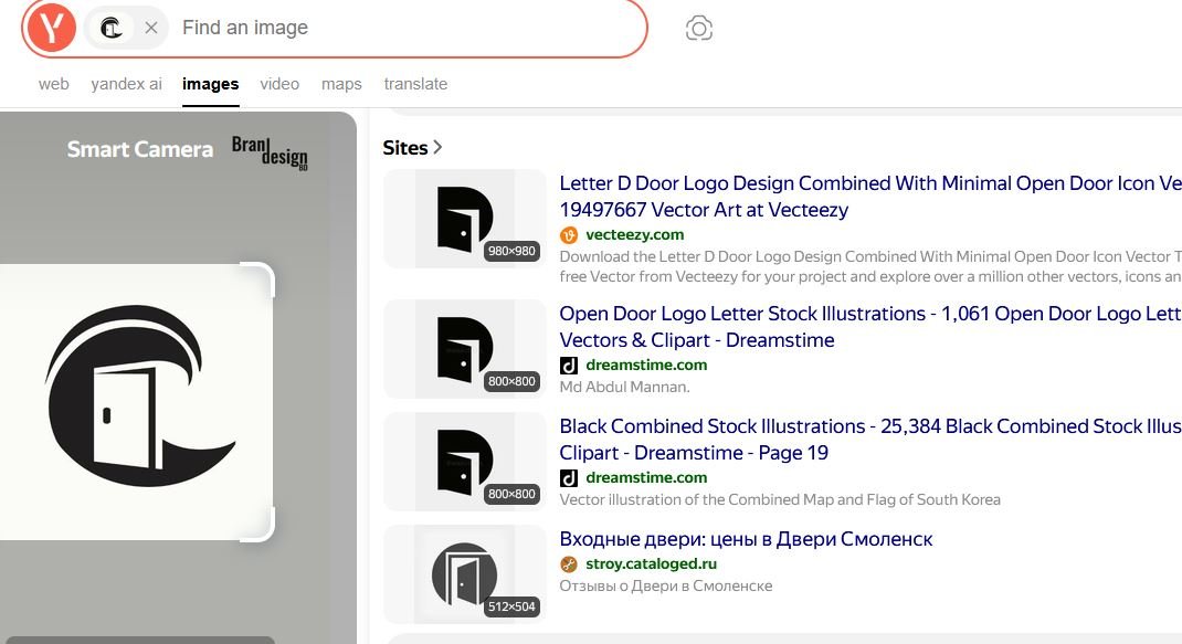
Yandex Image Search

Reviewing visual similarities

Yandex can be used as one part of a broader visual similarity review. Image search can help identify visually similar marks, concepts, or existing artwork that may appear online.

This type of search is useful during the design review process because it provides another opportunity to identify potential visual similarities before final delivery.
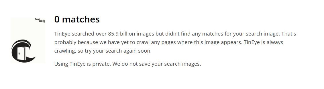
TinEye Reverse Image Search

Checking for matching or reused imagery

TinEye is another reverse-image search resource that can help investigate whether a similar image or graphic appears elsewhere online.

For logo development, reverse-image searches can support an originality review, particularly when the designer wants to check whether a visual element resembles existing online artwork.
Potential Applications for the Logo

A versatile logo should work beyond a single presentation image. The Doorway and Ocean Wave Loop Logo can be adapted for several industries and business types.

Real Estate and Property Brands

Creating a sense of entry and new possibilities

The doorway concept naturally connects with property and real estate. It can represent entering a new home or beginning a new chapter.

The wave element can also work especially well for coastal property companies, vacation rentals, beach homes, and waterfront developments.

Travel and Hospitality

Communicating exploration and relaxation

The ocean wave can create an association with travel, beaches, resorts, and relaxing destinations. Combined with the doorway, the logo can suggest an invitation to explore a new place.

This makes the concept suitable for selected travel agencies, hotels, vacation properties, tour services, and coastal hospitality brands.

Architecture and Interior Design

Connecting structure with creative spaces

The doorway provides an architectural reference, while the flowing wave introduces a softer visual element.

This combination can work for architecture studios, interior designers, home improvement companies, property developers, and creative firms that want an identity with both structure and movement.

Lifestyle and Coastal Brands

Building a relaxed visual personality

Brands connected with coastal living, outdoor experiences, wellness, travel, or lifestyle products can also benefit from this type of visual language.

The wave can communicate a relaxed feeling, while the doorway gives the mark a stronger sense of purpose and direction.

Logo Design for Digital and Print Use

A professional logo should be prepared with future use in mind. A design that looks good on a large screen should also remain clear when reduced to a small profile image.

Website and Social Media

Maintaining recognition at small sizes

The simple structure of the logo makes it suitable for website headers, social media profiles, digital advertisements, email signatures, and online directories.

A recognizable symbol can also help maintain brand consistency across multiple digital channels.

Business Cards and Stationery

Creating a professional first impression

The logo can be used on business cards, letterheads, envelopes, invoices, presentations, and other business materials.

A clean black-and-white version can be especially useful for documents where a simple one-color application is preferred.

Signage and Promotional Materials

Supporting larger brand applications

The bold shapes can also be adapted for signs, banners, vehicle graphics, merchandise, promotional products, and other physical applications.

Vector artwork is important for these uses because it allows the logo to scale without losing sharpness.

Copyright Verification Limitations

Understanding what an image search can and cannot prove

Search tools such as Yandex and TinEye can help identify online visual matches, but they do not provide a complete legal copyright clearance or trademark search.

A reverse-image search cannot guarantee that a logo is legally available for trademark registration. Businesses seeking formal trademark protection should also conduct appropriate trademark research and consult a qualified legal professional when necessary.

For this logo project, visual similarity checks can be presented as part of the designer’s quality-control process rather than as a legal guarantee.

Non-Disclosure and Logo Handover Agreement

Professional logo projects often involve confidential business information. A client may share a company name, product concept, launch plan, marketing strategy, packaging information, or other materials that are not yet public.

Non-Disclosure Agreement

Protecting confidential client information

A non-disclosure agreement, commonly called an NDA, can establish clear expectations about confidential information.

Depending on the agreement, the designer may be required to keep private materials confidential and avoid sharing unreleased brand information, business documents, product concepts, or other protected project details without permission.

An NDA should clearly define what information is confidential, how it may be used, and what responsibilities apply after the project ends.

Logo Handover Agreement

Defining the final ownership and deliverables

A logo handover agreement can clarify what the client receives after the project is completed.

A professional handover may include the final logo files, editable vector artwork, approved variations, color versions, and other agreed deliverables.

The agreement should also state when ownership or usage rights transfer to the client. Depending on the project terms, this may occur after final payment is received.

Final File Delivery

Providing practical brand assets

A complete logo package may include formats such as AI, EPS, SVG, PDF, and high-resolution PNG files when these are part of the agreed scope.

Vector formats are particularly useful because they allow the logo to be resized for both small and large applications without losing quality.

Final Thoughts on the Doorway and Ocean Wave Loop Logo

The Doorway and Ocean Wave Loop Logo combines two recognizable ideas into one clean visual symbol. The open doorway communicates welcome, access, opportunity, and new beginnings, while the flowing ocean wave represents movement, freedom, nature, and continuous flow.

Its minimalist structure makes it suitable for both digital and print applications. From real estate and architecture to travel, hospitality, lifestyle, and coastal businesses, the concept can be adapted to different brand directions.

For clients looking for a logo that feels modern, meaningful, and easy to use across multiple platforms, this concept offers a strong starting point. With professional vector artwork, organized final files, clear handover terms, and an appropriate originality review, the finished identity can be prepared for practical brand use.

When developing any new logo, visual originality should be reviewed carefully, while formal trademark and legal checks should be handled through the appropriate professional channels. This combination of creative design and responsible brand preparation helps create a more complete identity for a growing business.

Also, check the recent article about the best laptop for graphic design here.

Read More
lettermark

Lettermark logo design.

March 31, 2023
by badhan666@@ Graphic design

Table of Contents

  • What is a Letter Mark Logo Design?
  • Some key benefits of using lettermark logo design:
  • Tips for creating an outstanding lettermark logo:
  • Some market-leading examples of outstanding lettermark logos:

Creating a strong brand identity is essential for any business, and a logo is a crucial element of that identity. A lettermark logo design is a minimalist approach that can be highly effective in creating a memorable brand image. In this article, we will explore all about lettermark logo design.

What is a Letter Mark Logo Design?

A lettermark logo is a design that features the initials or first letters of a company’s name. It is also known as a monogram logo. Letter mark logos are popular because they are easy to recognize and remember. They are minimalist, focusing on the letters themselves rather than incorporating images or symbols.

Here are some examples :

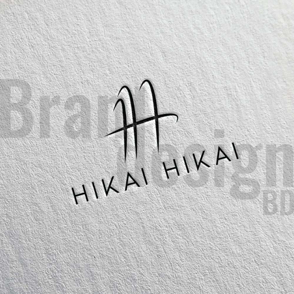
 An elegant lettermark logo featuring a stylized H with the word HIKAI written below it. The letters HH are subtly intertwined.
A unique HH lettermark logo that captures the brand essence of HIKAI.

Some key benefits of using lettermark logo design:

1. Memorable: A letter mark logo is easy to recognize and remember, making it an effective branding tool.

2. Versatile: A lettermark logo can be used in a variety of applications, from business cards to billboards, without losing its effectiveness.

3. Simple: A letter mark logo is a minimalist approach that focuses on the letters themselves rather than incorporating images or symbols, making it simple and elegant.

4. Timeless: A well-designed lettermark logo can be timeless, meaning it can withstand the test of time without looking outdated.

5. Cost-effective: Since a letter mark logo design is simple and straightforward, it can be more cost-effective to design and produce compared to more complex logo designs.

6. Professional: A lettermark logo can give a business a professional and sophisticated image, which can help attract and retain customers.

7. Global Appeal: A lettermark logo can have global appeal, as it relies on typography rather than graphics or symbols that may not be universally understood.

8. Brand Recognition: This logo can help build brand recognition and awareness by creating a consistent and recognizable visual identity.

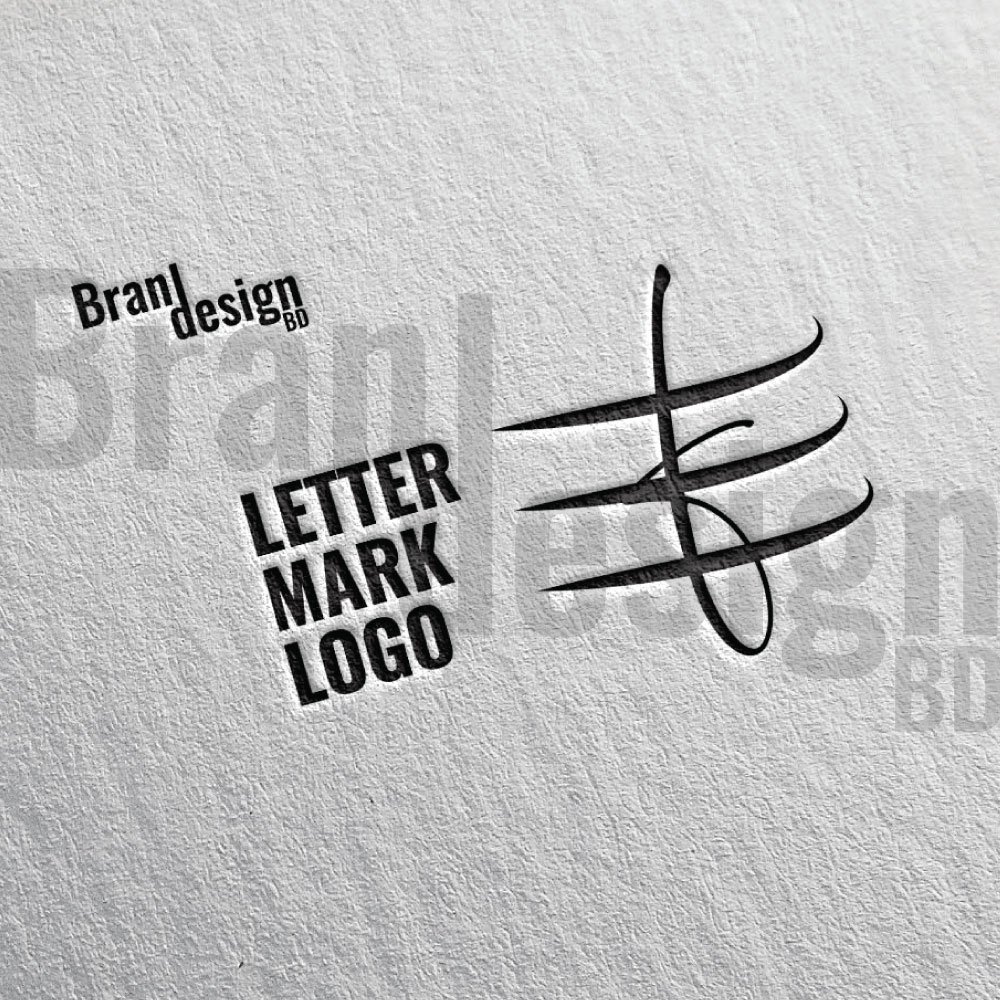
A lettermark logo design featuring a stylized, abstract letter on a textured paper background, with the words LETTER MARK LOGO in a modern sans-serif font. The image is in black and white.
Explore the creative possibilities of a lettermark logo design to build a unique and memorable brand identity.
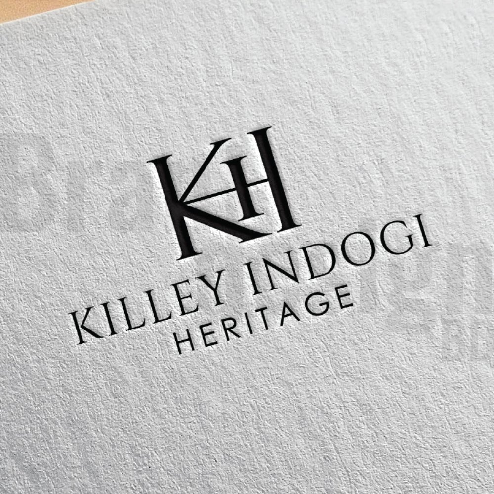
A classic and sophisticated lettermark logo for KILLEY INDOGI HERITAGE, featuring the intertwined initials K and H in a serif font, presented on a textured, light-colored paper.
Discover the elegance of the KI H lettermark logo, a timeless and professional design.
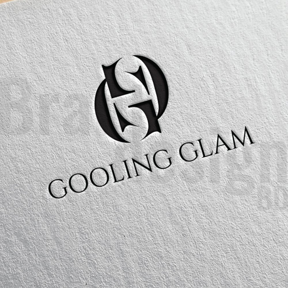
A sophisticated GG lettermark logo for GOOLING GLAM, featuring the two letters intertwined in a decorative, serif style. The logo is presented in a dark color on a textured paper background.
Explore the elegant GG lettermark logo, a perfect representation of the GOOLING GLAM brand identity.

Tips for creating an outstanding lettermark logo:

Creating an outstanding letter mark logo requires a combination of creativity, skill, and attention to detail. Here are some tips for designing a letter mark logo that stands out:

1. Keep it simple: A letter mark logo should be simple and easy to read, so avoid using too many colors, fonts, or intricate designs. Focus on the typography and negative space to create a minimalist design that is both elegant and memorable.

2. Choose the right font: The font you choose for your letter mark logo is crucial, as it will help communicate your brand’s personality and values. Experiment with different fonts and choose one that aligns with your brand’s identity and message.

3. Consider negative space: Negative space refers to the area surrounding the letters in your logo. By manipulating the negative space, you can create a clever design that incorporates hidden meaning or symbolism, making your logo more memorable and impactful.

4. Make it scalable: A letter mark logo should be scalable, meaning it should look good and remain legible whether it’s on a business card or a billboard. Test your design at different sizes to ensure it remains effective in all applications.

5. Get feedback: Before finalizing your letter mark logo design, get feedback from others, including colleagues, customers, and industry experts. This can help identify any issues or areas for improvement.

6. Consider color: While a letter mark logo is typically monochromatic, color can be used to enhance the design and create a distinctive look. Choose colors that align with your brand’s identity and message and use them sparingly to create a cohesive and impactful design.

7. Be creative: A letter mark logo is an opportunity to get creative and come up with a unique design that sets your brand apart from the competition. Don’t be afraid to experiment with different fonts, layouts, and negative space to create a memorable design.

Some market-leading examples of outstanding lettermark logos:

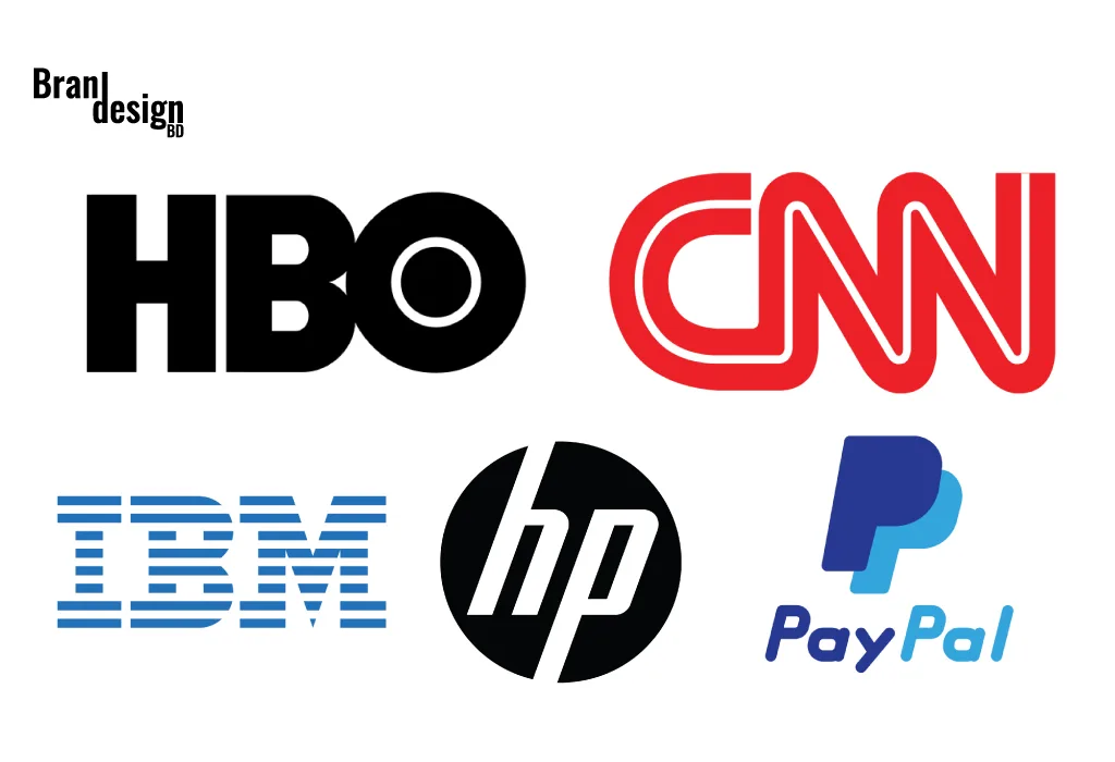
1. IBM: IBM’s letter mark logo is one of the most recognizable in the world. The simple, blue letters are synonymous with technology and innovation, and the logo has remained virtually unchanged since it was introduced in 1972.

2. HP: HP’s letter mark logo features a distinctive, stylized letter “hp” in blue and white. The logo has evolved over time, but the basic design has remained consistent, conveying a sense of innovation and creativity.

lettermark logo

3. CNN: CNN’s letter mark logo features a bold, red letter “CNN” set against a white background. The logo is instantly recognizable and has become synonymous with breaking news and journalism.

4. HBO: HBO’s letter mark logo is a simple, white, sans-serif “HBO” set against a black background. The logo conveys a sense of sophistication and quality, and it has become synonymous with premium television programming.

5. Paypal: The lettermark in the PayPal logo consists of a simple blue icon in the shape of two overlapping “P”s, forming a distinctive and memorable symbol. This symbol represents the brand’s focus on innovation and convenience, as well as its commitment to security and reliability.

In summary, a letter mark logo design is a minimalist approach that can be highly effective in creating a memorable brand identity. The simplicity and versatility of a letter mark logo make it an excellent branding tool for any business. When designing a letter mark logo, keep it simple, choose the right font, consider the negative space, make it scalable, get feedback, consider color, be creative, research your competition, and align with your brand identity. By following these tips, you can create a striking letter mark logo that reflects your brand’s personality and values.

If you want to make this type of lettermark logo then contact us now.

Also, check the recent article about the combination mark logo here.


What is a lettermark logo?

A lettermark logo is a type of logo design that uses stylized text, usually the initials or abbreviation of a brand name, to create a unique and memorable visual identity. It focuses purely on typography rather than symbols or illustrations.

How is a lettermark logo different from a monogram?

While both use letters, a lettermark is often designed for a company’s abbreviated name (e.g., IBM, NASA), while a monogram is more decorative and often used for personal branding, fashion, or luxury items.

Why should I choose a lettermark logo?

A lettermark logo is ideal if your brand name is long, complex, or hard to pronounce. It simplifies your identity into a recognizable form that’s easier for audiences to remember.

Which industries work best with lettermark logos?

Lettermark logos are popular in corporate, technology, fashion, media, law, and finance sectors—anywhere where a clean, professional, and timeless look is preferred.

How do you make sure my lettermark is unique?

We carefully research your industry and competitors, then combine custom typography, spacing, and design elements to ensure your lettermark is distinct and aligned with your brand personality.

Can a lettermark logo include symbols or shapes?

Yes, while the main focus is on letters, subtle icons, shapes, or textures can be integrated to add character—without overpowering the typography.

Will my lettermark work in both color and black-and-white?

Absolutely. We design lettermarks to remain effective, readable, and recognizable in any color variation, including monochrome and grayscale.

Can I use a lettermark as my social media profile picture?

Yes. Lettermark logos are perfect for profile images because their simplicity allows them to remain clear and identifiable even at small sizes.

Do you provide different file formats for the logo?

Yes, you’ll receive your logo in multiple formats (JPG, PNG, SVG, PDF, and EPS) so you can use it for print, web, merchandise, and more.

  • Custom Creative Letter P and Aviation Logo Concept
  • Modern Spartan Helmet T Logo Concept
  • Custom Elephant Head & Fox Negative Space Logo Concept
  • Custom Creative G Letter and Negative Space Puzzle Logo Concept
  • Creative Flame and Skull Antler Logo Concept
Read More

Search

Untitled-1-01Untitled-1-01

brandesignbd

Graphic Design Service Provider

Visit Link

  • Privacy Policy
  • Terms and condition

Company

  • Home
  • Our Services
  • portfolio
  • Contact Us

Contact

  • support@brandesignbd.com
  • brandesignbd27@gmail.com

Address

Narayanganj,

Dhaka, Bangladesh

1400

Linkedin-in Pinterest Facebook-f Instagram Behance
Copyright ©brandesignbd. All Rights Reserved.
Shopping Basket