Table of Contents
- Introduction
- What is the Pantone Color Bridge Set?
- Benefits of Using the Pantone Color Bridge Set
- Best Product Overview
- Key Features of the Pantone Color Bridge Set
- How to Use the Pantone Color Bridge Set
- Technical Insights
- Creative Applications
- Conclusion
Discover the Pantone Color Bridge Set (GP1601B), the ultimate color-matching tool for designers. Learn how it ensures accurate color reproduction across print and digital media with over 2,359 spot colors and 224 new shades.
Introduction
Color is at the heart of all visual design, influencing branding, packaging, marketing materials, and digital graphics. Maintaining color consistency across screens and printed materials can be challenging for creative professionals. The Pantone Color Bridge Set bridges this gap, providing a reliable reference for accurate color matching in both coated and uncoated paper applications.
With its comprehensive library, portable design, and technical precision, the Pantone Color Bridge Set has become a staple for designers, printers, and brand managers. In this guide, we’ll explore everything you need to know about this essential tool, including its features, usage, technical details, and creative applications.
What is the Pantone Color Bridge Set?
Purpose of the Color Bridge Set
The set helps designers maintain color accuracy from digital design to print output, ensuring that brand colors remain consistent across all media.
Who Uses It?
Graphic designers, brand managers, packaging professionals, and printing specialists all rely on the Pantone Color Bridge Set for accurate color representation.
Coated vs. Uncoated Paper
Coated (C) paper provides a glossy, vibrant finish, ideal for magazines and high-quality printed materials. Uncoated (U) paper absorbs ink, producing softer, matte results commonly used for stationery.
Transitioning from understanding the set’s purpose to its benefits highlights why it is indispensable for creative professionals.
Benefits of Using the Pantone Color Bridge Set
Accurate Color Reproduction
By providing both Pantone spot colors and CMYK equivalents, designers can confidently predict printed color results.
Streamlined Collaboration
The universal reference simplifies communication with clients, printers, and team members, reducing errors and revisions.
Expanded Creative Options
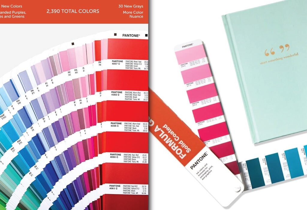
With 2,359 market-driven spot colors plus 224 new, on-trend colors, designers can explore a wide range of shades and achieve more creative freedom.
Portability and Convenience
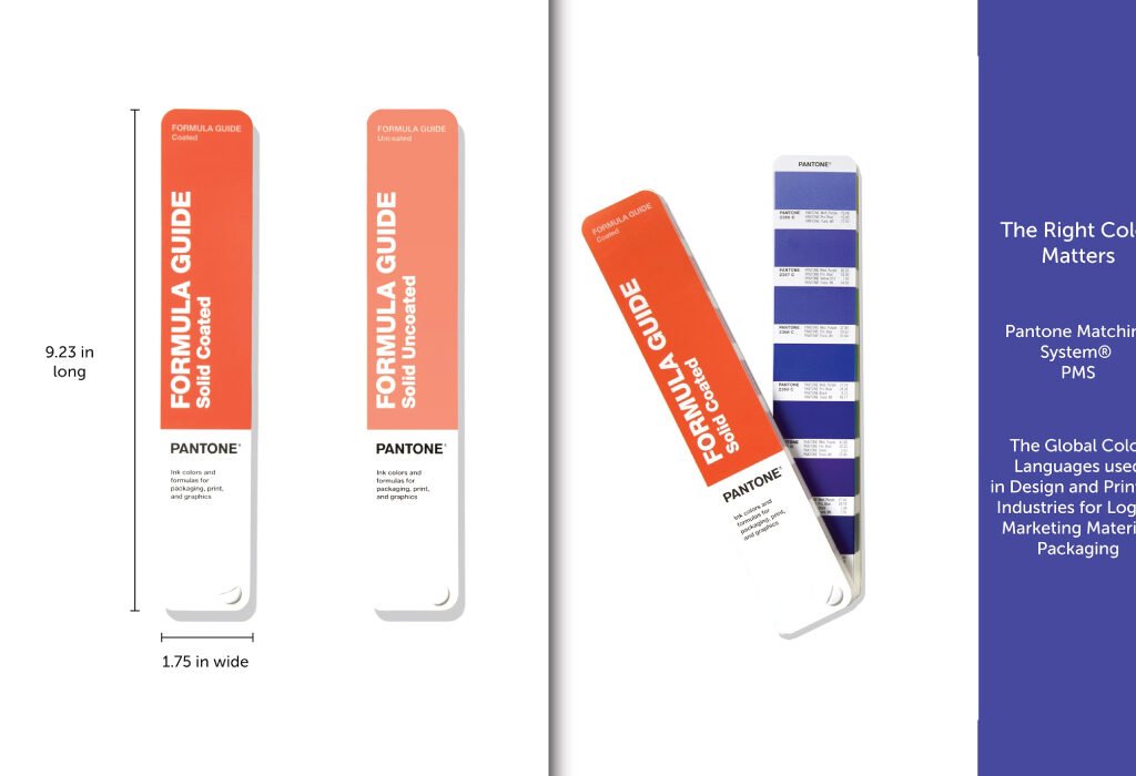
Handheld fan deck design allows easy access to colors during client presentations, design reviews, and on-location work.
Best Product Overview
The Pantone Formula Guide | Coated & Uncoated (GP1601B) is a professional color-matching tool designed to help creatives maintain consistent color in their work.
Product Specifications: Pantone Formula Guide GP1601B
| Specification | Details |
|---|---|
| Product Name | Pantone Formula Guide |
| Model | GP1601B |
| Brand | Pantone |
| Color | New Version – Formula Guide |
| Finish Type | Gloss |
| Size | 1 Count (Pack of 1) |
| Item Volume | 480 Cubic Centimeters |
| Special Feature | Formula Guide |
| Unit Count | 1.0 Count |
| Paint Type | PAINT |
| Specific Uses for Product | Interior/Exterior Design |
| Surface Recommendation | Paper |
| Spot Colors Included | 2,359 Pantone Spot Colors + 224 new market-relevant colors |
| Paper Stock Weights | 100 lb (168 gsm) coated, 80 lb (118 gsm) uncoated |
| Portable Fan Deck | Yes, handheld for on-the-go reference |
| Lighting Indicator Page | Yes, for proper color evaluation |
| Replacement Recommendation | Every 12–18 months due to fading, smudging, or yellowing |
| Delta E Tolerance | < 2.0 ∆E00 to Pantone master standard reference data |
This tool ensures accurate color reproduction across branding, logos, marketing, packaging, and other design applications. Its fan deck format makes it portable, while printed samples on both coated and uncoated paper ensure reliable reference in any professional environment.
Key Features of the Pantone Color Bridge Set
Comprehensive Color Library
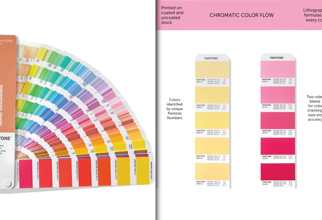
Includes 2,359 Pantone spot colors, 224 new market-relevant shades, and 5 new base inks for enhanced creative possibilities. The back index provides numeric locations for easy reference.
Coated and Uncoated References
Displays color on both coated and uncoated papers, allowing accurate visualization for different print applications.
Lighting Indicator Page
Ensures proper lighting for accurate color evaluation, essential for professional color matching.
Delta E (∆E00) Standard
Quantifies color differences between the selected color and the Pantone master reference. Lower Delta E indicates greater accuracy.
Durable and Portable Fan Deck
Compact design allows for portability, while durable pages maintain color integrity even with regular handling.
Transitioning from features, we now explore practical usage tips to maximize accuracy.
How to Use the Pantone Color Bridge Set
Selecting Colors
Use the numeric index to locate the desired Pantone color and compare it with the closest CMYK equivalent.
Matching Print Output
Ensure that the selected color will appear consistent in print, particularly for branding and packaging projects.
Communicating with Printers
Provide the exact Pantone reference number to your printer to ensure spot printing or CMYK approximations match your design intent.
Checking Lighting Conditions
Always verify your environment using the lighting indicator page for accurate color perception.
Replacing Guides
Pantone guides should be replaced every 12–18 months, as handling, light exposure, and ambient moisture can alter color accuracy over time.
Technical Insights
Spot Printing vs. Process Printing
Spot printing uses pre-mixed inks for exact color reproduction, ideal for bold, vibrant designs. Process printing uses CMYK to approximate the color, often necessary for mass production.
Delta E (∆E00) Measurement
Standardized measurement of color difference; lower values indicate a closer match to the Pantone master.
Coated vs. Uncoated Effects
Paper finish significantly affects color appearance; designers must select the right paper type for desired results.
Aging and Environmental Impact
Light, moisture, and handling can alter swatch colors over time, which is why periodic replacement is necessary.
Creative Applications
Branding and Logos
Ensures brand colors remain consistent across all platforms and print materials.
Packaging Design
Predicts color appearance on different materials, preventing surprises during production.
Marketing Materials
Maintains uniform color for brochures, flyers, and business cards, enhancing brand recognition.
Interior and Product Design
Supports color harmony in product finishes and interior design elements.
Trend-Driven Design
Incorporates the latest 224 market-relevant colors for modern, on-trend creative projects.
Conclusion
The Pantone Color Bridge Set (GP1601B) is a must-have tool for creative professionals. By providing accurate spot-to-CMYK color translation, it ensures brand consistency, reduces production errors, and expands creative possibilities. With portable fan decks, a comprehensive color library, and a Delta E accuracy standard, this set is indispensable for designers, printers, and brand managers who require reliable, professional-grade color matching.
Proper usage, care, and regular replacement keep your color selections precise, allowing your designs to consistently look exactly as intended across all media.
Also, check the recent article about the best laptop for graphic design here.
The Pantone Color Bridge Set is a professional color-matching system that provides Pantone spot colors alongside their closest CMYK equivalents. It helps designers maintain consistent color from digital design to print.
Graphic designers, brand managers, packaging designers, and printers who require accurate color reproduction in their work will benefit from this tool.
Coated paper (C) provides a glossy, vibrant finish, ideal for magazines and high-quality printed materials. Uncoated paper (U) absorbs ink, resulting in a softer, matte finish commonly used for stationery.
Pantone guides should be replaced every 12–18 months. Handling, exposure to light, and ambient moisture can alter colors over time, reducing accuracy.
The guide includes 2,359 Pantone spot colors plus 224 new market-relevant colors, giving designers a total of 2,390 solid colors for creative projects.
Delta E (∆E00) measures the difference between two colors. A lower Delta E indicates a closer match to the Pantone master, ensuring color accuracy in print and design.
Yes. The set helps designers approximate Pantone spot colors to CMYK equivalents, which is useful for both print and digital projects.
Yes. The fan deck is handheld and portable, making it convenient for on-site client presentations and color evaluations.
Yes. The guide includes a lighting indicator page to ensure accurate color evaluation under proper lighting conditions.