Table of Contents
- What is a Letter Mark Logo Design?
- Some key benefits of using lettermark logo design:
- Tips for creating an outstanding lettermark logo:
- Some market-leading examples of outstanding lettermark logos:
Creating a strong brand identity is essential for any business, and a logo is a crucial element of that identity. A lettermark logo design is a minimalist approach that can be highly effective in creating a memorable brand image. In this article, we will explore all about lettermark logo design.
What is a Letter Mark Logo Design?
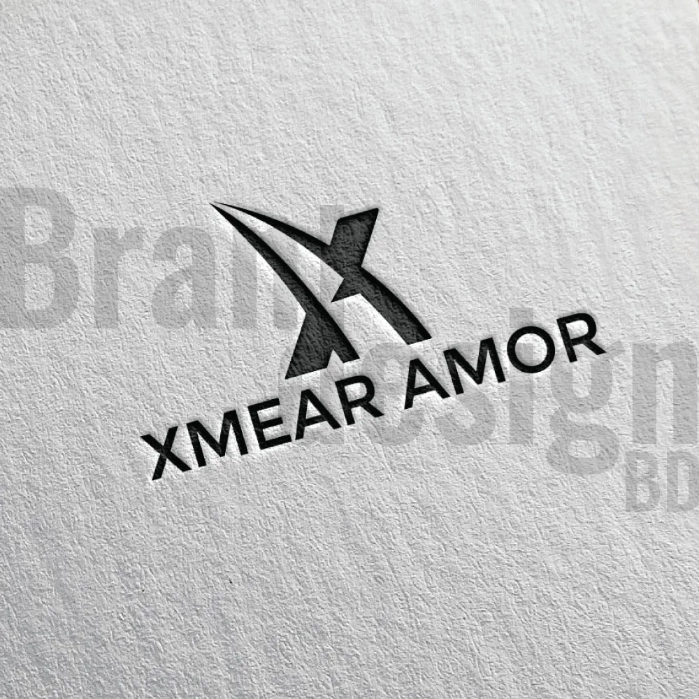
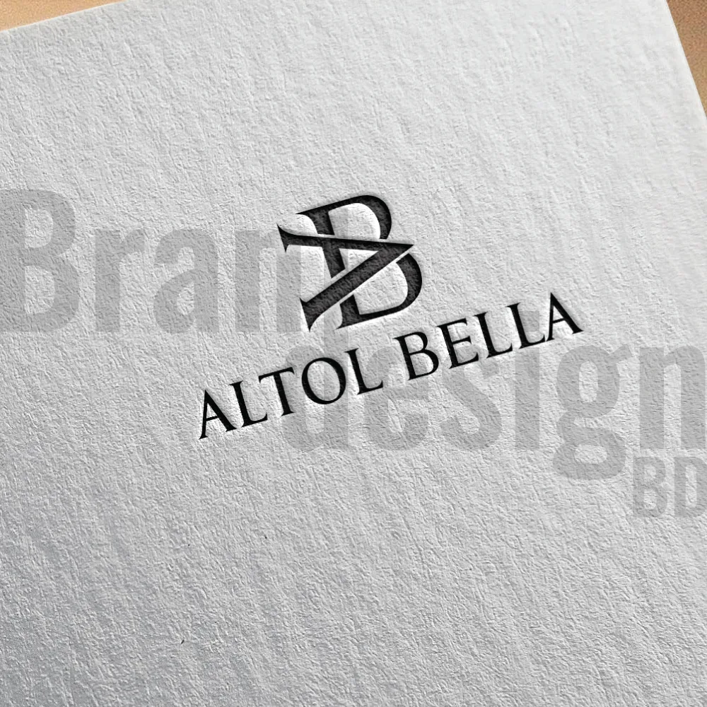
A lettermark logo is a design that features the initials or first letters of a company’s name. It is also known as a monogram logo. Letter mark logos are popular because they are easy to recognize and remember. They are minimalist, focusing on the letters themselves rather than incorporating images or symbols.
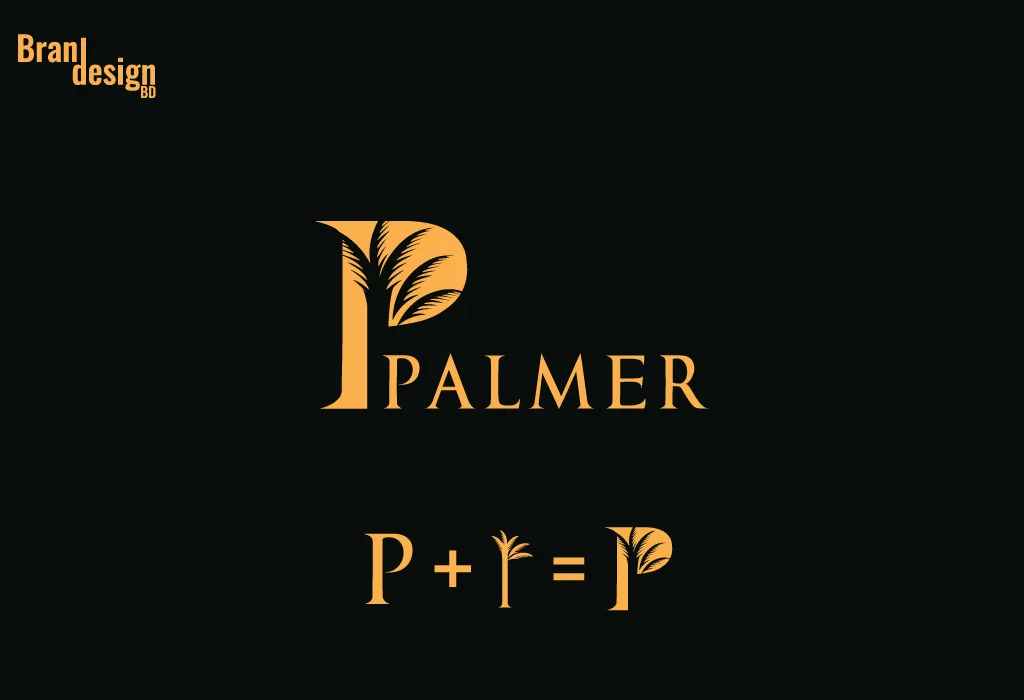
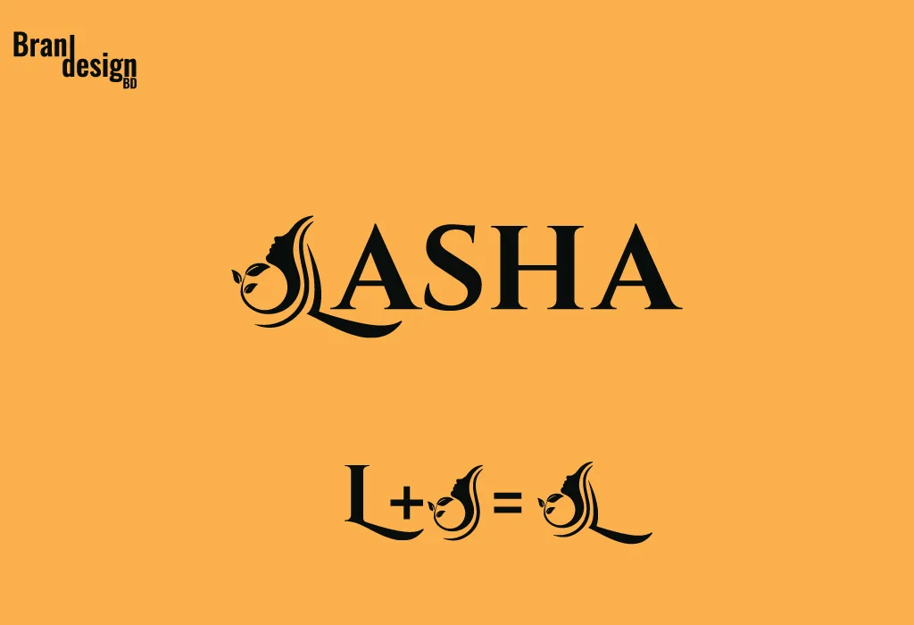
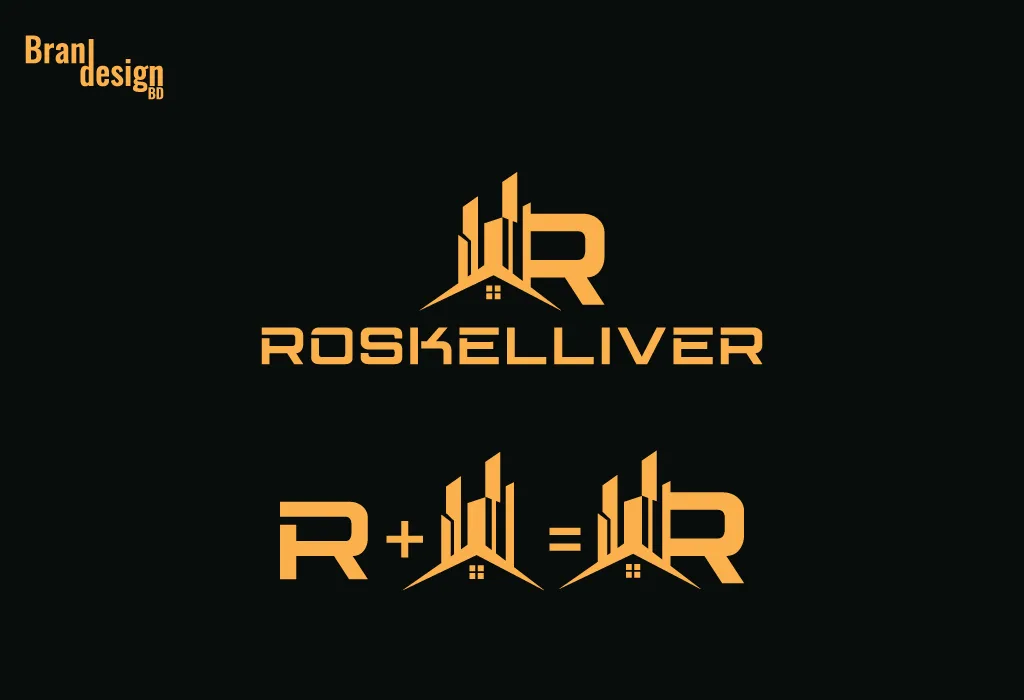
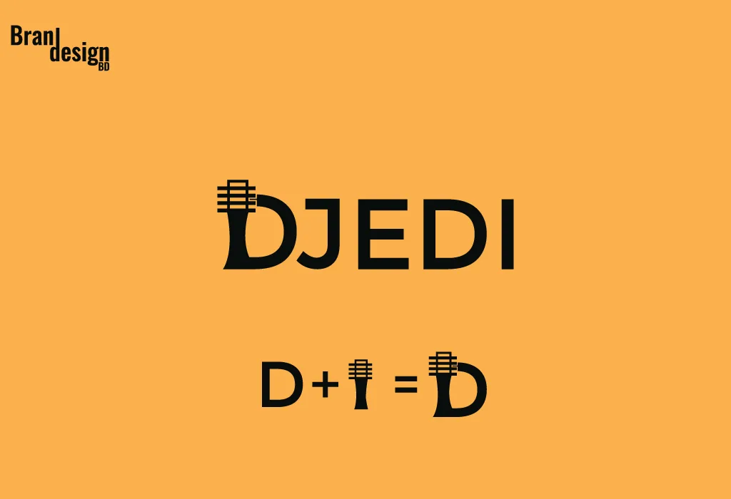
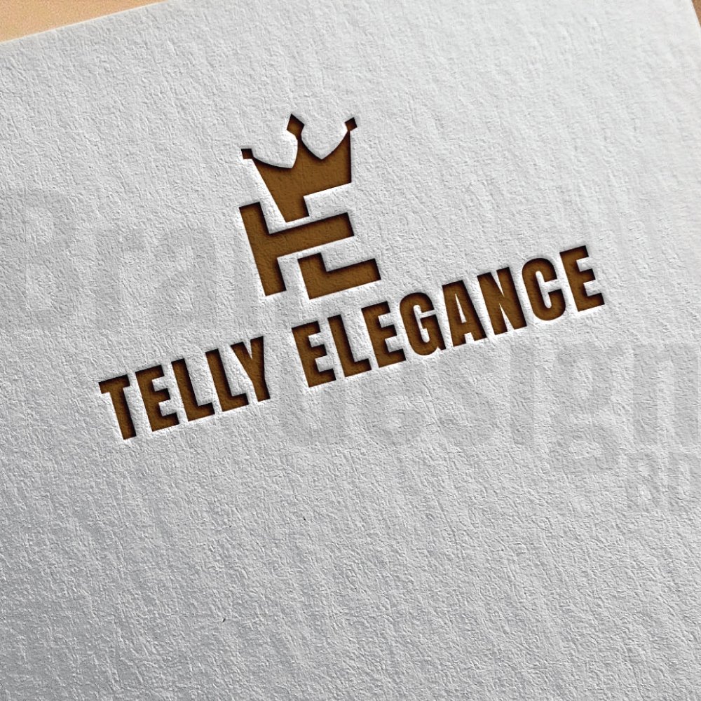
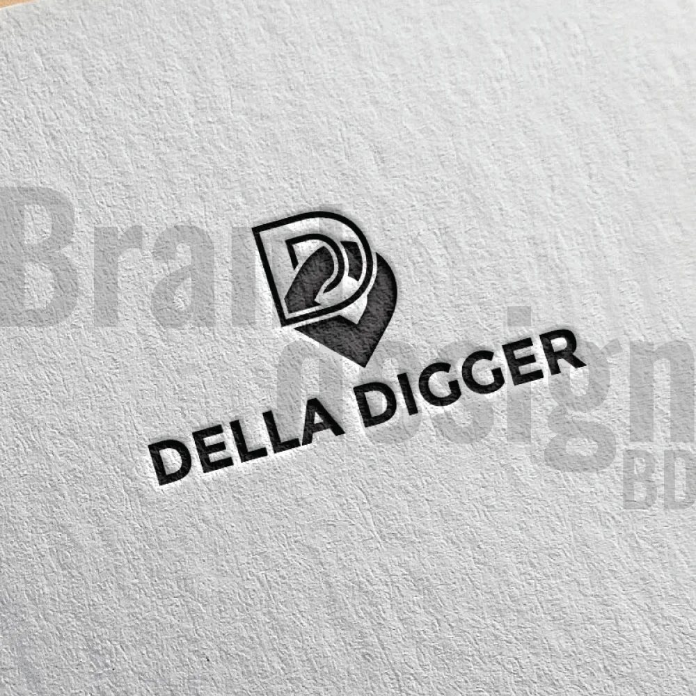
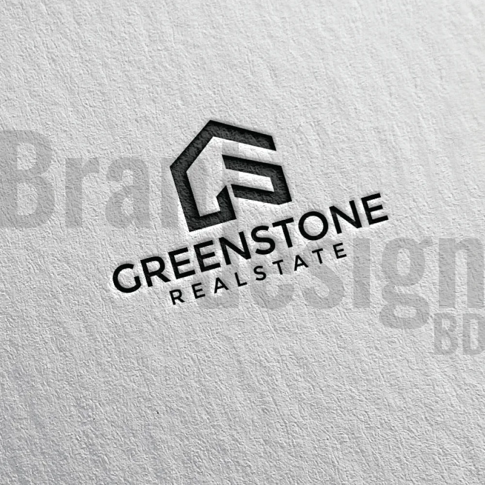
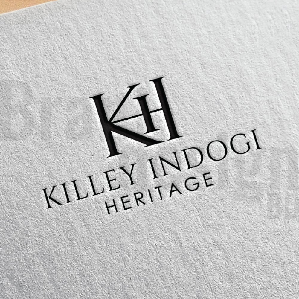
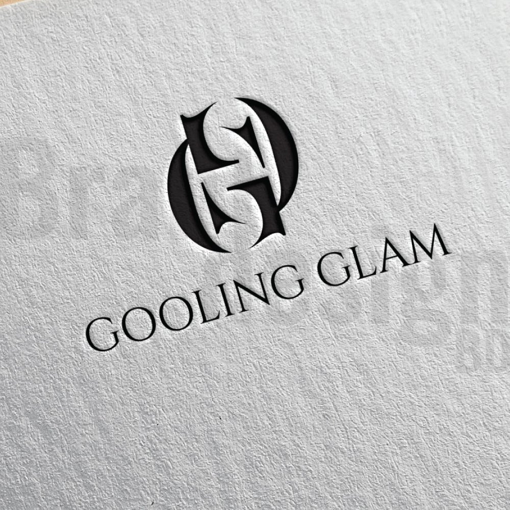
Here are some examples :
Some key benefits of using lettermark logo design:
1. Memorable: A letter mark logo is easy to recognize and remember, making it an effective branding tool.
2. Versatile: A lettermark logo can be used in a variety of applications, from business cards to billboards, without losing its effectiveness.
3. Simple: A letter mark logo is a minimalist approach that focuses on the letters themselves rather than incorporating images or symbols, making it simple and elegant.
4. Timeless: A well-designed lettermark logo can be timeless, meaning it can withstand the test of time without looking outdated.
5. Cost-effective: Since a letter mark logo design is simple and straightforward, it can be more cost-effective to design and produce compared to more complex logo designs.
6. Professional: A lettermark logo can give a business a professional and sophisticated image, which can help attract and retain customers.
7. Global Appeal: A lettermark logo can have global appeal, as it relies on typography rather than graphics or symbols that may not be universally understood.
8. Brand Recognition: This logo can help build brand recognition and awareness by creating a consistent and recognizable visual identity.
Tips for creating an outstanding lettermark logo:
Creating an outstanding letter mark logo requires a combination of creativity, skill, and attention to detail. Here are some tips for designing a letter mark logo that stands out:
1. Keep it simple: A letter mark logo should be simple and easy to read, so avoid using too many colors, fonts, or intricate designs. Focus on the typography and negative space to create a minimalist design that is both elegant and memorable.
2. Choose the right font: The font you choose for your letter mark logo is crucial, as it will help communicate your brand’s personality and values. Experiment with different fonts and choose one that aligns with your brand’s identity and message.
3. Consider negative space: Negative space refers to the area surrounding the letters in your logo. By manipulating the negative space, you can create a clever design that incorporates hidden meaning or symbolism, making your logo more memorable and impactful.
4. Make it scalable: A letter mark logo should be scalable, meaning it should look good and remain legible whether it’s on a business card or a billboard. Test your design at different sizes to ensure it remains effective in all applications.
5. Get feedback: Before finalizing your letter mark logo design, get feedback from others, including colleagues, customers, and industry experts. This can help identify any issues or areas for improvement.
6. Consider color: While a letter mark logo is typically monochromatic, color can be used to enhance the design and create a distinctive look. Choose colors that align with your brand’s identity and message and use them sparingly to create a cohesive and impactful design.
7. Be creative: A letter mark logo is an opportunity to get creative and come up with a unique design that sets your brand apart from the competition. Don’t be afraid to experiment with different fonts, layouts, and negative space to create a memorable design.
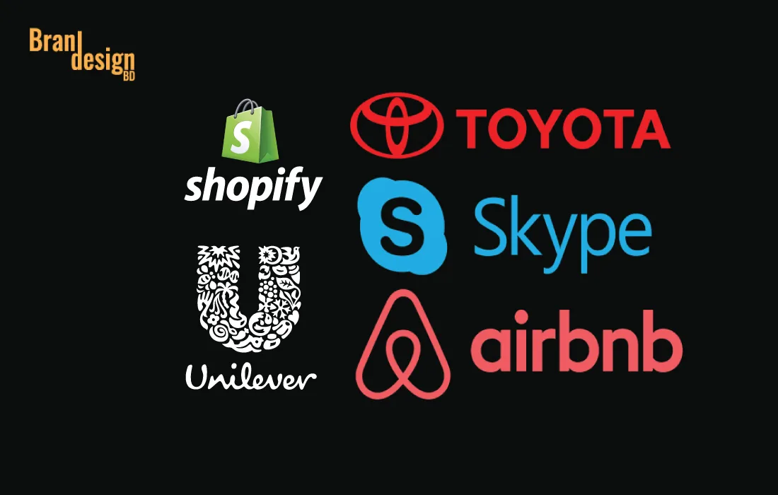
Some market-leading examples of outstanding lettermark logos:
1. IBM: IBM’s letter mark logo is one of the most recognizable in the world. The simple, blue letters are synonymous with technology and innovation, and the logo has remained virtually unchanged since it was introduced in 1972.
2. HP: HP’s letter mark logo features a distinctive, stylized letter “hp” in blue and white. The logo has evolved over time, but the basic design has remained consistent, conveying a sense of innovation and creativity.
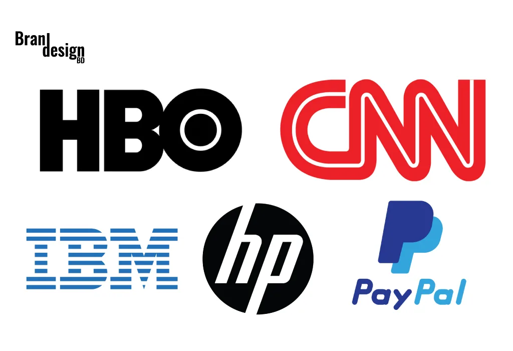
3. CNN: CNN’s letter mark logo features a bold, red letter “CNN” set against a white background. The logo is instantly recognizable and has become synonymous with breaking news and journalism.
4. HBO: HBO’s letter mark logo is a simple, white, sans-serif “HBO” set against a black background. The logo conveys a sense of sophistication and quality, and it has become synonymous with premium television programming.
5. Paypal: The lettermark in the PayPal logo consists of a simple blue icon in the shape of two overlapping “P”s, forming a distinctive and memorable symbol. This symbol represents the brand’s focus on innovation and convenience, as well as its commitment to security and reliability.
In summary, a letter mark logo design is a minimalist approach that can be highly effective in creating a memorable brand identity. The simplicity and versatility of a letter mark logo make it an excellent branding tool for any business. When designing a letter mark logo, keep it simple, choose the right font, consider the negative space, make it scalable, get feedback, consider color, be creative, research your competition, and align with your brand identity. By following these tips, you can create a striking letter mark logo that reflects your brand’s personality and values.
If you want to make this type of lettermark logo then contact us now.
Also, check the recent article about the combination mark logo here.
A lettermark logo is a type of logo design that uses stylized text, usually the initials or abbreviation of a brand name, to create a unique and memorable visual identity. It focuses purely on typography rather than symbols or illustrations.
While both use letters, a lettermark is often designed for a company’s abbreviated name (e.g., IBM, NASA), while a monogram is more decorative and often used for personal branding, fashion, or luxury items.
A lettermark logo is ideal if your brand name is long, complex, or hard to pronounce. It simplifies your identity into a recognizable form that’s easier for audiences to remember.
Lettermark logos are popular in corporate, technology, fashion, media, law, and finance sectors—anywhere where a clean, professional, and timeless look is preferred.
We carefully research your industry and competitors, then combine custom typography, spacing, and design elements to ensure your lettermark is distinct and aligned with your brand personality.
Yes, while the main focus is on letters, subtle icons, shapes, or textures can be integrated to add character—without overpowering the typography.
Absolutely. We design lettermarks to remain effective, readable, and recognizable in any color variation, including monochrome and grayscale.
Yes. Lettermark logos are perfect for profile images because their simplicity allows them to remain clear and identifiable even at small sizes.
Yes, you’ll receive your logo in multiple formats (JPG, PNG, SVG, PDF, and EPS) so you can use it for print, web, merchandise, and more.