Untitled-1-01Untitled-1-01

brandesignbd

Graphic Design Service Provider

  • Home
  • About Us
  • Our Services
  • portfolio
  • Contact Us
  • Blog
Get Started

Home » logo

Posts tagged: logo

lettermark

Lettermark logo design.

March 31, 2023
by badhan666@@ with No Comment Graphic design

Table of Contents

  • What is a Letter Mark Logo Design?
  • Some key benefits of using lettermark logo design:
  • Tips for creating an outstanding lettermark logo:
  • Some market-leading examples of outstanding lettermark logos:

Creating a strong brand identity is essential for any business, and a logo is a crucial element of that identity. A lettermark logo design is a minimalist approach that can be highly effective in creating a memorable brand image. In this article, we will explore all about lettermark logo design.

What is a Letter Mark Logo Design?

A lettermark logo is a design that features the initials or first letters of a company’s name. It is also known as a monogram logo. Letter mark logos are popular because they are easy to recognize and remember. They are minimalist, focusing on the letters themselves rather than incorporating images or symbols.

Here are some examples :

Some key benefits of using lettermark logo design:

1. Memorable: A letter mark logo is easy to recognize and remember, making it an effective branding tool.

2. Versatile: A lettermark logo can be used in a variety of applications, from business cards to billboards, without losing its effectiveness.

3. Simple: A letter mark logo is a minimalist approach that focuses on the letters themselves rather than incorporating images or symbols, making it simple and elegant.

4. Timeless: A well-designed lettermark logo can be timeless, meaning it can withstand the test of time without looking outdated.

5. Cost-effective: Since a letter mark logo design is simple and straightforward, it can be more cost-effective to design and produce compared to more complex logo designs.

6. Professional: A lettermark logo can give a business a professional and sophisticated image, which can help attract and retain customers.

7. Global Appeal: A lettermark logo can have global appeal, as it relies on typography rather than graphics or symbols that may not be universally understood.

8. Brand Recognition: This logo can help build brand recognition and awareness by creating a consistent and recognizable visual identity.

Tips for creating an outstanding lettermark logo:

Creating an outstanding letter mark logo requires a combination of creativity, skill, and attention to detail. Here are some tips for designing a letter mark logo that stands out:

https://www.high-endrolex.com/30

1. Keep it simple: A letter mark logo should be simple and easy to read, so avoid using too many colors, fonts, or intricate designs. Focus on the typography and negative space to create a minimalist design that is both elegant and memorable.

2. Choose the right font: The font you choose for your letter mark logo is crucial, as it will help communicate your brand’s personality and values. Experiment with different fonts and choose one that aligns with your brand’s identity and message.

3. Consider negative space: Negative space refers to the area surrounding the letters in your logo. By manipulating the negative space, you can create a clever design that incorporates hidden meaning or symbolism, making your logo more memorable and impactful.

4. Make it scalable: A letter mark logo should be scalable, meaning it should look good and remain legible whether it’s on a business card or a billboard. Test your design at different sizes to ensure it remains effective in all applications.

5. Get feedback: Before finalizing your letter mark logo design, get feedback from others, including colleagues, customers, and industry experts. This can help identify any issues or areas for improvement.

6. Consider color: While a letter mark logo is typically monochromatic, color can be used to enhance the design and create a distinctive look. Choose colors that align with your brand’s identity and message and use them sparingly to create a cohesive and impactful design.

7. Be creative: A letter mark logo is an opportunity to get creative and come up with a unique design that sets your brand apart from the competition. Don’t be afraid to experiment with different fonts, layouts, and negative space to create a memorable design.

Some market-leading examples of outstanding lettermark logos:

1. IBM: IBM’s letter mark logo is one of the most recognizable in the world. The simple, blue letters are synonymous with technology and innovation, and the logo has remained virtually unchanged since it was introduced in 1972.

2. HP: HP’s letter mark logo features a distinctive, stylized letter “hp” in blue and white. The logo has evolved over time, but the basic design has remained consistent, conveying a sense of innovation and creativity.

lettermark logo

3. CNN: CNN’s letter mark logo features a bold, red letter “CNN” set against a white background. The logo is instantly recognizable and has become synonymous with breaking news and journalism.

4. HBO: HBO’s letter mark logo is a simple, white, sans-serif “HBO” set against a black background. The logo conveys a sense of sophistication and quality, and it has become synonymous with premium television programming.

5. Paypal: The lettermark in the PayPal logo consists of a simple blue icon in the shape of two overlapping “P”s, forming a distinctive and memorable symbol. This symbol represents the brand’s focus on innovation and convenience, as well as its commitment to security and reliability.

In summary, a letter mark logo design is a minimalist approach that can be highly effective in creating a memorable brand identity. The simplicity and versatility of a letter mark logo make it an excellent branding tool for any business. When designing a letter mark logo, keep it simple, choose the right font, consider the negative space, make it scalable, get feedback, consider color, be creative, research your competition, and align with your brand identity. By following these tips, you can create a striking letter mark logo that reflects your brand’s personality and values.

If you want to make this type of lettermark logo then contact us now.

Also, check the recent article about the combination mark logo here.


  • Best Portable Tablet for Graphic Designers
  • The Art of Negative Space Logo Design: Making a Statement with Absence
  • The Top 5 Powerful Pattern Design Websites
  • Best Eye Protection Glass For Graphic Designers
  • Packaging box mockup PSD
Read More
COMBINATION-MARK

Combination Mark Logo

March 28, 2023
by badhan666@@ with No Comment Graphic design
combination mark logo

Table of Contents

  • What is a Combination Mark Logo?
    • Some key benefits of using this type of logo:
    • Tips for creating an outstanding combination mark logo:
    • Some market-leading examples of outstanding combination mark logos:

A combination mark logo is a versatile option for businesses as it can be used across various mediums, including print, digital, and social media. The use of a combination mark logo can provide an instant visual impact that can help to increase brand recognition, as well as build trust and credibility with customers. In this article, we will explore all about it.

What is a Combination Mark Logo?

A combination mark logo is a type of logo that combines both text and symbols to create a unique brand identity. The text and symbol can be placed together or separately, making it a versatile option for businesses. This type of logo is also known as a hybrid logo, as it combines both text and symbol elements to create a unified brand identity.

The text element of the logo can be the initial letter of the company name, and the symbol element can be an icon or graphic representing the brand. This allows businesses to create a unique and memorable identity that can be used across various mediums.

Here are some examples :

Combination
Combination mark logo

Some key benefits of using this type of logo:

There are several benefits to using a combination mark logo for your business. These benefits include:

1. Versatility: This logo can be used across various mediums, including print, digital, and social media. This versatility allows businesses to maintain a consistent brand identity across all platforms, increasing brand recognition.

2. Brand recognition: The use of a combination mark logo can help to increase brand recognition, as it provides an instant visual impact. The combination of text and symbols makes the logo more memorable, allowing customers to quickly identify the brand.

3. Credibility: It also helps to build trust and credibility with customers. A well-designed logo can communicate the values and personality of a brand, making it easier for customers to relate to and trust the brand.

4. Uniqueness: A hybrid mark logo allows businesses to create a unique and memorable brand identity. The use of both text and symbols provides businesses with more design options, making it easier to create a logo that stands out from competitors.

Tips for creating an outstanding combination mark logo:

Creating an outstanding combination mark logo requires careful consideration of several key factors. Here are some tips for creating a combination mark logo that will help your business stand out:

1. Keep it simple: This type of logo should be simple and easy to read. The text element should be legible, and the symbol element should be recognizable at a glance. Avoid using too many colors or intricate designs that make the logo difficult to read or recognize.

2. Choose the right font: The font used in the text element of the logo can play a significant role in the overall design. Choose a font that is easy to read and reflects the personality of your brand. Avoid using trendy or overly stylized fonts that may become outdated quickly.

3. Use color effectively: The use of color can help to make a combination mark logo more memorable and impactful. Choose colors that reflect the personality and values of your brand, and ensure that they complement each other well. Avoid using too many colors or colors that clash, as this can make the logo difficult to read or recognize.

4. Make it scalable: The logo should be scalable, meaning it can be resized without losing its clarity or quality. This is important as a logo needs to be used across various mediums, including print and digital. Ensure that the logo is created in a vector format, as this will allow it to be scaled up or down without losing quality.

5. Consider your target audience: The design of the logo should be tailored to your target audience. Consider the age, gender, and interests of your target audience when choosing the colors, fonts, and symbols for your logo.

6. Make it memorable: A hybrid mark logo should be amazing and easy to recognize. The use of unique symbols or icons can help to make the logo more memorable, as can using a unique font or color scheme.

7. Test it out: Before finalizing your hybrid mark logo, test it out across various mediums to ensure that it is legible and recognizable. This can include testing it on business cards, social media platforms, and websites. Hold summary meetings regularly to share work results and experiences.

Some market-leading examples of outstanding combination mark logos:

1. Shopify: Shopify logo features a distinctive shopping bag icon with a white letter “S” on it, which is positioned inside a rounded blue square. The design is minimalist and modern, with clean lines and bold, easily recognizable shapes.

2. Unilever: Unilever merges the company name with a pictorial mark and a lettermark. The Unilever logo is a simple yet effective mark that represents the brand’s commitment to sustainability, environmental responsibility, and social purpose.

3. Skype: Skype’s unite the company name with a recognizable cloud symbol representing the brand’s focus on communication and technology. The logo is simple, yet innovative, and has become synonymous with the brand’s video and voice-calling services.

combination mark logo

4. Airbnb: Airbnb’s integrate the company name with a recognizable symbol that represents a combination of a location icon and a heart. The logo is simple, yet effective, and represents the brand’s focus on providing unique and personalized travel experiences.

5. Toyota: Toyota’s blends the company name with a recognizable oval symbol that represents a steering wheel. The logo is simple, yet innovative, and represents the brand’s focus on high-quality and reliable automobiles.

So, a combination mark logo is a versatile and effective way to create a unique brand identity. The use of both text and symbols allows businesses to create a logo that is memorable, impactful, and versatile. When creating a combination mark logo, it is important to consider the key factors that will make the logo effective, including simplicity, font choice, color use, scalability, and target audience. With careful consideration and attention to detail, a combination mark logo can help to increase brand recognition, build trust and credibility with customers, and make a business stand out from competitors.

If you want to make this type of combination mark logo then contact us now.

Also, read our recent article on the top 7 logo marks and their uses at here.


  • Best Portable Tablet for Graphic DesignersJanuary 2, 2025
  • The Art of Negative Space Logo Design: Making a Statement with AbsenceFebruary 8, 2024
  • The Top 5 Powerful Pattern Design WebsitesOctober 8, 2023
  • Best Eye Protection Glass For Graphic DesignersJuly 24, 2023
  • Packaging box mockup PSDJuly 19, 2023
Read More
logo

Top 7 Logo Types | Marks and their uses

October 28, 2022
by badhan666@@ Graphic design

Logos are an essential part of any brand’s identity. They serve as a visual representation of the brand and help customers recognize and remember it. There are various types of logos, each with its unique characteristics and uses. Here are seven of the most common types of logos:
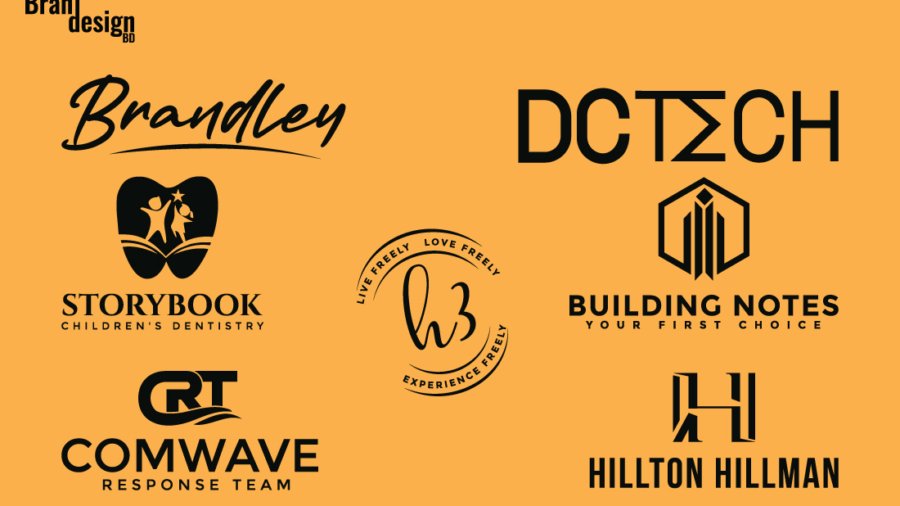
1. Word mark

This is a type of logo mark that highlights the name or a portion of the name of a company. The best word mark indicates the legible word(s) with distinctive font characteristics and may integrate abstract elements or pictorial elements. This type of logo is highly used for a new company/business formation.

Word Mark

2. Letter mark

This is a type of logo mark that only highlights the initial letter of the company/business name. The letter is always a unique and proprietary design that consists of significant personality and meaning. This type of logo is highly used for branding a company/business.

Letter Mark

3. Pictorial mark

This is a type of logo mark that symbolizes an icon or recognizable image that is related to its company/business name, vision, or mission. This type of logo is highly used for a company/business that is already established or in a maturity stage.

Pictorial Mark

4. Abstract mark

This is a type of logo mark that uses visual form to convey a big idea or hidden meaning. This mark, by its nature, can provide strategic ambiguity, and work effectively for large companies and especially effective for service-based and technology companies.

Abstract Mark

5. Combination mark

A combination mark is a logo mark that is a combination of a letter mark and an icon /abstract/ Pictorial mark. This type of logo is highly used for a company that is in a growth stage.

Combination Mark

6. Signature mark

A signature logo is a company logo made up primarily of the name of the brand written in cursive hand lettering or calligraphy-style typography. This is especially true if you have a new business and want to make yourself known. It should be noted that this type of logo is better suited for companies that have relatively short names.

Signature Mark

7. Emblem

An emblem is a trademark featuring a shape that is connected to the name of the organization and consists of a font inside a symbol that thinks badges, seals, and crests. The elements are never isolated. Emblems look terrific on a label, package, as a sign, or as an embroidered patch on a uniform. This is especially true if you have a new business and is especially effective for label and packaging companies.

Emblem Mark

With the above logotypes, each with its unique characteristics and uses. Whether a brand chooses a word mark, letter mark, Pictorial, emblem, abstract, signature, or combination logo depends on various factors, such as the brand’s name, message, target audience, and industry. However, the most important aspect of any logo is that it effectively communicates the brand’s identity and values to its customers and helps build recognition and loyalty over time.


Read More

Search

Untitled-1-01Untitled-1-01

brandesignbd

Graphic Design Service Provider

Visit Link

  • Privacy Policy
  • Terms and condition

Company

  • Home
  • Our Services
  • portfolio
  • Contact Us

Contact

  • brandesignbd27@gmail.com
  • brandesignbd27@gmail.com

Address

Narayanganj,

Dhaka, Bangladesh

1400

Linkedin-in Pinterest Facebook-f Instagram Behance
Copyright ©brandesignbd. All Rights Reserved.
Shopping Basket