Untitled-1-01Untitled-1-01

brandesignbd

Graphic Design Service Provider

  • Home
  • About Us
  • Our Services
  • portfolio
  • Contact Us
  • Blog
Get Started

Home » minimalist logo design

Posts tagged: minimalist logo design

Modern Abstract M Letterform & Infinity Loop Logo Design

Modern Abstract M Letterform & Infinity Loop Logo Design

October 29, 2026
by badhan666@@ Graphic design
Modern Abstract M Letterform & Infinity Loop Logo Design

Explore the Modern Abstract M Letterform and Infinity Loop Logo Design, featuring bold geometric shapes, flowing curves, and creative negative space for a distinctive brand identity.

Introduction

A memorable logo combines simplicity, meaning, and visual appeal to help a brand stand out. The Modern Abstract M Letterform & Infinity Loop Logo Design brings these qualities together through a bold letterform, a flowing infinity-inspired symbol, and carefully balanced negative space. The result is a contemporary logo concept that connects geometric structure with continuous movement.

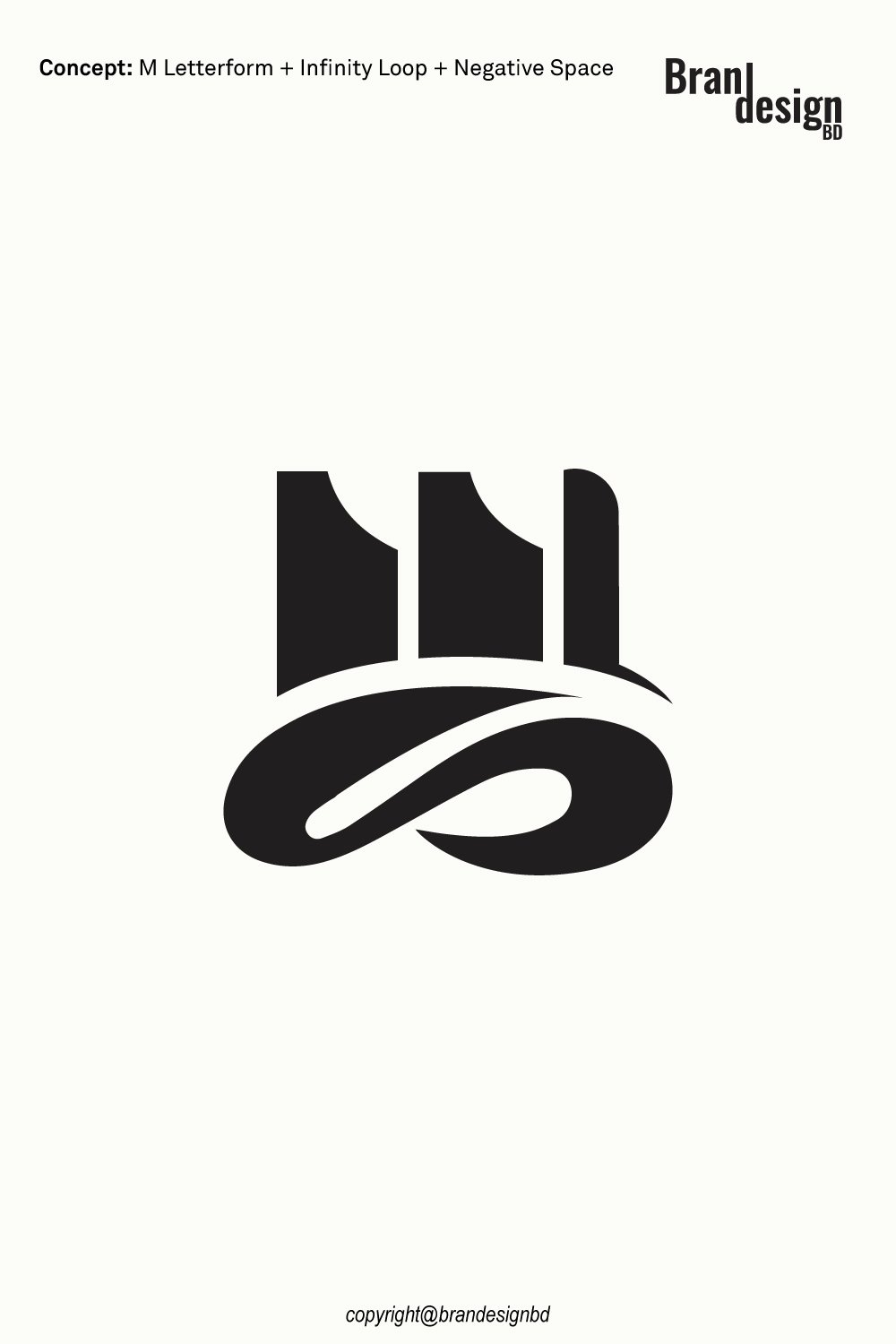
The design features an abstract M created from strong vertical shapes and curved cutouts. Beneath it, a flowing loop adds a sense of continuity, connection, and balance. The contrast between the structured upper symbol and the fluid lower element creates an interesting visual relationship that makes the logo distinctive and easy to recognize.

This minimalist concept can suit businesses seeking a professional identity with a modern appearance. From technology companies and creative agencies to consulting firms and lifestyle brands, the design offers a flexible foundation for a visual identity that can grow with the business.

Overview of the Modern Abstract M Letterform & Infinity Loop Logo

A Bold Abstract M Letterform

Geometric Structure + Distinctive Letterform

The upper portion of the logo uses bold, vertical forms to create an abstract interpretation of the letter M. Rather than relying on a conventional font, the letterform is constructed from simplified shapes and carefully considered curves.

This approach gives the symbol a strong visual presence while keeping the design minimal. The letter M can represent a business name, founder’s initial, product line, or another meaningful part of the brand identity.

An Infinity-Inspired Loop

Continuous Movement + Connection

The lower portion features a smooth, flowing loop inspired by the infinity symbol. Its continuous form introduces movement and contrasts with the more structured upper letterform.

An infinity-inspired shape can suggest continuity, long-term commitment, connection, and ongoing progress. These associations make it an appealing visual element for brands that value lasting relationships, innovation, or sustainable growth.

Flowing Negative Space

Hidden Balance + Visual Simplicity

Negative space is the area surrounding or separating visible shapes. In a thoughtfully designed logo, this space can help define the symbol, improve readability, and create a more engaging composition.

The flowing loop and the gaps within the abstract M work together to establish visual balance. This use of space helps the logo communicate its idea without relying on unnecessary decorative elements.

The Meaning Behind the Logo Elements

The Letter M

Identity + Ambition + Recognition

A custom lettermark can provide a direct connection to a company’s name or initials. By transforming the letter M into a distinctive geometric symbol, the logo creates a visual identity that can be recognized independently of a full wordmark.

Depending on the brand’s story, the letter can represent ambition, modern thinking, craftsmanship, or a commitment to quality. Its precise meaning will depend on the business using it.

The Infinity Loop

Continuity + Trust + Long-Term Vision

The infinity-inspired loop adds a symbolic dimension to the design. Its continuous path can represent enduring relationships, ongoing development, and a commitment to progress.

For service-based businesses, it may suggest long-term client partnerships. For technology companies, it can support ideas of continuous improvement. For lifestyle brands, it may represent lasting value and connection.

The Combination of Structure and Flow

Stability Meets Flexibility

The abstract M provides structure, while the loop introduces movement. This contrast creates a balanced composition that feels both stable and dynamic.

The relationship between these elements can communicate a brand that combines dependable service with fresh ideas. It offers a visual starting point for businesses that want to appear professional without feeling overly traditional.
Asking Price $500

For logo purchase or negotiation, please contact agency@brandesignbd.com

Logo Sale, Handover & NDA Information

All project handover agreements, ownership documentation, Non-Disclosure Agreement (NDA), and related communication will be handled through the email address provided above.
Once the logo is purchased, we will update the listing status to “Sold” and, upon request, add the buyer’s website or preferred address to the listing as confirmation of the sale. All necessary final files, ownership documentation, and agreed-upon project materials will be provided to the buyer after the purchase is completed.

Design Style and Visual Appeal

Minimalist Black-and-White Design

Bold Contrast + Timeless Simplicity

The logo’s black symbol against a light background creates a clear, high-contrast appearance. This treatment keeps attention on the letterform and loop rather than on color effects or decorative details.

A monochrome design also provides a practical foundation for branding. Additional colors can be introduced later to suit the company’s personality, industry, and audience while preserving the original symbol.

Geometric Shapes and Smooth Curves

A Balanced Visual Language

The upper M uses strong geometric shapes, while the lower infinity-inspired form relies on smooth curves. This combination creates visual contrast without making the design feel disconnected.

The geometric structure supports a sense of precision and order. The curved loop softens the composition and adds a feeling of movement, giving the logo a distinctive contemporary character.

Strong Silhouette and Recognition

A Compact, Memorable Symbol

A logo should remain recognizable across different sizes and applications. The compact composition of the M and infinity loop helps create a unified symbol that can work on websites, business cards, packaging, and promotional materials.

The smaller details should still be tested at reduced sizes. Proper spacing between the letterform and loop helps prevent the design from becoming crowded when reproduced on small surfaces.

Suitable Industries and Brand Applications

The abstract M and infinity concept is flexible enough to support several types of businesses. The most suitable industry will depend on the brand’s name, positioning, and target audience.

Technology and Software Companies

Innovation + Continuous Development

Technology companies, software developers, IT service providers, and digital platforms often need a clean identity that works across websites, applications, and digital products.

The abstract M can provide a recognizable brand mark, while the infinity loop can support ideas of ongoing development and connected systems. The design may work on application icons, dashboards, websites, presentations, and digital advertisements.

Consulting and Professional Services

Trust + Long-Term Partnerships

Consulting firms, business advisors, financial service providers, and professional agencies often build their reputations through trust and lasting client relationships.

The infinity-inspired loop may help communicate continuity, while the bold lettermark provides a clear brand signature. Combined with professional typography, the logo can support a consistent identity across proposals, business documents, and corporate websites.

Creative Agencies and Design Studios

Original Thinking + Creative Connection

Creative studios, marketing agencies, branding specialists, and production companies can benefit from a logo that feels distinctive without becoming complicated.

The abstract geometry offers an opportunity to build a modern visual system around the symbol. It can be used across portfolio websites, presentations, social media profiles, and promotional materials.

Education and Learning Platforms

Continuous Learning + Growth

Educational institutions, online learning platforms, coaching services, and professional training businesses may find the infinity concept relevant to their message.

The loop can represent ongoing learning and development, while the letter M can connect the logo to the organization’s name. A clear typeface and accessible color palette would help complete the identity.

Wellness and Lifestyle Brands

Balance + Connection + Continuity

Selected wellness, lifestyle, and personal development brands may appreciate the smooth curves and balanced composition.

The infinity-inspired form can support a message of ongoing growth or connection, while the abstract M provides a distinctive visual anchor. The final identity should use appropriate typography and colors to match the brand’s audience and values.

Retail and Consumer Product Brands

A Distinctive Mark Across Products

Retail businesses and consumer brands often need a logo that can be reproduced consistently on packaging, labels, tags, and online stores.

The compact design can work as a primary brand mark or a supporting symbol. Before production, the artwork should be tested at the intended size to ensure the loop and negative-space details remain clear.

Originality and Copyright Verification

Originality is an important part of professional logo development. A logo should not simply imitate an existing identity or use another company’s protected artwork.

Yandex Image Search

Reviewing visual similarities

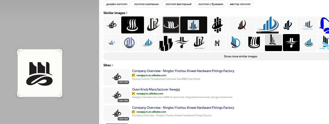
Yandex can be used as one part of a broader visual similarity review. Image search can help identify visually similar marks, concepts, or existing artwork that may appear online.

This type of search is useful during the design review process because it provides another opportunity to identify potential visual similarities before final delivery.
TinEye Reverse Image Search

Checking for matching or reused imagery

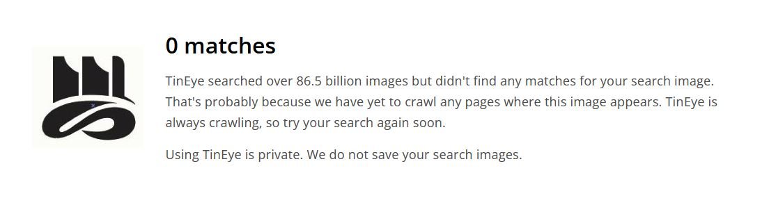
TinEye is another reverse-image search resource that can help investigate whether a similar image or graphic appears elsewhere online.

For logo development, reverse-image searches can support an originality review, particularly when the designer wants to check whether a visual element resembles existing online artwork.
Non-Disclosure and Logo Handover Agreement

Professional logo projects may involve confidential business information. A client may share a company name, product concept, launch plan, marketing strategy, packaging information, or other materials that are not yet publicly available.

Clear communication about confidentiality, ownership, and final deliverables can help establish expectations between the designer and buyer.

Non-Disclosure Agreement

Protecting confidential client information

A non-disclosure agreement, commonly called an NDA, can establish clear expectations regarding confidential information.

Depending on the agreement, the designer may be required to keep private materials confidential and avoid sharing unreleased brand information, business documents, product concepts, or other protected project details without permission.

An NDA should clearly define what information is confidential, how that information may be used, and what responsibilities apply after the project ends.

Logo Handover Agreement

Defining final ownership and deliverables

A logo handover agreement can clarify what the buyer receives after the purchase and completion of the project.

A professional handover may include the final logo files, editable vector artwork, approved variations, color versions, and other agreed project materials.

The agreement should also state when ownership or usage rights transfer to the buyer. Depending on the project terms, this may occur after final payment has been received.

Final File Delivery

Providing practical brand assets

A complete logo package may include formats such as AI, EPS, SVG, PDF, and high-resolution PNG files when these are included within the agreed scope.

Vector formats are particularly useful because they allow the logo to be resized for both small and large application.

The Modern Abstract M Letterform & Infinity Loop Logo Design combines bold geometric structure with smooth, continuous movement. The abstract M creates a recognizable brand anchor, while the infinity-inspired loop introduces ideas of connection, continuity, and long-term progress.

Its minimalist silhouette can support a range of potential applications, including technology, consulting, creative services, education, lifestyle, and consumer products. The most effective use will depend on how well the symbol fits the business’s identity and audience.

With complementary typography, a thoughtful color palette, and professionally prepared vector files, this logo concept can become the foundation of a consistent visual identity across digital platforms, packaging, print materials, and merchandise.

For inquiries about purchasing this logo concept or discussing its availability, please contact support@brandesignbd.com.

Also, check the recent article about the Creative Doorway and Ocean Wave Loop Logo Concept here

Read More
Creative-Flame-and-Skull-Antler-Logo-Concept

Modern Abstract S and C Letterform Logo Design

October 28, 2026
by badhan666@@ Graphic design

Discover the modern abstract S and C letterform logo design, featuring flowing shapes, a circular element, and minimalist geometry for a distinctive brand identity.

Introduction

A strong logo helps a business create a memorable first impression. It communicates the brand’s personality through shapes, typography, and visual balance. The Modern Abstract S and C Letterform Logo Design combines creative letterforms with minimalist geometry to create a distinctive and versatile brand symbol.

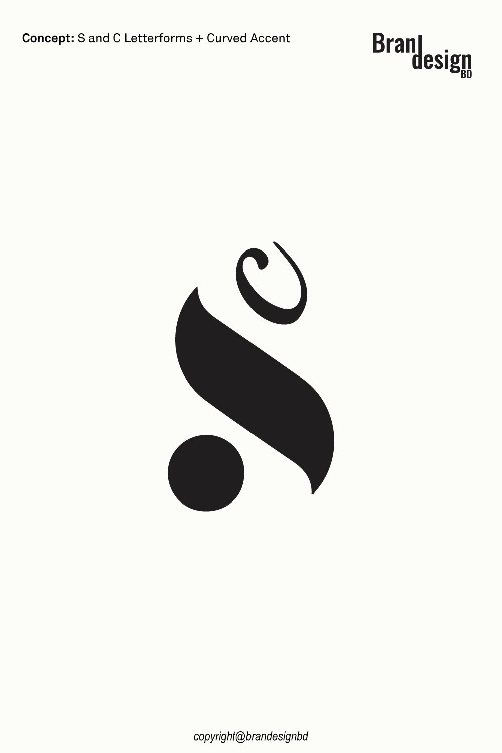
This logo concept brings together the letters S and C in an abstract visual composition. The flowing central shape creates a sense of movement, while the separate circular dot adds balance and visual interest. A smaller curved accent completes the design, giving the symbol an elegant appearance without adding unnecessary details.

Designed with simplicity and flexibility in mind, this logo can suit businesses that want a contemporary visual identity. Its bold black silhouette and clean negative space make it suitable for digital platforms, printed materials, packaging, and other brand applications.

Overview of the Modern Abstract S and C Letterform Logo

A Creative Combination of Two Letters

S and C Letterforms

The main concept focuses on combining the letters S and C into a single abstract symbol. Instead of displaying both letters in a traditional typographic style, the design uses flowing curves and simplified shapes to create a more artistic interpretation.

This approach gives the logo a unique appearance while maintaining a connection to its letterform foundation. It can represent a business name, founder’s initials, or a brand built around the letters S and C.

A Minimalist Visual Structure

Simple Shapes with Strong Recognition

The logo uses a limited number of solid shapes to create a clear visual identity. The bold central form attracts attention, while the circular dot and curved accent help establish the overall composition.

The minimalist structure allows the symbol to remain visually effective without relying on complex illustrations, gradients, or decorative elements. This simplicity also makes the logo easier to adapt to different branding materials.

The Meaning Behind the Logo Elements

The Abstract S and C Symbol

Creativity, Connection, and Individuality

The abstract letterforms can communicate creativity, collaboration, and a distinctive brand personality. Their flowing appearance gives the design a sense of continuity, while the combined initials create an opportunity for a recognizable custom monogram.

Depending on the company’s industry and brand story, the symbol can represent innovation, personal identity, modern thinking, or the connection between different ideas.

The Circular Dot

Balance, Focus, and Simplicity

The circular dot provides a visual counterpoint to the larger flowing shape. Its rounded form creates contrast with the central symbol and helps balance the overall composition.

A circle can also suggest unity, completeness, or a central point of focus. These associations can support a brand story, although the precise meaning will depend on how the business uses the logo.

The Curved Accent

Elegance and Dynamic Movement

The smaller curved element above the central shape adds a distinctive detail. Its smooth form complements the main lettermark and reinforces the logo’s abstract character.

This accent also helps distinguish the design from a conventional monogram. Together, the three visual components create a compact symbol with a recognizable silhouette.

Modern Abstract S and C Letterform Logo Design
Asking Price $500

For logo purchase or negotiation, please contact agency@brandesignbd.com

Logo Sale, Handover & NDA Information

All project handover agreements, ownership documentation, Non-Disclosure Agreement (NDA), and related communication will be handled through the email address provided above.
Once the logo is purchased, we will update the listing status to “Sold” and, upon request, add the buyer’s website or preferred address to the listing as confirmation of the sale. All necessary final files, ownership documentation, and agreed-upon project materials will be provided to the buyer after the purchase is completed.

Potential Applications for the Logo

The Abstract A Letter & Geometric Circle Brand Logo Design Concept can be adapted for businesses across several industries. Its suitability depends on the brand name, target audience, services, and desired personality.

Creative Agencies and Branding Studios

Expressing originality through simple forms

Creative businesses often need a distinctive identity that communicates design thinking without becoming overly complicated.

An abstract lettermark can provide a recognizable foundation, while the geometric circle introduces a visual element that can be developed into a broader brand system.

The concept may suit graphic design studios, branding agencies, advertising firms, digital creative teams, and independent designers.

It can be used on portfolio websites, presentations, stationery, social media profiles, and promotional materials.

Fashion and Lifestyle Brands

Creating a clean and memorable signature

A minimalist lettermark can work well for fashion labels, accessories businesses, lifestyle products, and selected premium brands.

The A can serve as a recognizable initial, while the circular element adds balance and visual refinement.

The logo can be adapted for clothing labels, hangtags, packaging boxes, shopping bags, product cards, and online stores.

For small product applications, the final artwork should be tested to ensure that the letter and geometric details remain recognizable.

Corporate and Consulting Businesses

Communicating confidence and consistency

Professional service businesses often need an identity that looks organized, modern, and adaptable.

The abstract A can provide a direct connection to the business name, while the circle may suggest unity, continuity, and a structured approach.

The concept can suit consulting firms, management services, financial businesses, professional agencies, and corporate organizations whose names connect with the letter A.

It can be used on company websites, proposals, reports, business cards, letterheads, and presentations.

Originality and Copyright Verification

Originality is an important part of professional logo development. A logo should not simply imitate an existing identity or use another company’s protected artwork.

Yandex Image Search

Reviewing visual similarities

Yandex can be used as one part of a broader visual similarity review. Image search can help identify visually similar marks, concepts, or existing artwork that may appear online.

This type of search is useful during the design review process because it provides another opportunity to identify potential visual similarities before final delivery.

TinEye Reverse Image Search

Checking for matching or reused imagery

TinEye is another reverse-image search resource that can help investigate whether a similar image or graphic appears elsewhere online.

For logo development, reverse-image searches can support an originality review, particularly when the designer wants to check whether a visual element resembles existing online artwork.

Non-Disclosure and Logo Handover Agreement

Professional logo projects may involve confidential business information. A client may share a company name, product concept, launch plan, marketing strategy, packaging information, or other materials that are not yet publicly available.

Clear communication about confidentiality, ownership, and final deliverables can help establish expectations between the designer and buyer.

Non-Disclosure Agreement

Protecting confidential client information

A non-disclosure agreement, commonly called an NDA, can establish clear expectations regarding confidential information.

Depending on the agreement, the designer may be required to keep private materials confidential and avoid sharing unreleased brand information, business documents, product concepts, or other protected project details without permission.

An NDA should clearly define what information is confidential, how that information may be used, and what responsibilities apply after the project ends.

Logo Handover Agreement

Defining final ownership and deliverables

A logo handover agreement can clarify what the buyer receives after the purchase and completion of the project.

A professional handover may include the final logo files, editable vector artwork, approved variations, color versions, and other agreed project materials.

The agreement should also state when ownership or usage rights transfer to the buyer. Depending on the project terms, this may occur after final payment has been received.

Final File Delivery

Providing practical brand assets

A complete logo package may include formats such as AI, EPS, SVG, PDF, and high-resolution PNG files when these are included within the agreed scope.

Vector formats are particularly useful because they allow the logo to be resized for both small and large application.

Final Thoughts

The Modern Abstract S and C Letterform Logo Design combines flowing letterforms, a bold central shape, a circular dot, and a curved accent to create a distinctive minimalist symbol.

Its monochrome style, compact composition, and abstract character offer flexibility for a variety of potential brand identities. From creative studios and fashion labels to technology businesses and professional services, the design can provide a starting point for a consistent visual identity.

The best results come from pairing the logo with suitable typography, thoughtful color choices, and consistent usage guidelines. Careful preparation of vector files and appropriate originality checks can further support its professional use.

Also, check the recent article about the Creative Doorway and Ocean Wave Loop Logo Concept here

Read More
Abstract-A-Letter-&-Geometric-Circle-Brand-Logo-Design-Concept

Abstract A Letter & Geometric Circle Brand Logo Design Concept

October 24, 2026
by badhan666@@ Graphic design

Explore the Abstract A Letter & Geometric Circle Brand Logo Design Concept, combining a stylized letter A with geometric circular elements to create a modern, minimalist, and memorable brand identity.

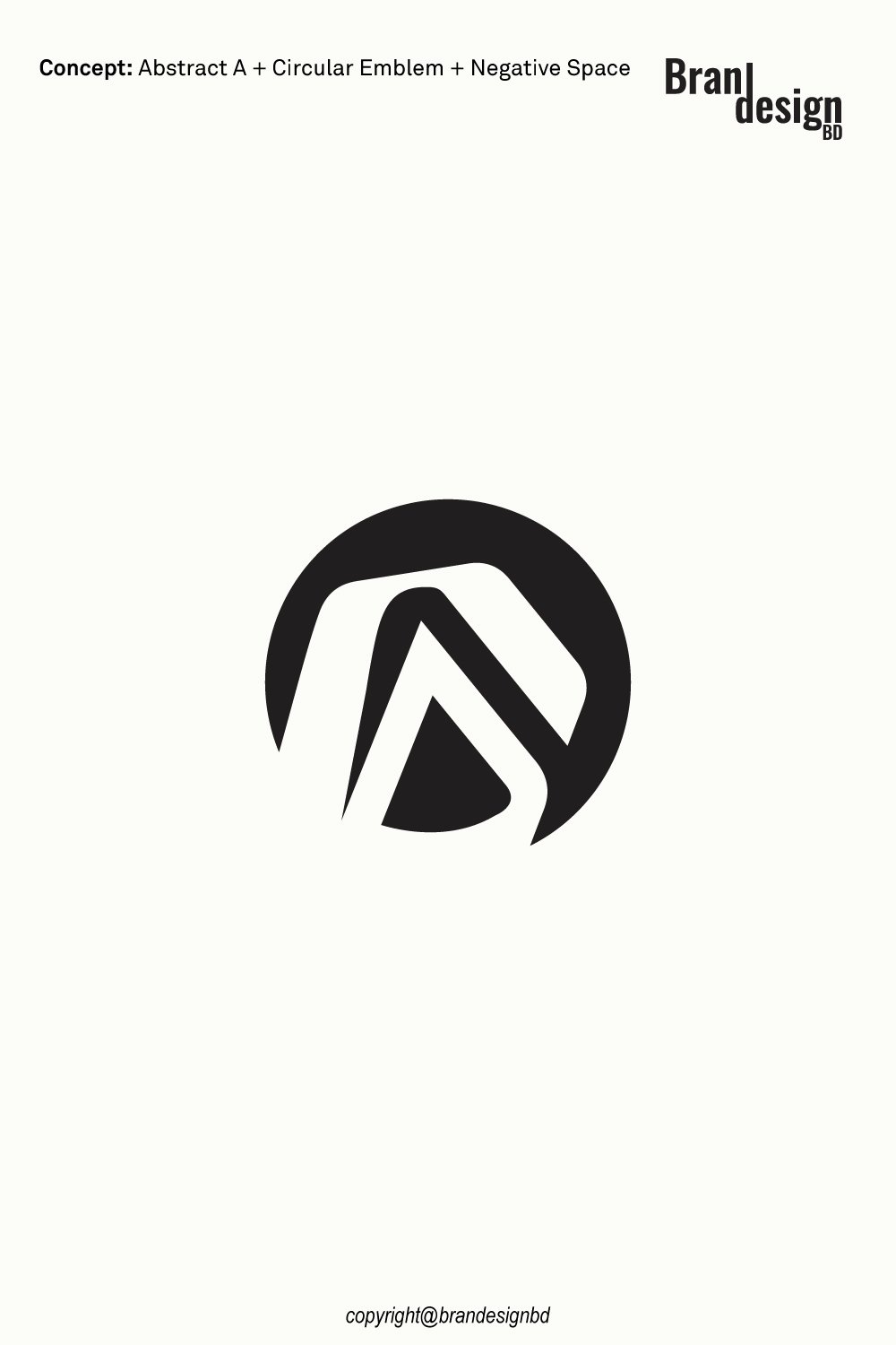
A distinctive logo can transform a simple letter into a memorable brand symbol. The Abstract A Letter & Geometric Circle Brand Logo Design Concept combines the recognizable structure of the letter A with geometric circular elements to create a modern and versatile visual identity. This design approach balances strong shapes with smooth curves, giving the logo a clean appearance and a distinctive character.

The letter A provides the foundation of the concept, representing the initial of a company name, founder’s name, product, or personal brand. The geometric circle introduces a sense of unity, balance, continuity, and connection. Together, these elements can create a visual identity that communicates stability while maintaining a contemporary and creative appearance.

Abstract lettermarks are especially useful for businesses that want a recognizable symbol without relying on a detailed illustration. By combining typography-inspired shapes with geometric structure, this logo concept can be adapted for technology companies, architecture studios, creative agencies, consulting firms, fashion brands, and modern corporate identities.

The minimalist design also offers flexibility across digital and print applications, including websites, business cards, product packaging, stationery, signage, and promotional materials.

The Concept Behind the Logo

A successful logo begins with a clear visual idea. This concept explores how a familiar letter and a simple geometric shape can work together to create a distinctive brand identity.

The Abstract Letter A

Representing identity and ambition

The letter A serves as the primary identifying element of the logo. Its angular structure can communicate strength, direction, confidence, and forward thinking.

Rather than presenting the letter as ordinary typography, an abstract treatment allows its shape to become part of a larger visual symbol. This approach can make the design more distinctive while maintaining a connection to the brand’s name.

The letter can represent a company, founder, product line, or personal identity. Its simplified form also provides flexibility when the logo is used independently of the full business name.

The Geometric Circle

A symbol of unity and continuity

The circle is a fundamental geometric shape associated with unity, balance, connection, and continuity. Its smooth outline can soften the sharper angles of the letter A and create a more balanced composition.

In branding, circular forms can suggest completeness and consistency. They can also help organize the visual elements into a unified symbol.

When incorporated into an abstract lettermark, the circle introduces contrast between curved and angular shapes. This combination creates visual interest without requiring unnecessary decoration.

The Combination of Letter and Circle

Turning simple shapes into a unified identity

The central idea is to combine the letter A and the geometric circle so they function as one visual mark. The letter provides a recognizable initial, while the circular element adds structure and balance.

This relationship can help the logo feel both personal and geometric. Instead of using a separate letter and decorative symbol, the design brings them together within one composition.

The result is a flexible logo concept that can support different brand applications while maintaining a consistent visual identity.

Minimalism and Negative Space

Creating clarity through simplicity

Minimalist logo design often relies on a small number of carefully arranged shapes. Negative space, or the open area surrounding and between solid forms, can help define the symbol and improve visual clarity.

In an abstract A and circle logo, these open areas can separate the letter from the surrounding geometry or help the elements appear connected.

A well-balanced design should remain recognizable at different sizes. Testing the final artwork at small dimensions can help ensure that the letterform and circular elements remain distinct.

Why Choose an Abstract A Letter and Circle Logo?

A professional logo should reflect a brand’s personality while remaining practical and recognizable. Combining a lettermark with geometric structure offers several advantages for businesses seeking a modern identity.

A Modern and Professional Appearance

Combining geometric precision with creative design

The angular letter A provides a strong visual foundation, while the circular element introduces smoothness and balance.

This combination can create a contemporary appearance suitable for businesses that want a clean and professional brand image.

The restrained design also allows the logo to work alongside different typefaces, colors, and supporting graphic elements.

Strong Brand Recognition

Building a recognizable visual signature

An abstract lettermark can connect a brand directly to its name or initials. When used consistently, the symbol can become a recognizable identifier across different platforms.

The standalone mark can appear on social media profiles, website headers, product labels, and business cards. A complete version with the company name can provide additional clarity when introducing the brand to new audiences.

A Versatile Geometric Style

Supporting different brand applications

Geometric logos can be adapted to a wide range of digital and physical materials. The combination of angular and circular shapes offers a useful foundation for monochrome and color variations.

The final design should be tested on light and dark backgrounds and at different sizes to ensure that its overall silhouette remains clear.

Abstract A Letter & Geometric Circle Logo
Asking Price $500

For logo purchase or negotiation, please contact agency@brandesignbd.com

Logo Sale, Handover & NDA Information

All project handover agreements, ownership documentation, Non-Disclosure Agreement (NDA), and related communication will be handled through the email address provided above.
Once the logo is purchased, we will update the listing status to “Sold” and, upon request, add the buyer’s website or preferred address to the listing as confirmation of the sale. All necessary final files, ownership documentation, and agreed-upon project materials will be provided to the buyer after the purchase is completed.

Potential Applications for the Logo

The Abstract A Letter & Geometric Circle Brand Logo Design Concept can be adapted for businesses across several industries. Its suitability depends on the brand name, target audience, services, and desired personality.

Technology and Digital Businesses

Representing innovation and connected systems

Technology companies often need a clean identity that works across digital interfaces and professional communication.

The abstract A can represent a company or product name, while the geometric circle can suggest connection, integration, and continuity.

The concept may suit software companies, technology startups, digital service providers, IT consultancies, and businesses developing modern digital products.

The logo can be used on websites, application interfaces, software dashboards, presentations, digital advertisements, and social media profiles.

Architecture and Interior Design

Connecting structure with visual balance

The angular structure of the letter A can create an architectural impression, while the circle introduces a softer geometric element.

This combination may suit architecture studios, interior designers, property developers, construction consultancies, and creative design firms.

The logo can appear on project presentations, building signage, business cards, design portfolios, client proposals, and company websites.

Creative Agencies and Branding Studios

Expressing originality through simple forms

Creative businesses often need a distinctive identity that communicates design thinking without becoming overly complicated.

An abstract lettermark can provide a recognizable foundation, while the geometric circle introduces a visual element that can be developed into a broader brand system.

The concept may suit graphic design studios, branding agencies, advertising firms, digital creative teams, and independent designers.

It can be used on portfolio websites, presentations, stationery, social media profiles, and promotional materials.

Fashion and Lifestyle Brands

Creating a clean and memorable signature

A minimalist lettermark can work well for fashion labels, accessories businesses, lifestyle products, and selected premium brands.

The A can serve as a recognizable initial, while the circular element adds balance and visual refinement.

The logo can be adapted for clothing labels, hangtags, packaging boxes, shopping bags, product cards, and online stores.

For small product applications, the final artwork should be tested to ensure that the letter and geometric details remain recognizable.

Corporate and Consulting Businesses

Communicating confidence and consistency

Professional service businesses often need an identity that looks organized, modern, and adaptable.

The abstract A can provide a direct connection to the business name, while the circle may suggest unity, continuity, and a structured approach.

The concept can suit consulting firms, management services, financial businesses, professional agencies, and corporate organizations whose names connect with the letter A.

It can be used on company websites, proposals, reports, business cards, letterheads, and presentations.

Education and Knowledge-Based Brands

Representing learning and development

The letter A and geometric circle combination can also suit educational services, training providers, learning platforms, and knowledge-based businesses.

The letter can represent the organization’s name, while the circle can suggest completeness, connection, and ongoing development.

The logo can be used on learning portals, course materials, certificates, educational websites, stationery, and promotional resources.

Originality and Copyright Verification

Originality is an important part of professional logo development. A logo should not simply imitate an existing identity or use another company’s protected artwork.

Yandex Image Search

Reviewing visual similarities

Yandex can be used as one part of a broader visual similarity review. Image search can help identify visually similar marks, concepts, or existing artwork that may appear online.

This type of search is useful during the design review process because it provides another opportunity to identify potential visual similarities before final delivery.

TinEye Reverse Image Search

Checking for matching or reused imagery

TinEye is another reverse-image search resource that can help investigate whether a similar image or graphic appears elsewhere online.

For logo development, reverse-image searches can support an originality review, particularly when the designer wants to check whether a visual element resembles existing online artwork.

Non-Disclosure and Logo Handover Agreement

Professional logo projects may involve confidential business information. A client may share a company name, product concept, launch plan, marketing strategy, packaging information, or other materials that are not yet publicly available.

Clear communication about confidentiality, ownership, and final deliverables can help establish expectations between the designer and buyer.

Non-Disclosure Agreement

Protecting confidential client information

A non-disclosure agreement, commonly called an NDA, can establish clear expectations regarding confidential information.

Depending on the agreement, the designer may be required to keep private materials confidential and avoid sharing unreleased brand information, business documents, product concepts, or other protected project details without permission.

An NDA should clearly define what information is confidential, how that information may be used, and what responsibilities apply after the project ends.

Logo Handover Agreement

Defining final ownership and deliverables

A logo handover agreement can clarify what the buyer receives after the purchase and completion of the project.

A professional handover may include the final logo files, editable vector artwork, approved variations, color versions, and other agreed project materials.

The agreement should also state when ownership or usage rights transfer to the buyer. Depending on the project terms, this may occur after final payment has been received.

Final File Delivery

Providing practical brand assets

A complete logo package may include formats such as AI, EPS, SVG, PDF, and high-resolution PNG files when these are included within the agreed scope.

Vector formats are particularly useful because they allow the logo to be resized for both small and large application.

Final Thoughts on the Abstract A Letter & Geometric Circle Logo

The Abstract A Letter & Geometric Circle Brand Logo Design Concept combines a recognizable letterform with geometric circular elements to create a clean and modern visual identity.

The letter A provides a connection to the brand name, while the circle introduces balance, unity, and continuity. Their combination offers a versatile foundation for technology companies, architecture studios, creative agencies, fashion labels, consulting firms, and other businesses seeking a minimalist identity.

With properly prepared vector files and clear handover terms, the logo can support consistent branding across websites, business cards, packaging, signage, and promotional materials.

Before commercial use or trademark registration, buyers should complete appropriate visual and legal checks for their market. Image-search resources can support the design review, while formal legal questions may require professional guidance.

A successful lettermark should do more than combine a letter and a geometric shape. It should communicate the brand’s identity, remain recognizable across different formats, and provide a practical foundation for long-term brand communication.

Also, check the recent article about the Creative Doorway and Ocean Wave Loop Logo Concept here

Read More
Modern Custom Circular CG and Medical Cross Logo Concept

Modern Custom Circular CG and Medical Cross Logo Concept

October 11, 2026
by badhan666@@ Graphic design
Modern Custom Circular CG and Medical Cross Logo Concept

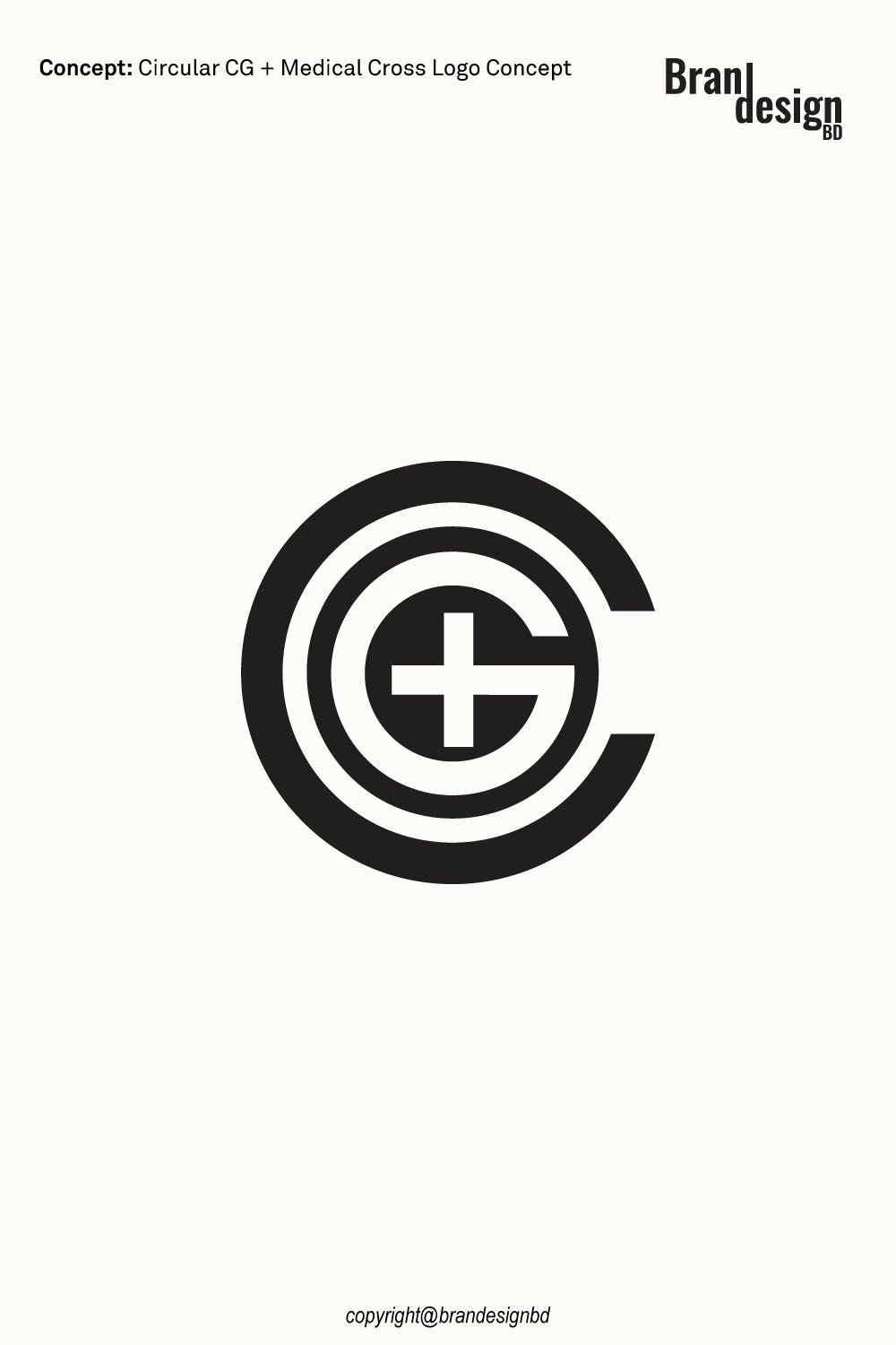
A memorable logo can communicate trust, care, and professionalism through a simple visual design. The Modern Custom Circular CG and Medical Cross Logo Concept combines a circular CG monogram with a medical cross to create a clean, balanced, and meaningful brand symbol. Its geometric structure gives the logo a modern appearance while keeping the central design easy to recognize.

The logo brings together the letters C and G within a series of circular shapes, with a plus sign positioned at the center. The circular forms can represent unity, continuity, protection, and connection, while the medical cross suggests care, support, health, and wellness. Together, these elements create a distinctive identity that connects letter-based branding with healthcare symbolism.

This custom logo concept can work well for medical clinics, healthcare providers, pharmacies, wellness centers, medical technology companies, health consulting firms, and other businesses that want a professional visual identity. Its minimalist black-and-white design also makes it adaptable to websites, social media, business cards, signage, documents, and other brand materials.

The Concept Behind the Logo

Concept: Circular C + Letter G + Plus Sign

A strong logo starts with a clear idea. This design uses simple geometric shapes and recognizable symbols to communicate several related brand values without adding unnecessary detail.

The Circular CG Monogram

A personalized symbol of identity

The letters C and G form the main foundation of the logo. Combining these letters within a circular structure creates a compact monogram that can represent a company name, founder’s initials, or another meaningful brand connection.

The overlapping circular forms give the symbol a unified appearance. They also create visual depth while maintaining a clean, organized structure.

The Medical Cross

A symbol of care and support

The central plus sign provides the healthcare connection. It can suggest medical assistance, patient support, wellness, and professional care.

Combined with the CG monogram, the cross helps establish a clear visual direction for businesses working in healthcare or related services. It also creates a recognizable focal point within the circular design.

The Circular Structure

Representing unity and continuity

The rounded shapes create a sense of movement and balance. Circles are often used in branding to suggest unity, connection, completeness, and continuity.

In this concept, the circular arrangement brings the initials and medical cross together into one visual mark. This helps the logo feel cohesive rather than like a collection of separate symbols.

Modern Custom Circular CG and Medical Cross Logo Concept
Asking Price $500

For logo purchase or negotiation, please contact support@brandesignbd.com.

Logo Sale, Handover & NDA Information

All project handover agreements, ownership documentation, Non-Disclosure Agreement (NDA), and related communication will be handled through the email address provided above.
Once the logo is purchased, we will update the listing status to “Sold” and, upon request, add the buyer’s website or preferred address to the listing as confirmation of the sale. All necessary final files, ownership documentation, and agreed-upon project materials will be provided to the buyer after the purchase is completed.

Why Choose a Circular CG and Medical Cross Logo?

A logo should be more than an attractive graphic. It should also reflect a brand’s values and work well across different platforms.

A Modern and Professional Appearance

Building a consistent brand image

The geometric structure gives the logo a modern look without relying on complicated illustrations. Its balanced composition can support a professional brand presentation across digital and print materials.

This approach can be useful for businesses that want an identity that feels organized, clear, and dependable.

Meaningful Visual Elements

Combining initials with healthcare symbolism

The CG monogram adds a personalized element, while the medical cross communicates the intended healthcare connection.

Together, these features give the design a clear purpose and make it easier to adapt to a specific business name or service category.

A Clean Black-and-White Style

Keeping the logo simple and versatile

The monochrome design places attention on the shape, contrast, and structure of the symbol. It can also provide a useful foundation for later color variations.

A black-and-white logo can be practical for documents, stamps, forms, basic stationery, and other applications where one-color reproduction is preferred.

Potential Applications for the Logo

The Modern Custom Circular CG and Medical Cross Logo Concept can suit several healthcare and service-related industries. Its final use should reflect the buyer’s business name, services, and branding needs.

Medical Clinics and Healthcare Providers

Communicating care and professionalism

The medical cross and circular monogram can work for clinics, healthcare practices, patient support services, and selected medical organizations.

The logo can be used on appointment cards, patient documents, office signage, websites, and other business materials.

Pharmacies and Wellness Centers

Creating a recognizable health-related identity

The cross symbol can help communicate a connection with health and wellness. When combined with the CG monogram, it offers a way to create a more personalized visual identity for a pharmacy or wellness business.

The design can also be adapted for product information sheets, promotional materials, packaging, and digital platforms.

Healthcare Technology Companies

Connecting innovation with care

Healthcare technology companies often need an identity that feels modern while remaining approachable. The geometric circles can suggest connection and integrated systems, while the cross provides an immediate healthcare association.

This makes the concept worth considering for selected health technology, medical software, digital health, and patient-service businesses.

Consulting and Professional Services

Using the CG monogram as a brand identifier

The initials can also support a company whose name includes C and G but operates in a related professional service category.

For these applications, the medical cross should be retained only when it accurately reflects the business and its services.

Originality and Copyright Verification

Originality is an important part of professional logo development. A logo should not simply imitate an existing identity or use another company’s protected artwork.

Yandex Image Search

Reviewing visual similarities

Yandex can be used as one part of a broader visual similarity review. Image search can help identify visually similar marks, concepts, or existing artwork that may appear online.

This type of search is useful during the design review process because it provides another opportunity to identify potential visual similarities before final delivery.

TinEye Reverse Image Search

Checking for matching or reused imagery

TinEye is another reverse-image search resource that can help investigate whether a similar image or graphic appears elsewhere online.

For logo development, reverse-image searches can support an originality review, particularly when the designer wants to check whether a visual element resembles existing online artwork.

Non-Disclosure and Logo Handover Agreement

Professional logo projects may involve confidential business information. A client may share a company name, product concept, launch plan, marketing strategy, packaging information, or other materials that are not yet publicly available.

Clear communication about confidentiality, ownership, and final deliverables can help establish expectations between the designer and buyer.

Non-Disclosure Agreement

Protecting confidential client information

A non-disclosure agreement, commonly called an NDA, can establish clear expectations regarding confidential information.

Depending on the agreement, the designer may be required to keep private materials confidential and avoid sharing unreleased brand information, business documents, product concepts, or other protected project details without permission.

An NDA should clearly define what information is confidential, how that information may be used, and what responsibilities apply after the project ends.

Logo Handover Agreement

Defining final ownership and deliverables

A logo handover agreement can clarify what the buyer receives after the purchase and completion of the project.

A professional handover may include the final logo files, editable vector artwork, approved variations, color versions, and other agreed project materials.

The agreement should also state when ownership or usage rights transfer to the buyer. Depending on the project terms, this may occur after final payment has been received.

Final File Delivery

Providing practical brand assets

A complete logo package may include formats such as AI, EPS, SVG, PDF, and high-resolution PNG files when these are included within the agreed scope.

Vector formats are particularly useful because they allow the logo to be resized for both small and large application.

Final Thoughts on the Circular CG and Medical Cross Logo

The Modern Custom Circular CG and Medical Cross Logo Concept combines a CG monogram, concentric circles, and a central medical cross in one balanced visual identity. The initials create a personalized brand element, while the cross establishes a connection with healthcare, support, and wellness.

Its minimalist structure makes the logo suitable for a range of digital and print uses, including websites, social media, business cards, medical documents, office signage, and promotional materials.

For businesses seeking a professional identity that connects their initials with healthcare symbolism, this concept offers a clean and adaptable starting point. Properly prepared vector files, clear handover terms, and an appropriate originality review can help prepare the logo for commercial use.

Before using the design commercially or seeking trademark registration, buyers should complete the appropriate checks for their market. Image searches can support visual review, while formal copyright and trademark questions may require professional legal guidance.

A well-designed logo should represent a brand clearly, remain practical across different applications, and provide a consistent visual foundation as the business grows.

Also, check the recent article about the Creative Doorway and Ocean Wave Loop Logo Concept here

Read More
Doorway and Ocean Wave Loop Logo

Creative Doorway and Ocean Wave Loop Logo Concept

September 30, 2026
by badhan666@@ Graphic design
Doorway and Ocean Wave Loop Logo

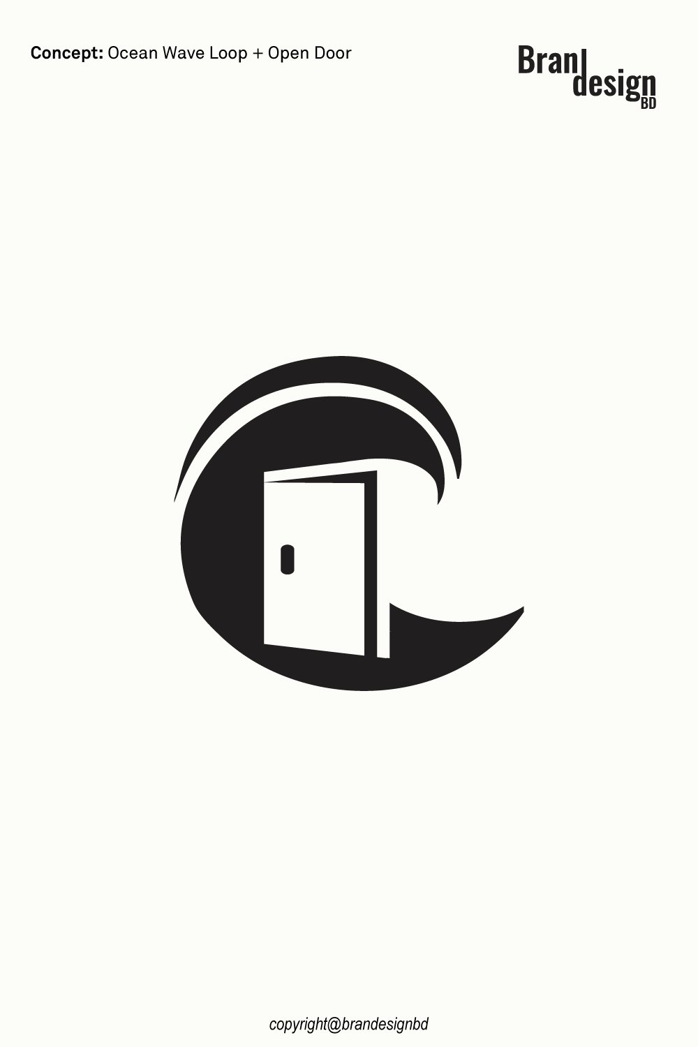
A strong logo can tell a story without using a single sentence. The right shape, space, and visual symbol can help people understand a brand within seconds. The Doorway and Ocean Wave Loop Logo is designed around this idea, combining two simple concepts into one memorable visual mark.

The logo brings together an open doorway and a flowing ocean wave loop. The doorway can represent welcome, access, opportunity, and new beginnings. The ocean wave can suggest freedom, movement, travel, nature, and continuous growth. Together, these elements create a modern symbol with a calm yet dynamic character.

This type of logo can work well for businesses connected with real estate, architecture, interior design, hospitality, travel, coastal properties, home services, construction, lifestyle brands, and other industries that want a clean and meaningful identity.

The Concept Behind the Logo

A successful logo should have a clear visual idea. Instead of adding many elements, this concept uses a small number of shapes to communicate several related ideas.

The Open Doorway

A symbol of welcome and opportunity

The open doorway is one of the most recognizable symbols of entry and possibility. In this design, the doorway creates a sense of invitation. It can suggest entering a new space, starting a new journey, or discovering a new opportunity.

For a business, this message can be useful because customers often want to feel that a brand is approachable and trustworthy.

The Ocean Wave Loop

A symbol of movement and continuous flow

The curved wave structure adds energy to the logo. Its loop creates a feeling of movement while also giving the overall mark a rounded and balanced appearance.

The ocean-inspired shape can represent freedom, travel, nature, relaxation, and the continuous flow of life. The loop also helps create a visual connection between the doorway and the surrounding wave.

The Combined Symbol

Turning two ideas into one visual identity

The most interesting part of the concept is how the doorway and wave work together. Rather than appearing as two separate illustrations, the shapes form a unified symbol.

This approach can make the logo easier to recognize. A simple symbol is also easier to use across different brand applications, from websites and social media profiles to business cards, packaging, signage, and promotional materials.

Ocean-Wave-Loop-Logo-Design
Asking Price $500

For logo purchase or negotiation, please contact support@brandesignbd.com.

Logo Sale, Handover & NDA Information

All project handover agreements, ownership documentation, Non-Disclosure Agreement (NDA), and related communication will be handled through the email address provided above.
Once the logo is purchased, we will update the listing status to “Sold” and, upon request, add the buyer’s website or preferred address to the listing as confirmation of the sale. All necessary final files, ownership documentation, and agreed-upon project materials will be provided to the buyer after the purchase is completed.

Originality and Copyright Verification

Originality is an important part of professional logo development. A logo should not simply imitate an existing identity or use another company’s protected artwork.

Yandex Image Search

Reviewing visual similarities

Yandex can be used as one part of a broader visual similarity review. Image search can help identify visually similar marks, concepts, or existing artwork that may appear online.

This type of search is useful during the design review process because it provides another opportunity to identify potential visual similarities before final delivery.

TinEye Reverse Image Search

Checking for matching or reused imagery

TinEye is another reverse-image search resource that can help investigate whether a similar image or graphic appears elsewhere online.

For logo development, reverse-image searches can support an originality review, particularly when the designer wants to check whether a visual element resembles existing online artwork.

Potential Applications for the Logo

A versatile logo should work beyond a single presentation image. The Doorway and Ocean Wave Loop Logo can be adapted for several industries and business types.

Real Estate and Property Brands

Creating a sense of entry and new possibilities

The doorway concept naturally connects with property and real estate. It can represent entering a new home or beginning a new chapter.

The wave element can also work especially well for coastal property companies, vacation rentals, beach homes, and waterfront developments.

Travel and Hospitality

Communicating exploration and relaxation

The ocean wave can create an association with travel, beaches, resorts, and relaxing destinations. Combined with the doorway, the logo can suggest an invitation to explore a new place.

This makes the concept suitable for selected travel agencies, hotels, vacation properties, tour services, and coastal hospitality brands.

Architecture and Interior Design

Connecting structure with creative spaces

The doorway provides an architectural reference, while the flowing wave introduces a softer visual element.

This combination can work for architecture studios, interior designers, home improvement companies, property developers, and creative firms that want an identity with both structure and movement.

Lifestyle and Coastal Brands

Building a relaxed visual personality

Brands connected with coastal living, outdoor experiences, wellness, travel, or lifestyle products can also benefit from this type of visual language.

The wave can communicate a relaxed feeling, while the doorway gives the mark a stronger sense of purpose and direction.

Logo Design for Digital and Print Use

A professional logo should be prepared with future use in mind. A design that looks good on a large screen should also remain clear when reduced to a small profile image.

Website and Social Media

Maintaining recognition at small sizes

The simple structure of the logo makes it suitable for website headers, social media profiles, digital advertisements, email signatures, and online directories.

A recognizable symbol can also help maintain brand consistency across multiple digital channels.

Business Cards and Stationery

Creating a professional first impression

The logo can be used on business cards, letterheads, envelopes, invoices, presentations, and other business materials.

A clean black-and-white version can be especially useful for documents where a simple one-color application is preferred.

Signage and Promotional Materials

Supporting larger brand applications

The bold shapes can also be adapted for signs, banners, vehicle graphics, merchandise, promotional products, and other physical applications.

Vector artwork is important for these uses because it allows the logo to scale without losing sharpness.

Copyright Verification Limitations

Understanding what an image search can and cannot prove

Search tools such as Yandex and TinEye can help identify online visual matches, but they do not provide a complete legal copyright clearance or trademark search.

A reverse-image search cannot guarantee that a logo is legally available for trademark registration. Businesses seeking formal trademark protection should also conduct appropriate trademark research and consult a qualified legal professional when necessary.

For this logo project, visual similarity checks can be presented as part of the designer’s quality-control process rather than as a legal guarantee.

Non-Disclosure and Logo Handover Agreement

Professional logo projects often involve confidential business information. A client may share a company name, product concept, launch plan, marketing strategy, packaging information, or other materials that are not yet public.

Non-Disclosure Agreement

Protecting confidential client information

A non-disclosure agreement, commonly called an NDA, can establish clear expectations about confidential information.

Depending on the agreement, the designer may be required to keep private materials confidential and avoid sharing unreleased brand information, business documents, product concepts, or other protected project details without permission.

An NDA should clearly define what information is confidential, how it may be used, and what responsibilities apply after the project ends.

Logo Handover Agreement

Defining the final ownership and deliverables

A logo handover agreement can clarify what the client receives after the project is completed.

A professional handover may include the final logo files, editable vector artwork, approved variations, color versions, and other agreed deliverables.

The agreement should also state when ownership or usage rights transfer to the client. Depending on the project terms, this may occur after final payment is received.

Final File Delivery

Providing practical brand assets

A complete logo package may include formats such as AI, EPS, SVG, PDF, and high-resolution PNG files when these are part of the agreed scope.

Vector formats are particularly useful because they allow the logo to be resized for both small and large applications without losing quality.

Final Thoughts on the Doorway and Ocean Wave Loop Logo

The Doorway and Ocean Wave Loop Logo combines two recognizable ideas into one clean visual symbol. The open doorway communicates welcome, access, opportunity, and new beginnings, while the flowing ocean wave represents movement, freedom, nature, and continuous flow.

Its minimalist structure makes it suitable for both digital and print applications. From real estate and architecture to travel, hospitality, lifestyle, and coastal businesses, the concept can be adapted to different brand directions.

For clients looking for a logo that feels modern, meaningful, and easy to use across multiple platforms, this concept offers a strong starting point. With professional vector artwork, organized final files, clear handover terms, and an appropriate originality review, the finished identity can be prepared for practical brand use.

When developing any new logo, visual originality should be reviewed carefully, while formal trademark and legal checks should be handled through the appropriate professional channels. This combination of creative design and responsible brand preparation helps create a more complete identity for a growing business.

Also, check the recent article about the best laptop for graphic design here.


Read More

Search

Untitled-1-01Untitled-1-01

brandesignbd

Graphic Design Service Provider

Visit Link

  • Privacy Policy
  • Terms and condition

Company

  • Home
  • Our Services
  • portfolio
  • Contact Us

Contact

  • support@brandesignbd.com
  • brandesignbd27@gmail.com

Address

Narayanganj,

Dhaka, Bangladesh

1400

Linkedin-in Pinterest Facebook-f Instagram Behance
Copyright ©brandesignbd. All Rights Reserved.
Shopping Basket