Untitled-1-01Untitled-1-01

brandesignbd

Graphic Design Service Provider

  • Home
  • About Us
  • Our Services
  • portfolio
  • Contact Us
  • Blog
Get Started

Home » unique logo design

Posts tagged: unique logo design

Negative Space Logo

The Art of Negative Space Logo Design: Making a Statement with Absence

February 8, 2024
by badhan666@@ Graphic design
Negative Space Logo

In the vast world of design, simplicity often speaks volumes. One of the most fascinating techniques in logo design is the use of a negative space logo—a concept where the absence of elements creates as much impact as their presence. Negative space logo design is a subtle yet powerful art form that captivates audiences by cleverly integrating hidden meanings and visual storytelling. Let’s delve into this fascinating realm and explore how designers harness the power of negative space to craft memorable brand identities.

Understanding Negative Space in Logo Design

Negative space, also known as white space, is the area surrounding the main subject in an image. In logo design, it refers to the space around and between the primary elements of the logo. While positive space contains the main focus of the design, negative space plays a supporting role, often contributing to the overall composition and conveying secondary messages.

The Power of Simplicity

Negative space logo design relies on the principle of simplicity to communicate complex ideas effectively. By stripping away unnecessary elements, designers create clean and minimalist logos that leave a lasting impression. These logos are not only visually appealing but also versatile, making them suitable for various applications across different media platforms.

Creating Visual Illusions

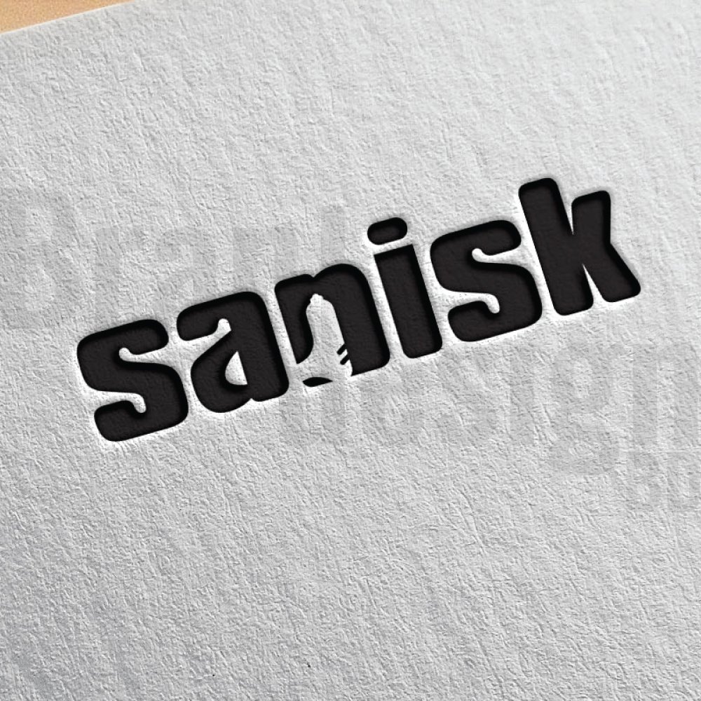
One of the most intriguing aspects of negative space logo design is its ability to create visual illusions. By cleverly manipulating the arrangement of shapes and spaces, designers can produce multiple layers of meaning within a single logo. These hidden elements invite viewers to engage with the design on a deeper level, discovering subtle nuances over time.

A negative space logo featuring a bear's silhouette with a fox formed within its body. The logo is inside a hexagon.
A clever negative space logo design using a bear’s silhouette to reveal a fox.
A negative space logo for CUNNINGFOX, featuring a fox's head within the letter C.
A clever negative space logo where a fox’s head is revealed within the letter C.

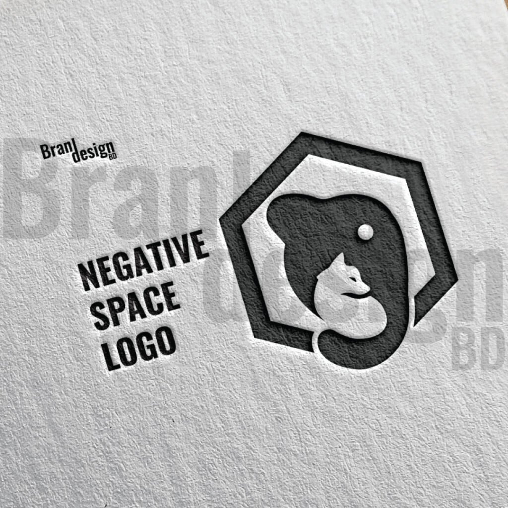
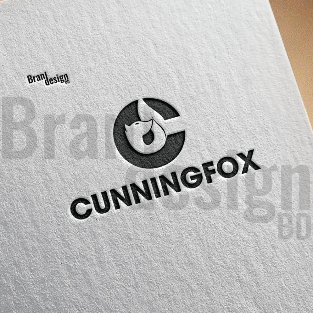
Some Established Examples of Negative Space Logo Design:

Several iconic logos demonstrate the power of negative space in branding:

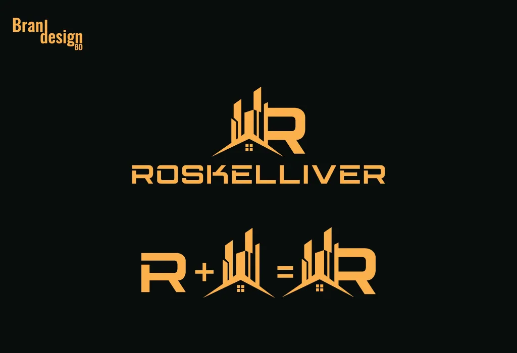
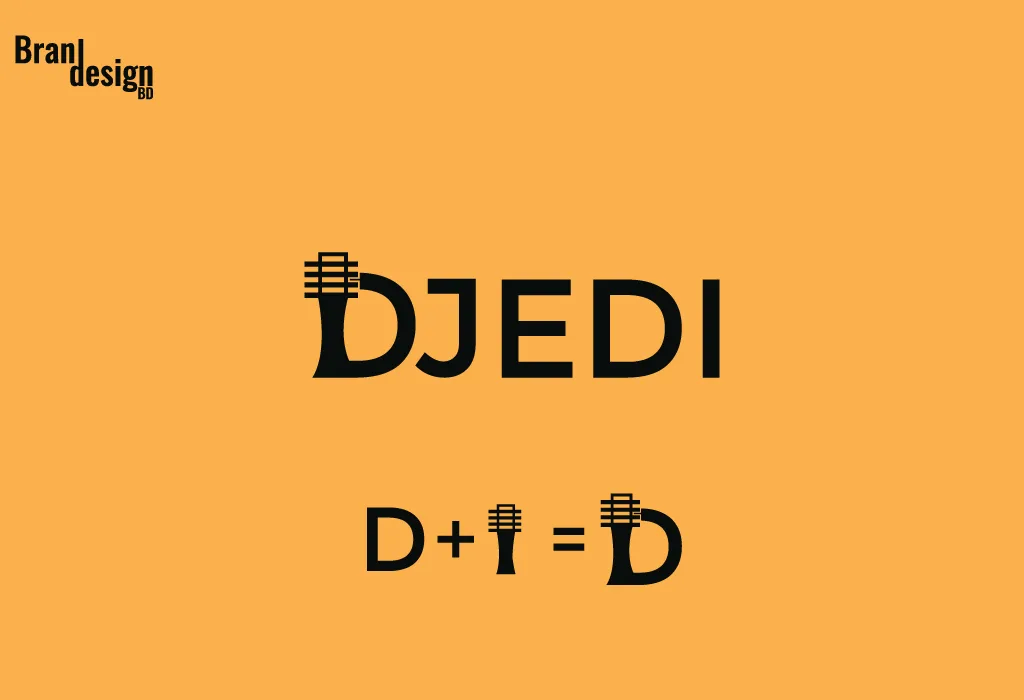
1. FedEx: Perhaps one of the most famous examples, the FedEx logo incorporates an arrow formed by the negative space between the “E” and the “x,” symbolizing speed and efficiency in delivery.

2. Amazon: The Amazon logo features a smile that stretches from the letter “A” to the letter “Z,” suggesting that the company offers everything from A to Z.

3. NBC: The peacock in the NBC logo is created using colorful negative space, symbolizing the network’s diverse programming.

Tips for Effective Negative Space Logo Design:

For designers looking to incorporate negative space into their logo creations, here are some tips to keep in mind:

1. Start with a Strong Concept: A solid concept forms the foundation of any successful logo design. Spend time brainstorming ideas and sketching out rough drafts before diving into the finer details.

2. Keep it Balanced: Balance is crucial in negative space logo design to ensure that the composition feels harmonious and visually appealing. Pay attention to the distribution of positive and negative space to achieve equilibrium.

3. Test for Legibility: While negative space can add depth and complexity to a logo, it’s essential to ensure that the design remains legible and recognizable, even at smaller sizes.

4. Experiment with Shapes: Don’t be afraid to experiment with different shapes and forms to find the perfect balance of positive and negative space. Sometimes, the most unexpected combinations yield the most compelling results.

A logo for ANGELIC FLAME, featuring a flame with an angel's wing in the negative space.
A unique logo design for ANGELIC FLAME, integrating an angel’s wing within a flame icon.
A negative space logo for the word Sanisk, featuring a USB flash drive icon subtly formed in the letters. The text is in a dark, rounded font on textured paper.
A clever negative space logo for Sanisk, where a USB drive is integrated into the wordmark.

Negative space logo design offers several advantages:

Memorability: Logos designed using negative space often stand out due to their clever use of space and hidden imagery. This memorability helps brands leave a lasting impression on their audience, making it easier for them to recall the logo and associated brand.

Simplicity: Negative space logos are inherently simple, with clean lines and minimalistic designs. This simplicity not only makes the logo visually appealing but also ensures that it remains versatile and easily recognizable across various platforms and mediums.

Distinctiveness: Negative space logos have the potential to be more distinctive and unique compared to logos with complex designs. By utilizing negative space creatively, brands can differentiate themselves from competitors and carve out a distinct identity in the market.

Versatility: Negative space logos are highly versatile and adaptable to different contexts and applications. Whether displayed on a billboard, website, or business card, these logos maintain their clarity and impact, making them suitable for diverse branding needs.

Engagement: The hidden elements and visual illusions created by negative space logos often spark curiosity and engagement among viewers. This encourages them to take a closer look at the logo, decipher its hidden meanings, and connect with the brand on a deeper level.

Timelessness: Negative space logos have a timeless quality that allows them to remain relevant and effective for years to come. By avoiding trendy design elements and focusing on fundamental principles of design, these logos have the potential to withstand the test of time and maintain their relevance in evolving markets.

Conclusion:

Negative space logos are a smart way to make your brand stand out. They use the empty space around and inside shapes to form another image or meaning. This clever style is simple, yet it can say a lot about your brand. People enjoy finding the hidden parts, and that makes your logo more memorable.

A good negative space logo is easy to read and easy to recognize. It works in color and in black-and-white. It can be printed on small items like business cards or used on large signs without losing clarity. This makes it a flexible choice for many types of brands.

Designing a negative space logo takes skill and creativity. Every line, curve, and space must have a purpose. When done right, it can tell your brand’s story in a unique way.

Whether your brand is modern, playful, or professional, a negative space logo can help you make a lasting impression. It invites people to look twice and remember what they see. That is the power of using space as part of the design.

Choosing a negative space logo is not just about style—it is about creating a smart, lasting image for your brand.

If you want to make any Negative Space Logo Design then contact us now.

Also, check the recent article about the combination mark logo here and the lettermark logo here.

Why is negative space important in logo design?

Negative space plays a crucial role in logo design as it can enhance visual impact, create depth, convey hidden meanings, and improve overall composition. It adds an element of sophistication and intrigue to the design, making it more memorable and engaging for the audience.

How do you create a negative space logo?

To create a negative space logo, designers strategically manipulate the arrangement of shapes, letters, or symbols to form hidden images or convey secondary messages within the empty spaces. This often involves careful planning, sketching, and experimentation to achieve the desired effect.

What are the advantages of negative space logo design?

Negative space logo design offers several advantages, including memorability, simplicity, distinctiveness, versatility, engagement, cost-effectiveness, and timelessness. These qualities make negative space logos effective in conveying brand identity and leaving a lasting impression on the audience.

How can I ensure that my negative space logo is legible and recognizable?

To ensure that your negative space logo remains legible and recognizable, test it across various sizes and backgrounds to assess its visibility and clarity. Keep the design simple and avoid excessive complexity that may obscure the main elements of the logo. Additionally, gather feedback from stakeholders and potential customers to identify any potential issues and make necessary adjustments.

Can negative space logos be trademarked?

Yes, negative space logos can be trademarked like any other logo design. To protect your logo, you’ll need to register it as a trademark with the relevant authorities in your country or region. Ensure that your logo meets the criteria for trademark registration, including distinctiveness and non-infringement of existing trademarks.


  • Essential AI Tools and Subscriptions Every Graphic Designer Needs in 2025
  • Best Keyboard and Mouse Combination for Graphic Designer
  • 10 Logo Presentation Mockup PSDs Every Graphic Designer Needs
  • Which Is More Cost-Effective for Teams: A Figma Subscription or Adobe Creative Cloud?
  • Cooling & Ventilation Tips for Long Design Work Sessions
Read More
COMBINATION-MARK

Combination Mark Logo

March 28, 2023
by badhan666@@ Graphic design
combination mark logo

Table of Contents

  • What is a Combination Mark Logo?
    • Some key benefits of using this type of logo:
    • Tips for creating an outstanding combination mark logo:
    • Some market-leading examples of outstanding combination mark logos:

A combination mark logo is a versatile option for businesses as it can be used across various mediums, including print, digital, and social media. The use of a combination mark logo can provide an instant visual impact that can help to increase brand recognition, as well as build trust and credibility with customers. In this article, we will explore all about it.

What is a Combination Mark Logo?

A combination mark logo is a type of logo that combines both text and symbols to create a unique brand identity. The text and symbol can be placed together or separately, making it a versatile option for businesses. This type of logo is also known as a hybrid logo, as it combines both text and symbol elements to create a unified brand identity.

The text element of the logo can be the initial letter of the company name, and the symbol element can be an icon or graphic representing the brand. This allows businesses to create a unique and memorable identity that can be used across various mediums.

Here are some examples :

Combination
Combination mark logo

Some key benefits of using this type of logo:

There are several benefits to using a combination mark logo for your business. These benefits include:

1. Versatility: This logo can be used across various mediums, including print, digital, and social media. This versatility allows businesses to maintain a consistent brand identity across all platforms, increasing brand recognition.

2. Brand recognition: The use of a combination mark logo can help to increase brand recognition, as it provides an instant visual impact. The combination of text and symbols makes the logo more memorable, allowing customers to quickly identify the brand.

3. Credibility: It also helps to build trust and credibility with customers. A well-designed logo can communicate the values and personality of a brand, making it easier for customers to relate to and trust the brand.

4. Uniqueness: A hybrid mark logo allows businesses to create a unique and memorable brand identity. The use of both text and symbols provides businesses with more design options, making it easier to create a logo that stands out from competitors.

Tips for creating an outstanding combination mark logo:

Creating an outstanding combination mark logo requires careful consideration of several key factors. Here are some tips for creating a combination mark logo that will help your business stand out:

1. Keep it simple: This type of logo should be simple and easy to read. The text element should be legible, and the symbol element should be recognizable at a glance. Avoid using too many colors or intricate designs that make the logo difficult to read or recognize.

2. Choose the right font: The font used in the text element of the logo can play a significant role in the overall design. Choose a font that is easy to read and reflects the personality of your brand. Avoid using trendy or overly stylized fonts that may become outdated quickly.

3. Use color effectively: The use of color can help to make a combination mark logo more memorable and impactful. Choose colors that reflect the personality and values of your brand, and ensure that they complement each other well. Avoid using too many colors or colors that clash, as this can make the logo difficult to read or recognize.

4. Make it scalable: The logo should be scalable, meaning it can be resized without losing its clarity or quality. This is important as a logo needs to be used across various mediums, including print and digital. Ensure that the logo is created in a vector format, as this will allow it to be scaled up or down without losing quality.

5. Consider your target audience: The design of the logo should be tailored to your target audience. Consider the age, gender, and interests of your target audience when choosing the colors, fonts, and symbols for your logo.

6. Make it memorable: A hybrid mark logo should be amazing and easy to recognize. The use of unique symbols or icons can help to make the logo more memorable, as can using a unique font or color scheme.

7. Test it out: Before finalizing your hybrid mark logo, test it out across various mediums to ensure that it is legible and recognizable. This can include testing it on business cards, social media platforms, and websites. Hold summary meetings regularly to share work results and experiences.

A combination mark logo for DENNY DENTAL, featuring the letter D with a tooth shape integrated into the negative space. The logo is blue and is presented on a textured, light-colored paper.
A unique combination mark logo that cleverly integrates a tooth symbol into the letter D for DENNY DENTAL.
A combination mark logo for TELLY ELEGANCE, featuring the letters T and E stylized to form a crown. The logo is debossed in a golden-brown color on a textured paper.
A majestic logo for TELLY ELEGANCE, blending initials with a crown.
A combination mark logo for SKYSTARnet, featuring a stylized S with a star icon at the bottom, presented in blue and dark text on a textured, light-colored paper.
A modern and sleek combination mark logo for SKYSTARnet, symbolizing connectivity and excellence.

Some market-leading examples of outstanding combination mark logos:

1. Shopify: Shopify logo features a distinctive shopping bag icon with a white letter “S” on it, which is positioned inside a rounded blue square. The design is minimalist and modern, with clean lines and bold, easily recognizable shapes.

2. Unilever: Unilever merges the company name with a pictorial mark and a lettermark. The Unilever logo is a simple yet effective mark that represents the brand’s commitment to sustainability, environmental responsibility, and social purpose.

3. Skype: Skype’s unite the company name with a recognizable cloud symbol representing the brand’s focus on communication and technology. The logo is simple, yet innovative, and has become synonymous with the brand’s video and voice-calling services.

combination mark logo

4. Airbnb: Airbnb’s integrate the company name with a recognizable symbol that represents a combination of a location icon and a heart. The logo is simple, yet effective, and represents the brand’s focus on providing unique and personalized travel experiences.

5. Toyota: Toyota’s blends the company name with a recognizable oval symbol that represents a steering wheel. The logo is simple, yet innovative, and represents the brand’s focus on high-quality and reliable automobiles.

So, a combination mark logo is a versatile and effective way to create a unique brand identity. The use of both text and symbols allows businesses to create a logo that is memorable, impactful, and versatile. When creating a combination mark logo, it is important to consider the key factors that will make the logo effective, including simplicity, font choice, color use, scalability, and target audience. With careful consideration and attention to detail, a combination mark logo can help to increase brand recognition, build trust and credibility with customers, and make a business stand out from competitors.

If you want to make this type of combination mark logo then contact us now.

Also, read our recent article on the top 7 logo marks and their uses at here.


What is a combination mark logo?

A combination mark logo blends text (like your brand name or initials) with a symbol, icon, or illustration to create a versatile and memorable brand identity.

Why should I choose a combination mark logo?

Combination marks offer flexibility—they can be used together or separately depending on the medium, making them ideal for both digital and print branding.

Which industries benefit most from combination marks?

Almost any industry can use a combination mark, but they’re especially effective for retail, food and beverage, sports, travel, and tech brands that want both a recognizable icon and a readable name.

Can I use just the icon or text from my combination mark?

Yes. One of the main benefits of a combination mark is that you can use the icon or the text independently while maintaining brand recognition.

How do you make sure my combination mark is unique?

We conduct industry research, competitor analysis, and develop custom iconography and typography that reflect your brand’s values, ensuring your logo stands out.

Will my combination mark work for small sizes like social media icons?

Yes. We design combination marks to remain clear and recognizable at any size, with optimized layouts for profile images and favicons

Can I trademark my combination mark?

Yes. Since combination marks are unique blends of imagery and typography, they are generally easier to trademark than text-only or icon-only logos.

How long does it take to design a combination mark?

Typically, the process takes 3 to 5 days, depending on the complexity of the concept and the number of revisions.

  • Essential AI Tools and Subscriptions Every Graphic Designer Needs in 2025August 17, 2025
  • Best Keyboard and Mouse Combination for Graphic DesignerAugust 14, 2025
  • 10 Logo Presentation Mockup PSDs Every Graphic Designer NeedsAugust 14, 2025
  • Which Is More Cost-Effective for Teams: A Figma Subscription or Adobe Creative Cloud?August 11, 2025
  • Cooling & Ventilation Tips for Long Design Work SessionsAugust 11, 2025
Read More

Search

Untitled-1-01Untitled-1-01

brandesignbd

Graphic Design Service Provider

Visit Link

  • Privacy Policy
  • Terms and condition

Company

  • Home
  • Our Services
  • portfolio
  • Contact Us

Contact

  • brandesignbd27@gmail.com
  • brandesignbd27@gmail.com

Address

Narayanganj,

Dhaka, Bangladesh

1400

Linkedin-in Pinterest Facebook-f Instagram Behance
Copyright ©brandesignbd. All Rights Reserved.
Shopping Basket