

Table of Contents
- Understanding the Importance of Monitor Size for Designers
- Factors to Consider When Choosing a Monitor Size
- Recommended Monitor Sizes for Different Design Needs
- How Resolution Impacts Your Monitor Size Choice
Struggling to pick the right monitor size for design? Learn what pros use, why screen size matters, and how to upgrade your creative setup in 2025.
Understanding the Importance of Monitor Size for Designers
A monitor is more than just a screen for a designer—it’s a canvas that directly impacts creativity, efficiency, and eye comfort. Choosing the right monitor size isn’t just about picking the biggest display you can afford. It’s about balancing resolution, workspace needs, ergonomics, and your design workflow.
Selecting the wrong size could mean constant eye strain, difficulty fitting your work on the screen, or wasted desk space. On the other hand, the right choice can significantly improve productivity and precision in your design projects.
Factors to Consider When Choosing a Monitor Size
Before you invest in a monitor, you need to understand the key factors that influence size choice. Each consideration plays a role in determining whether the monitor will suit your design workflow.
Screen Resolution and Clarity
Resolution refers to the number of pixels displayed on the screen. Higher resolutions like 4K or 5K deliver sharper visuals, making it easier to work on high-detail projects. For large monitors, higher resolution is essential to avoid pixelation.
Workspace Dimensions
Your available desk space will determine the maximum monitor size you can comfortably use. Oversized screens can overwhelm smaller desks and lead to poor posture. Always measure your workspace before purchasing.
Viewing Distance and Ergonomics
The ideal viewing distance changes with monitor size. A 27-inch monitor is best viewed from about two feet away, while ultrawide monitors may require a slightly greater distance. Poor ergonomics can cause neck and eye strain.
Type of Design Work
Different design fields have different requirements. A video editor might prefer a 34-inch ultrawide for timeline visibility, while a graphic designer might opt for a 27-inch 4K display for precision work.
Aspect Ratio Preferences
Aspect ratio impacts the layout of your workspace. While the standard 16:9 ratio works well for most designers, 21:9 ultrawide monitors offer extra horizontal space for multitasking.
Recommended Monitor Sizes for Different Design Needs
The right monitor size can transform your workflow, especially in the design world where detail, color, and workspace management matter as much as creativity. While there’s no universal answer that works for every designer, understanding how different monitor sizes suit different types of design work will help you make an informed choice. Below is a detailed guide on the most common creative fields and the ideal monitor sizes for each, along with specific use cases, pros, and potential drawbacks.
For Graphic Design and Illustration
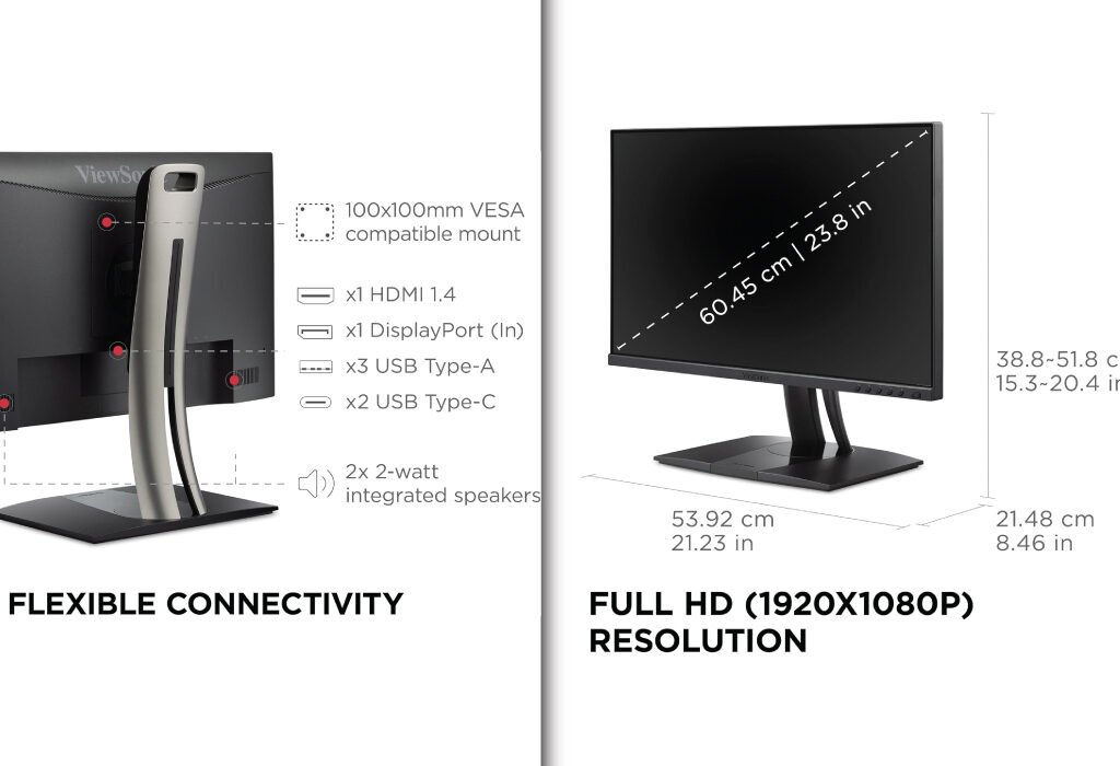
Illustrators and logo designers often work on highly detailed graphics that require pixel-level precision. While large monitors are popular for multitasking, a 24-inch 4K right monitor size offers several advantages for these creatives.
The compact size keeps all elements within your natural field of vision, reducing the need to move your head or shift focus constantly. This can lead to less eye strain during long illustration sessions. With a 4K resolution, even on a smaller screen, the pixel density is extremely high, ensuring crisp lines and accurate curves when zoomed in.
For example, if you’re refining a logo in Adobe Illustrator, a 24-inch screen allows you to keep your artboard in view while having your essential toolbars at the edges without crowding the design. It’s also more space-efficient for smaller studios or home workstations.
Recommended model: ViewSonic VP2456A
For Video Editing
Video editors have unique needs compared to other designers. They work with complex timelines, multiple video tracks, and a range of visual effects panels. A 32-inch 4K monitor offers the space needed to view your entire editing timeline without excessive scrolling.
If you prefer an even broader view, a 34-inch ultrawide monitor with a 21:9 aspect ratio can be a game-changer. The extended horizontal space allows you to see longer portions of your timeline at once, which is especially helpful when editing documentaries or multi-scene commercial videos. The extra width also means you can keep your preview window, effects panel, and file browser all visible at the same time, reducing the need for constant window switching.
An example would be working in Adobe Premiere Pro—on a standard monitor, your timeline might require constant left-right scrolling. On an ultrawide, you can see the entire sequence in one glance, which makes cutting and syncing clips much faster.
Recommended model: ViewSonic VP3456A 34 Inch Ultrawide
For 3D Modeling and Animation
3D artists and animators benefit from large monitors because their workflows often involve multiple viewports—front, side, and perspective—displayed simultaneously. A 32-inch 4K monitor is ideal for this kind of work.
With a large display, you can dedicate separate areas to modeling, texture painting, and animation timelines without overlapping windows. This reduces the need to zoom in and out constantly. For instance, if you’re sculpting a character in Blender, you can have your sculpting viewport take up half the screen while your material editor and reference images remain visible.
Some animators even prefer dual-monitor setups—one large main display for the 3D workspace and a secondary vertical monitor for scripts, notes, or real-time previews.
Recommended model: LG 32UN650-W Monitor
For Web and UI Design
Web and UI designers need to see their projects as end users would experience them. This means testing designs across multiple resolutions, from small mobile screens to large desktop displays. A 27-inch QHD or 4K right monitor size works well for this purpose.
The benefit of this size is that it offers enough room to view full-page designs while still keeping your developer console, style guides, and design tools visible. For responsive design testing, having an ultrawide monitor lets you open multiple browser windows side by side—simulating how the design will look on different devices.
Imagine you’re designing a landing page in Figma—you could keep the desktop layout on one side of the screen while previewing the mobile layout on the other, all without switching tabs. This setup speeds up testing and reduces context switching.
Recommended model: BenQ MA270U 27
For Photography and Photo Editing
Photographers require high-resolution monitors with excellent color accuracy to ensure their edits match the intended look across print and digital platforms. A 27-inch or 32-inch 4K monitor with a wide color gamut (such as AdobeRGB or DCI-P3 coverage) is the go-to choice for most professionals.
A 27-inch display allows you to view high-resolution photos in full detail without excessive zooming. The larger 32-inch variant offers even more room for editing panels, side-by-side image comparisons, and reference shots. For example, in Adobe Lightroom, you can have the histogram, tone curve, and adjustment sliders all open without covering your image.
If you regularly work on print projects, a 5K display can be an even better option, as it offers extremely sharp detail and extra workspace for large-format editing.
Recommended model: LG 32UN650-W Monitor
For Motion Graphics and VFX
Motion graphics artists and VFX professionals deal with layered compositions, particle effects, and real-time rendering. A 32-inch 4K monitor or 34-inch ultrawide provides the necessary space for multiple panels and high-resolution previews.
Programs like After Effects can be very panel-heavy, and a large display means you can keep the timeline, effects controls, and preview window open without compromising on visibility. An ultrawide setup also helps when scrubbing through long animation sequences, reducing the need for constant zooming and scrolling.
Recommended model: LG 34WP65C-B UltraWide Computer Monitor
For Print and Layout Design
Layout designers working with newspapers, magazines, or catalogs need to see entire spreads at once. A 27-inch QHD or 4K monitor is often sufficient, but for very large projects, a 32-inch display offers the extra space to view multiple pages side by side.
This makes it easier to ensure visual consistency across spreads and reduces the need for zooming in and out. For example, in Adobe InDesign, you could view a two-page magazine spread at full size while keeping your layers, styles, and swatches panels visible.
Recommended model: LG 32UN650-W Monitor
For Multi-Discipline Design Work
Some designers work across multiple fields—switching between photo editing, web design, and occasional video projects. In this case, versatility is more important than size alone. A 24-inch 4K monitor is often a smart choice for multi-discipline designers who value balanced desk space, portability, and affordability.
At 24 inches, the display offers enough room for most creative applications while remaining compact enough for tight workspaces or multi-monitor setups. For example, you could pair a 24-inch main display with a second monitor or a drawing tablet without feeling crowded.
This size also encourages better posture since you don’t have to move your head as much when switching between panels or applications, which is useful for long work sessions that jump between design tasks.
Recommended model: ViewSonic VP2456A
How Resolution Impacts Your Monitor Size Choice
When choosing the right monitor size, resolution is one of the most important factors to consider. Resolution defines how many pixels make up the display, directly affecting image sharpness, clarity, and the amount of workspace you have on the screen. Understanding the relationship between resolution and monitor size will help you pick a screen that fits your design needs perfectly.
What Is Resolution?
Resolution is expressed as width × height in pixels, such as 1920×1080 or 3840×2160. More pixels mean more detail, resulting in clearer images and sharper text. The most common resolutions for design monitors include Full HD (1080p), Quad HD (1440p), and Ultra HD (4K). Higher-end displays can even have 5K or 6K resolutions, providing exceptional clarity.
Why Resolution Matters for Different Monitor Sizes
Choosing a large monitor without adequate resolution often leads to a poor experience. For example, a 32-inch monitor with 1080p resolution can look pixelated because the pixels are stretched over a larger area. This reduces sharpness and makes detailed design work difficult. Conversely, a small monitor with very high resolution may render text and icons too small, straining your eyes.
Common Resolutions and Their Best Uses
1080p (Full HD)
Full HD displays have 1920 pixels horizontally and 1080 vertically. They are ideal for smaller monitors, generally under 24 inches. At this size, pixel density remains high enough for clear visuals. However, at sizes above 24 inches, 1080p starts to look less sharp because the same number of pixels spreads out over a larger area. This can make precise design work challenging.
1440p (Quad HD)
Also called QHD, 2560×1440 pixels is a popular middle ground. It offers higher pixel density than Full HD, making it a great choice for 27-inch monitors. QHD provides more workspace, letting you fit more windows and design elements on screen without losing clarity. Many designers find this resolution balances cost, performance, and image quality well.
4K (Ultra HD)
4K resolution is 3840×2160 pixels, offering four times the pixels of Full HD. This is perfect for monitors 27 inches and larger. The pixel density on a 27-inch 4K display results in extremely sharp images, ideal for detailed graphic design, photo editing, and video production. However, 4K requires more powerful computers to run smoothly and may need scaling settings to keep interface elements readable.
5K and Higher
Some monitors go beyond 4K to 5K (5120×2880) or 6K resolutions, mostly used by professionals requiring the highest clarity. These are found on larger screens—27 inches or more—and provide unmatched detail, essential for print designers and photographers working with large-format files.
Pixel Density: The Key Metric
Pixel density, measured in pixels per inch (PPI), combines screen size and resolution to describe how sharp the display appears. Higher PPI means more pixels packed in a smaller area, producing crisper images. For example, a 24-inch 4K monitor has a higher PPI than a 32-inch 4K monitor, making it look sharper even though they share the same resolution.
Balancing Resolution and Workspace
Higher resolution increases workspace, allowing you to fit more design windows, toolbars, and reference materials on the screen. But too high a resolution on a small monitor can make UI elements tiny and hard to read without scaling. Proper scaling settings in your operating system can help make interface elements comfortable, but not all software scales well.
Practical Tips
- Match your monitor size with the right resolution to maintain a sharp, clear image.
- For 24 inches and smaller, 1080p or 1440p is usually sufficient.
- For 27 inches and above, opt for 4K resolution for the best clarity.
- Always consider your computer’s graphics capability to handle higher resolutions smoothly.
- Check if your design software supports scaling well to avoid tiny or blurry UI elements.
Understanding how resolution impacts your monitor size choice ensures you pick a display that makes your design work easier, more accurate, and more enjoyable. Balancing size, resolution, and pixel density will help you create a workstation tailored to your creative needs.
Also, check the recent article about the best laptop for graphic design here.