
Explore the top clean workstation essentials every graphic designer should own. From desk mats and dust blowers to ergonomic tools and storage, boost creativity and productivity with the perfect setup.
Why a Clean Workstation Matters for Graphic Designers
Graphic designers thrive in creative, focused environments. But clutter, dust, and disorganization can quickly break that flow. That’s why setting up a clean, optimized workstation is more than just a visual upgrade—it’s a productivity tool.
In this guide, we’ll explore the must-have clean workstation essentials every graphic designer should own. These tools and habits can transform your workspace into a place of clarity, comfort, and creative energy.
Clean Desk Surfaces with the Right Accessories
A clean desk isn’t just about minimalism—it’s about intentional design, long-term maintenance, and the tools that help you stay productive and focused. For graphic designers, whose workflow relies on both digital and physical tools, the desk surface is a crucial part of the creative process.
Whether you’re retouching images, illustrating, or editing layouts, the surface you work on needs to stay clean, protected, and well-arranged. Below is a comprehensive guide to the Clean Workstation Essentials that every graphic designer should consider. These tools don’t just organize your space—they elevate your entire design experience.
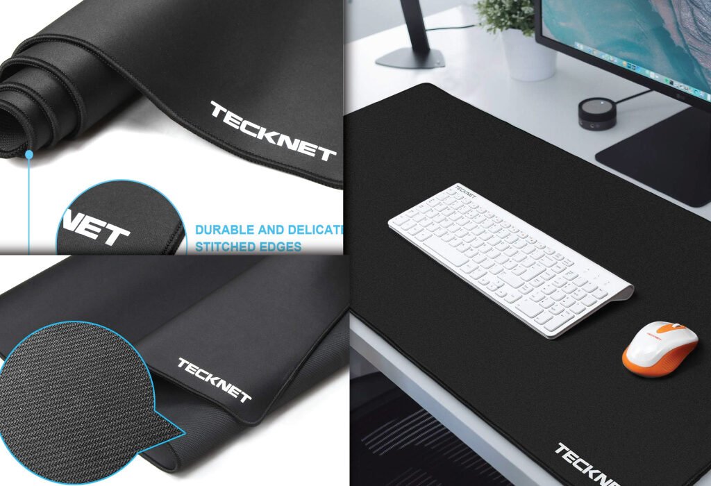
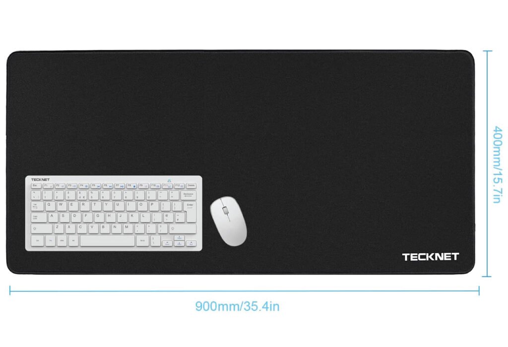
Desk Mat for Surface Protection
Start with the foundation. A desk mat is one of the most basic yet powerful Clean Workstation Essentials. One of the most valuable clean desk investments is a high-quality desk mat. It serves as a foundation for your entire workspace.
A desk mat protects the surface of your desk from scratches, spills, and heat damage caused by laptops or coffee mugs. It also improves mouse tracking, which is essential for precise design work. Choose a mat that fits your desk size and personal aesthetic—faux leather, felt, and eco-friendly silicone are all excellent options.
Recommended model: TECKNET Large Gaming Mouse Pad
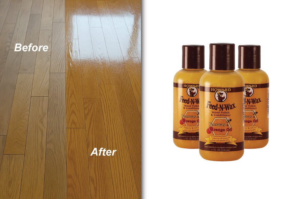
Beeswax Wood Polish for Desk Maintenance
Maintaining wood desktops is easier with beeswax polish, a lesser-known but vital member of your Clean Workstation Essentials. If you’re working with a wooden desk, regular cleaning isn’t enough—you’ll need to maintain its finish and luster over time. Enter beeswax wood polish.
Beeswax acts as a natural conditioner and sealant for wood. Applying it once a month helps repel dust, resist stains, and maintain the smoothness of your desk surface. It’s especially beneficial if your desk is made from oak, walnut, bamboo, or reclaimed wood.
To apply:
- Clean the surface first with a damp cloth.
- Rub the wax in with a microfiber pad or soft sponge.
- Buff with a dry cloth until smooth and shiny.
This small habit protects your investment and keeps your desk looking studio-fresh.
Recommended model: Howard Products Beeswax
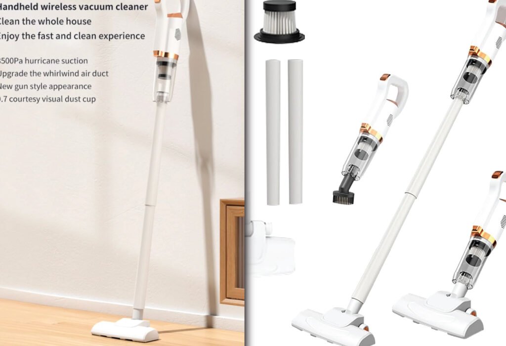
Desk Vacuum Cleaner
Quick, easy cleanup is key to maintaining your Clean Workstation Essentials. A mini desk vacuum is the ideal solution. A desk vacuum cleaner is more than a novelty—it’s a functional tool that makes daily maintenance quick and enjoyable.
Choose a compact, USB-rechargeable model that can suck up eraser bits, snack crumbs, pencil shavings, and even dust from your keyboard. Some models come with brush attachments that let you clean delicate areas like monitor bezels or speaker grilles.
The key benefit? You don’t have to move everything off your desk to use it. Quick, quiet, and efficient—an ideal tool for fast cleanups between client calls or deep work sessions.
Recommended model: GTSTEG New Model Cordless Vacuum Cleaner
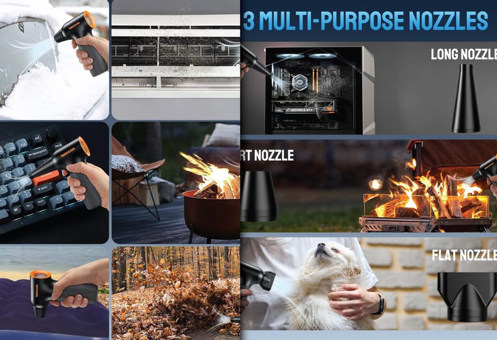
Compressed Air Dust Blower
Another favorite in the realm of Clean Workstation Essentials, the compressed air blower targets all the nooks and crannies.
A compressed air dust blower targets tight spaces that brushes and vacuums can’t reach. Use it to clear:
- Keyboard gaps
- Vents in your PC or laptop
- Pen tablet edges
- Monitor ports
- USB hubs
A few strong bursts once a week help prevent overheating, electrical inefficiencies, and general grime buildup. Choose a reusable electric blower over disposable cans to reduce environmental waste.
Recommended model: VASSON Compressed Air Duster
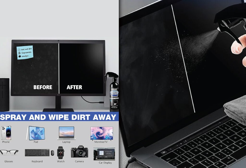
Screen Cleaning Kit
Clear visuals are non-negotiable. That’s why a screen cleaning kit earns its place among your top Clean Workstation Essentials.
A screen cleaning kit typically includes:
- A bottle of non-alcoholic cleaning solution (safe for matte and glossy screens)
- One or two microfiber cloths
- Optional brush or air blower
Use light, circular motions when cleaning and never spray directly on the screen. A clean display reduces eye strain and allows you to view your projects more accurately.
Recommended model: XPERTCHEMY Screen Cleaner Spray and Wipe
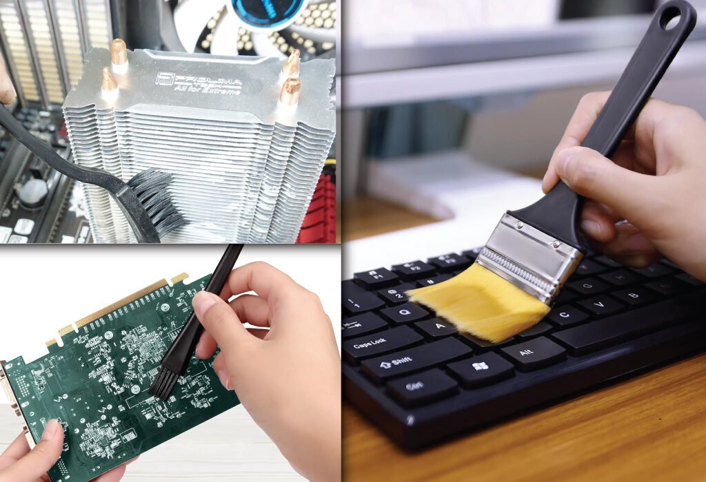
Brush Sets for Desktop Crevices
Small, soft-bristle brush sets are ideal for removing dust from keyboard switches, audio interfaces, and stylus buttons.
Use multiple sizes:
- A large brush for clearing desk mats and general surfaces
- A small precision brush for your keyboard and stylus
- A flat edge brush for monitor and tablet edges
Brushes are reusable, quiet, and safer than harsh chemicals or paper wipes. Keep them in a desk drawer or on a magnetic wall mount for quick access.
Recommended model: Brand: APBFH, Small Portable Nylon Anti Static Brushes
Under-Desk Hook for Headphones or Bags
Headphones are essential for focus and client calls. But leaving them on your desk clutters the surface and invites dust.
Install an under-desk hook to hang:
- Headphones
- Laptop bags
- Camera straps
- Lanyards
This keeps these daily-use items off your desk and within arm’s reach. Bonus: It also protects your gear from accidental spills or damage.
Anti-Static Cleaning Gloves
For delicate gear, anti-static gloves are key Clean Workstation Essentials. If you’re handling expensive gear like color calibration tools, pro-grade lenses, or new monitors, anti-static gloves are worth having on hand.
They:
- Prevent fingerprints on sensitive glass or screens
- Reduce the chance of static discharge damaging electronics
- Allow safe handling of internal PC components or printed materials
Keep a pair in your drawer for high-touch or high-detail cleaning.
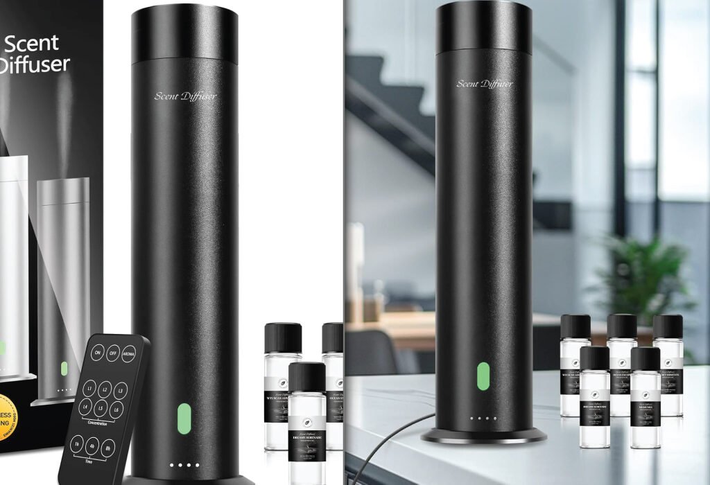
Aroma Diffuser or Desktop Air Purifier
Clean air is part of a clean desk. That’s why a small diffuser or air purifier makes our list of Clean Workstation Essentials. While not directly cleaning tools, clean air is part of a clean environment. A small aroma diffuser or HEPA filter purifier can make your desk more pleasant and health-supportive.
Choose one with a minimalist design and set it to a light scent—lavender or citrus are ideal for focus. Clean filters or refill water every week as part of your workstation upkeep routine.
Recommended model: XspideM Waterless Scent Diffuser Starter Kit
Wireless Charging Mouse Pads
Wireless charging mouse pads combine two Clean Workstation Essentials into one: surface protection and device charging. Some desk mats now include embedded wireless charging zones. This innovation eliminates the need for tangled charging cables on your desk altogether.
A 2-in-1 charging mat lets you:
- Charge your phone, earbuds, or stylus
- Maintain a clean look without extra accessories
- Work comfortably with a large, soft surface
Make sure your devices support Qi charging to take full advantage.
Glass or Acrylic Desk Cover
For designers who sketch or take notes directly on their desk, a transparent acrylic or glass desk cover protects the surface while keeping it stylish and clean.
It’s easy to wipe down and often used to display inspiration, schedules, or cheat sheets beneath. It also pairs well with under-mat lighting for a premium desk look.
Cleaning Schedule Checklist (Optional Add-On)
No list of Clean Workstation Essentials is complete without a strategy to keep everything in check. Use a weekly cleaning checklist to stay on top of maintenance.
Daily:
- Wipe your desk mat
- Return items to their trays or organizers
Weekly:
- Vacuum and dust your surface
- Clean your screen and polish wood (if applicable)
Monthly:
- Reorganize trays
- Purge unused tools or gear
- Reset your layout for better flow
Consistency is what keeps your space clean long after the tools are bought.
Daily and Weekly Habits to Maintain Cleanliness
Buying the right tools is only half the battle. Consistent maintenance habits are what keep your workstation clean in the long run.
Clean as You Go
After each project or design session, take two minutes to reset your space. Close tabs, put away tools, and wipe surfaces.
Weekly Wipe Down
Set aside time once a week to clean your monitor, vacuum your keyboard, and dust corners. It prevents buildup and keeps your space fresh.
Review What’s Not Used
Remove anything from your desk that you haven’t touched in a week. You’ll be surprised how many items just take up space.
Digital Declutter Sessions
Once a month, organize your desktop, back up your files, and delete unnecessary assets. A clean digital space mirrors a clean physical one.
Common Mistakes That Break Your Clean Desk Setup
Even the most organized people can fall into traps that make a clean workstation messy again. Be aware of these to avoid backsliding.
Overusing the Desk as Storage
Your desk is a workspace, not a shelf. Avoid piling up deliveries, books, or extra gadgets that don’t serve daily purposes.
Letting Cables Run Wild
A common visual issue is unmanaged cables. Spend time labeling, bundling, or clipping them so they don’t dominate your space.
Ignoring Dust Buildup
Dust collects fast—especially on electronics. Make use of your blower or vacuum regularly to avoid buildup that can affect your equipment.
Using the Entire Desk Surface
Create boundaries. Don’t spread out just because you have the room. A focused workspace leads to focused work.
Conclusion: Curate Your Space with Intention
A clean workstation is an investment in your craft, your mental clarity, and your professional growth. Each essential mentioned here helps reduce friction in your daily workflow, keeps your environment inspiring, and supports your physical health.
With the right essentials and a few habits, you’ll create a workspace where your creativity can thrive—one clean surface at a time.
Also, check the recent article about the best laptop for graphic design here.
Clean Workstation Essentials for graphic designers include desk mats, compressed air dust blowers, screen cleaning kits, mini vacuum cleaners, microfiber cloths, and beeswax polish. These tools help maintain a tidy, efficient, and inspiring creative workspace.
Clean Workstation Essentials promote productivity, minimize distractions, and extend the lifespan of expensive tools like tablets, monitors, and peripherals. A clean workspace also contributes to better focus and creative flow.
You should use Clean Workstation Essentials like dust blowers and screen cleaners at least once a week. Regular maintenance prevents buildup of dust, grime, and allergens, keeping your workstation functional and hygienic.
Yes, Clean Workstation Essentials can drastically improve your workflow. A clean desk with defined zones, smooth mouse movement, and spotless screens ensures you can work without unnecessary friction or interruptions.
Absolutely. Eco-conscious designers can opt for reusable microfiber cloths, beeswax-based polish for wooden surfaces, and rechargeable mini vacuums. These Clean Workstation Essentials align with sustainable work habits.
Definitely. A desk mat not only protects surfaces but also organizes your space visually and functionally. It’s one of the most underrated Clean Workstation Essentials for everyday use.
While both benefit from a clean workspace, traditional designers may add tools like brush cleaners or cutting mat scrubbers to their Clean Workstation Essentials, whereas digital designers may prioritize screen wipes and stylus sanitizers.
Not at all. Many Clean Workstation Essentials like microfiber cloths, dust blowers, and desk mats are affordable and long-lasting. Investing in these small items can prevent damage to your high-cost equipment.