

A strong monogram logo can transform two simple letters into a distinctive visual identity through clever structure, proportion, and interaction. The Creative E and F Letter Interlock Logo is designed around this idea, combining the letters E and F into a single connected symbol.
The design uses overlapping and interlocking letterforms to create a compact monogram. Rather than presenting E and F as two separate characters, the forms work together within one visual structure, creating a more distinctive and memorable identity.
The interlocking approach gives the logo a sense of connection, unity, collaboration, structure, and continuity. At the same time, its minimalist construction allows the symbol to remain versatile across different branding applications.
This type of logo can work well for businesses connected with technology, fashion, finance, consulting, architecture, real estate, creative services, media, education, professional services, lifestyle brands, and personal branding.
The Concept Behind the Logo
A successful monogram should have a clear visual idea. Instead of simply placing two initials beside each other, this concept integrates the letters into one unified graphic symbol.
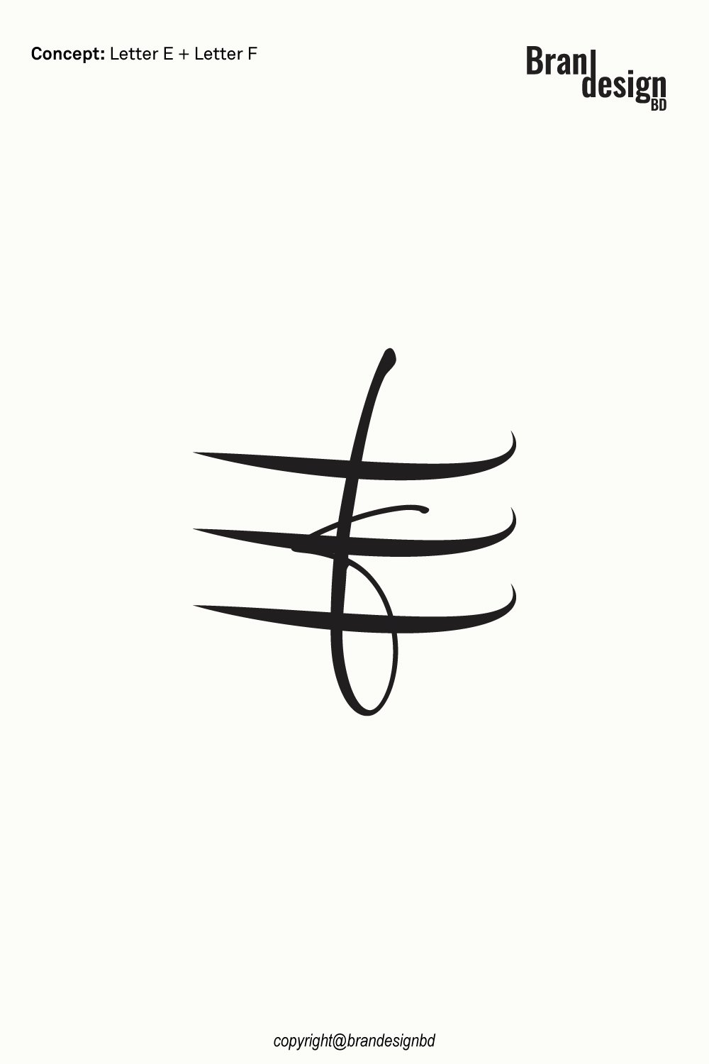
Concept: Letter E + Letter F Interlock
The E and F forms are arranged so that their strokes overlap and connect. This creates the visual impression that the two letters are structurally linked, giving the mark a stronger sense of unity.
The interlocking construction also allows the logo to function as both a readable monogram and an independent abstract symbol.
The Letter E
A foundation of the monogram
The letter E contributes the horizontal structure of the logo. Its strong strokes provide visual direction and help establish the framework into which the second letter is integrated.
As a branding element, E can represent the initial of a company name, founder, product, service, or organization.
The repeated horizontal structure can also create a sense of order, consistency, and stability.
The Letter F
A complementary vertical form
The letter F is integrated into the same visual construction rather than being placed separately from E.
Its vertical and horizontal relationships create a complementary structure that allows both initials to remain connected while maintaining their individual identities.
This approach can be particularly useful for businesses whose names or founders are represented by the initials E and F.
The Interlocking Structure
A symbol of connection and unity
The defining characteristic of the logo is the way the two letters interlock.
The overlapping structure can symbolize partnership, collaboration, connection, shared purpose, and combined strengths.
Instead of treating E and F as independent letterforms, the design presents them as parts of the same visual system. This creates a stronger and more cohesive brand symbol.
Line Interaction
Creating visual rhythm and movement
The relationship between the vertical and horizontal strokes gives the logo a distinctive visual rhythm.
Where the lines meet and overlap, the viewer can follow the structure from one part of the mark to another. This interaction adds visual interest without requiring additional decorative elements.
The clean line construction also allows the logo to maintain a professional and modern appearance.
The Combined E + F Symbol
Turning two initials into one identity
The most important part of the concept is the complete integration of the E and F.
Rather than using a conventional text-based monogram, the design turns the initials into a single graphic mark. This creates a symbol that can work alongside the brand name or independently as an icon.
The compact structure can make the logo suitable for digital profiles, stationery, packaging, signage, merchandise, and other brand applications.
For logo purchase or negotiation, please contact support@brandesignbd.com.
Logo Sale, Handover & NDA Information
All project handover agreements, ownership documentation, Non-Disclosure Agreement (NDA), and related communication will be handled through the email address provided above.
Once the logo is purchased, we will update the listing status to “Sold” and, upon request, add the buyer’s website or preferred address to the listing as confirmation of the sale. All necessary final files, ownership documentation, and agreed-upon project materials will be provided to the buyer after the purchase is completed.
Potential Applications for the Logo
A versatile monogram should work across multiple industries while maintaining its recognizable form. The Creative E and F Letter Interlock Logo can be adapted for several business categories.
Fashion and Lifestyle Brands
Developing a recognizable signature mark
Monograms can be effective for fashion and lifestyle brands because they can function as compact symbols on products and packaging.
The E and F mark can be applied to clothing labels, accessories, product tags, packaging, shopping bags, websites, and social media profiles.
Creative Businesses
Creating a distinctive visual signature
The abstract quality of the interlocking letters allows the logo to work for photographers, production companies, media businesses, marketing agencies, content creators, and creative professionals.
The symbol can also be used as a watermark or compact signature.
Personal Brands
Turning initials into a professional identity
The E and F initials can represent two important aspects of a personal brand or professional partnership.
A monogram provides a compact visual identity that can be used on websites, business cards, portfolios, social media profiles, presentations, and other professional materials.
Originality and Copyright Verification
Originality is an important part of professional logo development. A logo should not simply imitate an existing identity or use another company’s protected artwork.
Yandex Image Search
Reviewing visual similarities
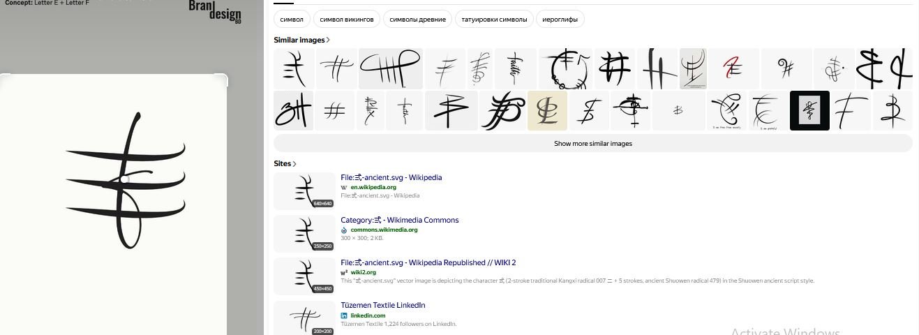
Yandex can be used as one part of a broader visual similarity review. Image search can help identify visually similar marks, concepts, or existing artwork that may appear online.
This type of search is useful during the design review process because it provides another opportunity to identify potential visual similarities before final delivery.
TinEye Reverse Image Search
Checking for matching or reused imagery
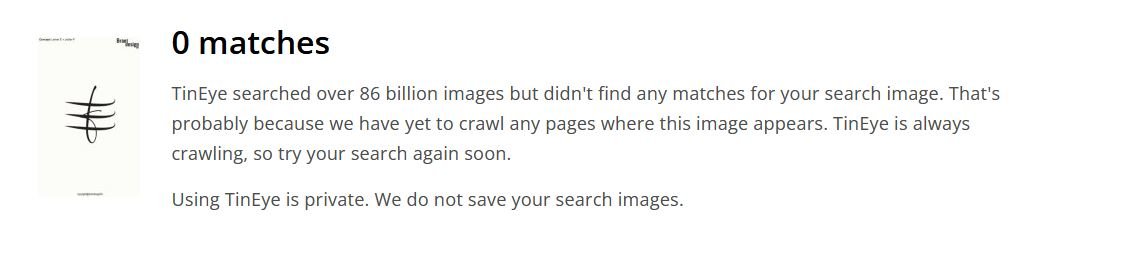
TinEye is another reverse-image search resource that can help investigate whether a similar image or graphic appears elsewhere online.
For logo development, reverse-image searches can support an originality review, particularly when the designer wants to check whether a visual element resembles existing online artwork.
Non-Disclosure and Logo Handover Agreement
Professional logo projects may involve confidential business information. A client may share a company name, product concept, launch plan, marketing strategy, packaging information, or other materials that are not yet publicly available.
Clear communication about confidentiality, ownership, and final deliverables can help establish expectations between the designer and buyer.
Non-Disclosure Agreement
Protecting confidential client information
A non-disclosure agreement, commonly called an NDA, can establish clear expectations regarding confidential information.
Depending on the agreement, the designer may be required to keep private materials confidential and avoid sharing unreleased brand information, business documents, product concepts, or other protected project details without permission.
An NDA should clearly define what information is confidential, how that information may be used, and what responsibilities apply after the project ends.
Logo Handover Agreement
Defining final ownership and deliverables
A logo handover agreement can clarify what the buyer receives after the purchase and completion of the project.
A professional handover may include the final logo files, editable vector artwork, approved variations, color versions, and other agreed project materials.
The agreement should also state when ownership or usage rights transfer to the buyer. Depending on the project terms, this may occur after final payment has been received.
Final File Delivery
Providing practical brand assets
A complete logo package may include formats such as AI, EPS, SVG, PDF, and high-resolution PNG files when these are included within the agreed scope.
Vector formats are particularly useful because they allow the logo to be resized for both small and large applications without losing qualit
Final Thoughts on the Creative E and F Letter Interlock Logo
The Creative E and F Letter Interlock Logo combines two simple initials into one connected and memorable visual identity.
The letter E provides a strong horizontal structure, while F contributes a complementary form that integrates naturally into the overall mark. Their interlocking relationship creates a visual representation of connection, unity, partnership, and shared identity.
The minimalist construction makes the logo versatile enough for digital and print applications, including websites, social media, business cards, stationery, packaging, labels, signage, merchandise, and promotional materials.
For businesses or individuals looking for a monogram that represents the initials E and F in a creative and unified way, this concept provides a flexible starting point for building a professional brand identity.
With professional vector artwork, organized final files, clear handover terms, appropriate confidentiality arrangements, and a responsible originality review, the finished identity can be prepared for practical brand use.
When developing any new logo, visual similarity should be reviewed carefully, while formal trademark and legal checks should be handled through the appropriate professional channels. This combination of creative design and responsible brand preparation helps create a more complete identity for a growing business.
Also, check the recent article about the Creative Doorway and Ocean Wave Loop Logo Concept here