If you’re looking for an easy way to add a touch of floral elegance to your designs, then the flower vector icon set is the perfect solution. This beautiful set of icons features over 50 different floral designs that are perfect for a wide range of projects.
Whether designing a website, creating a social media post, or putting together a print brochure, this flower symbol is sure to add a touch of beauty and sophistication. Each flower vector symbol is designed with precision and attention to detail, making them ideal for high-resolution designs.
One of the great things about this set is that it includes a wide range of different flower designs. From classic to more exotic blooms, there’s something here for every design need.
Free flower vector download link –
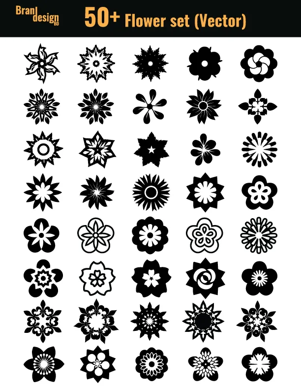
In addition to the variety of flower vector designs, these symbols also come in a range of different styles. Some are more minimalist and modern, while others have a more traditional and ornate feel. This makes it easy to find the perfect icon for your project, no matter what style you’re going for.
The advantage of using vector icons is that they can be easily scaled up or down without losing any quality. This means that you can use these icons in a variety of different sizes, from small icons on a website to large graphics in a printed brochure.
Overall, the flower vector icon set is a great investment for anyone who wants to add a touch of floral elegance to their designs. With a wide range of different flower designs and styles to choose from, these icons are sure to be a valuable addition to your design toolkit.
Also, check the recent article about arrow vector symbols for free download 50+ here.
If you want to make any customized icons then contact us now.
To get more flower vector symbols click here.